
Aquamar is a seafood company that primarily sells to restaurants. To expand their offering beyond the world of B to B, they asked us for some ideas on ways to make their packaging more consumer friendly.
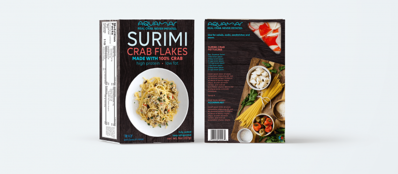
The original packaging (dark version) included lots of messaging and product features. Our goal was to simplify and modernize into an attractive design that would cut through cluttered retail environments and show off the potential of Surimi and other Aquamar seafood products.

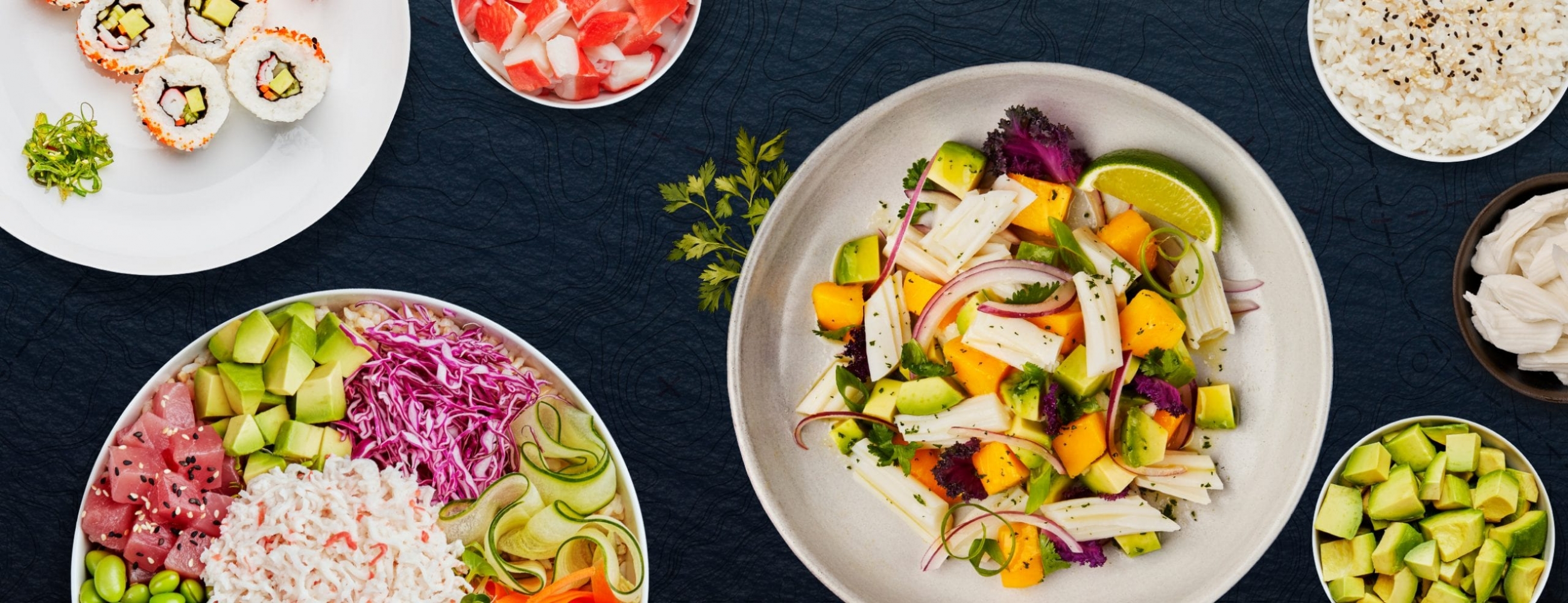
The first design cuts out extraneous messaging, features custom topographic seafloor map textures and a slate look/feel reminiscent of modern cookbook design. The direction also features a simple recipe on the back and utilized existing product photography. A window panel on the rear shows the consumer the actual product. Shown are examples of the Crab Sticks and Surimi product lines.
The second design takes our textures a step further. Angular side panel windows (plastic layer over printed seascape panels) provide an ocean/sea feel in a modern non-overt way. This time we use our topographic seafloor maps over the main slate panels. Again, typography has been updated, logo has been simplified, and product benefits and callouts have been reduced.
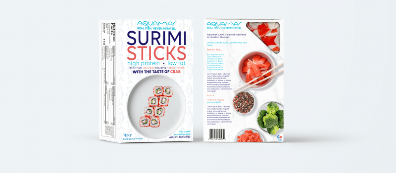
Aquamar often needs to differentiate many product lines. We use color and alternative styles to accomplish this. Below is an example of the light version packaging for the Surimi product line. On the right is an example of their current packaging.

Light version of the Surimi packaging.