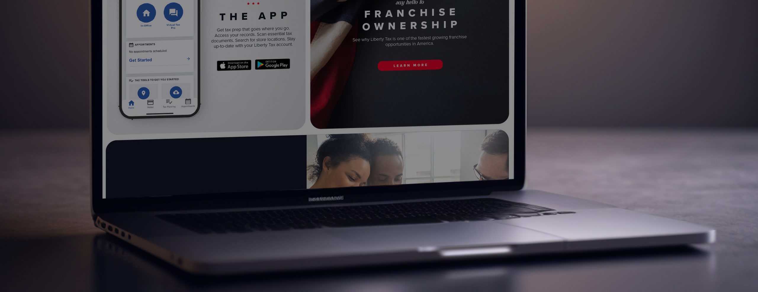

Liberty Tax came to us requesting help to improve their corporate site, Liberty Tax.com. As a thirty-year old company with thousands of store locations across the US and Canada run by a network of franchisees, Liberty Tax is a leader in tax preparation and financial solutions for a wide variety of customers. But like many companies with legacy sites, theirs had become dated and it was time for improvement. The site was hampered by an aging tech stack, outdated UX, old content, and was lacking in analytics and reporting. From an experience standpoint, the site was slow and was creating massive friction for customers who had to wait long times for pages to load often causing abandonment. The brief was clear: create a best-in-class experience that would be both easy to maintain and allow for an optimal user experience no matter what device or browser someone chose to engage with it on. And, amongst many needs but most important, the site needed to quickly get customers into the tax conversion funnel that made best sense for their personal needs whether that meant going in-store and filing with a tax professional, working online with a little help from Liberty, or doing it yourself.
With tax season coming, we had ten months to get the new site up and running. Here’s how we delivered success.
When we looked at the legacy site, we found a staggering 6,200 pages, many of which were no longer valid and featured out-of-date content. Additionally, a lot of these pages hadn’t been removed and were showing up as 404’s. This was giving the site a poor rating on Google and hurting organic search. The legacy site navigation made it difficult to find important information and the existing CMS wasn’t easy to update causing delays when it came to making quick updates or other important content changes. Finally, it was clear that the tech stack needed a major overhaul in order to become both current and easier facilitate vital technology integrations.
Because a significant amount of site traffic comes via mobile, the new site experience was created to be mobile first in design. Our modern tiled approach ensured information could be arrayed clearly and simply allowing customers to scan what they want and then choose to go for a deeper dive as needed. Additionally, by creating all the key promotional and content tiles in advance, we’d be better able to make changes on-the-fly as business demands dictated.
Because Liberty has a significant footprint in Canada, we designed the site to be easily portable to that audience and the similar but slightly different brand, business, and tax needs the Canadian market brings.