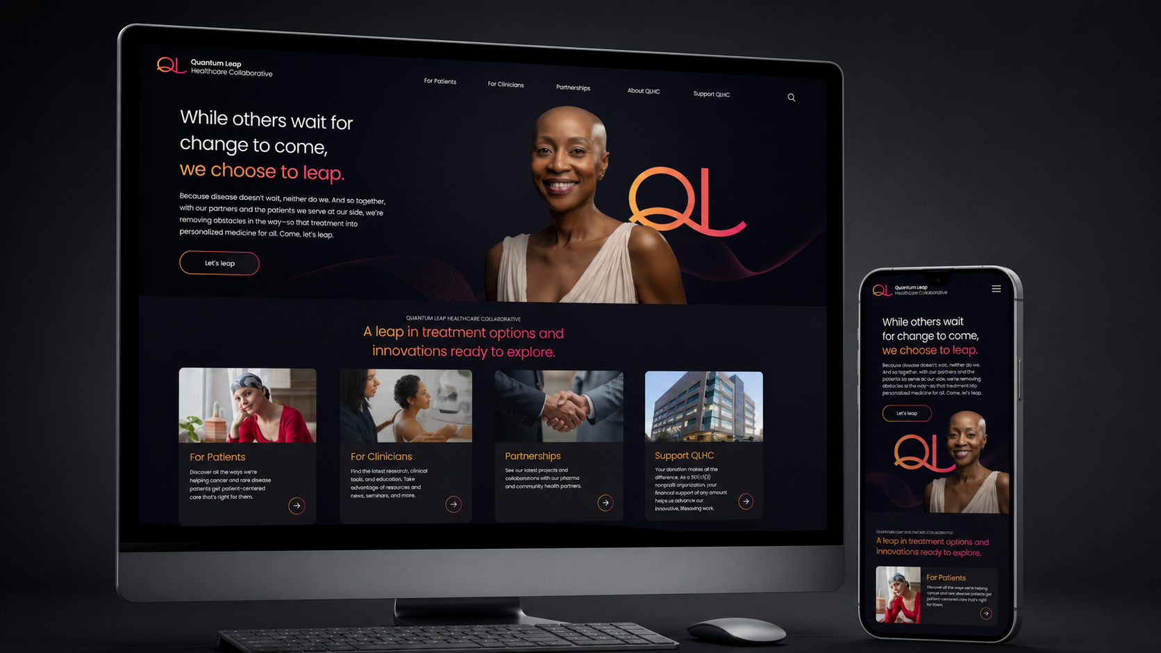
Quantum Leap Healthcare Collaborative
Let’s leap.
Services
Brand Identity
Result
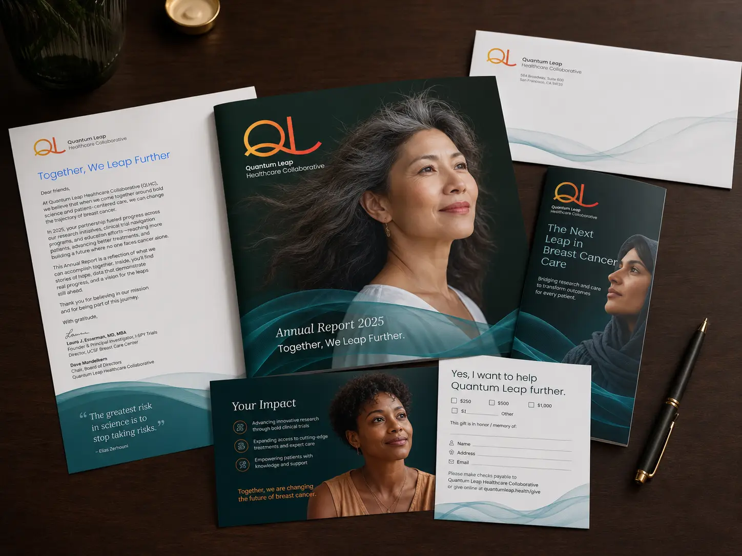
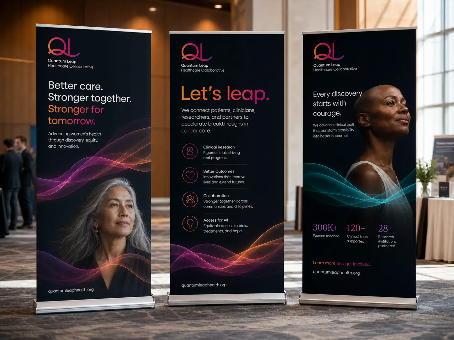
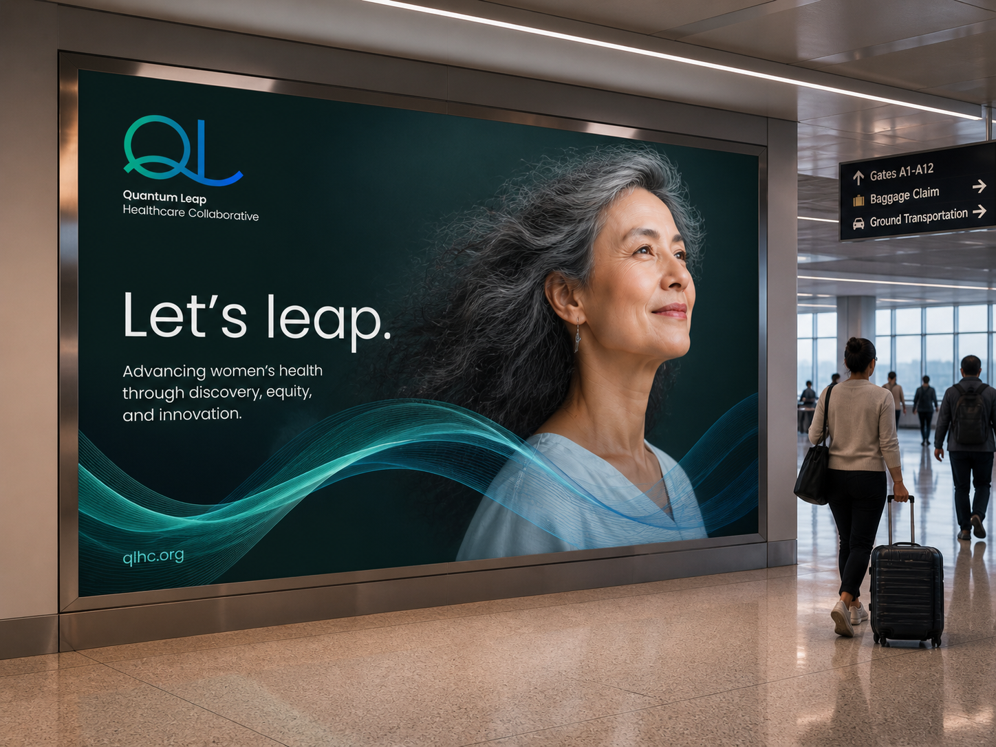
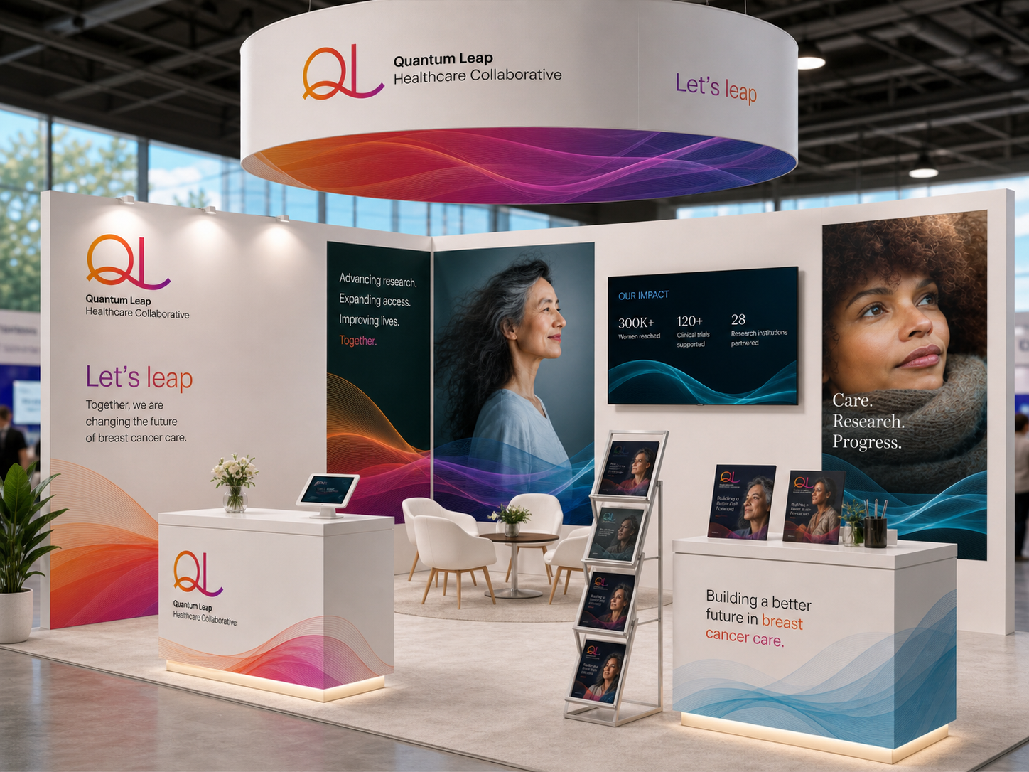
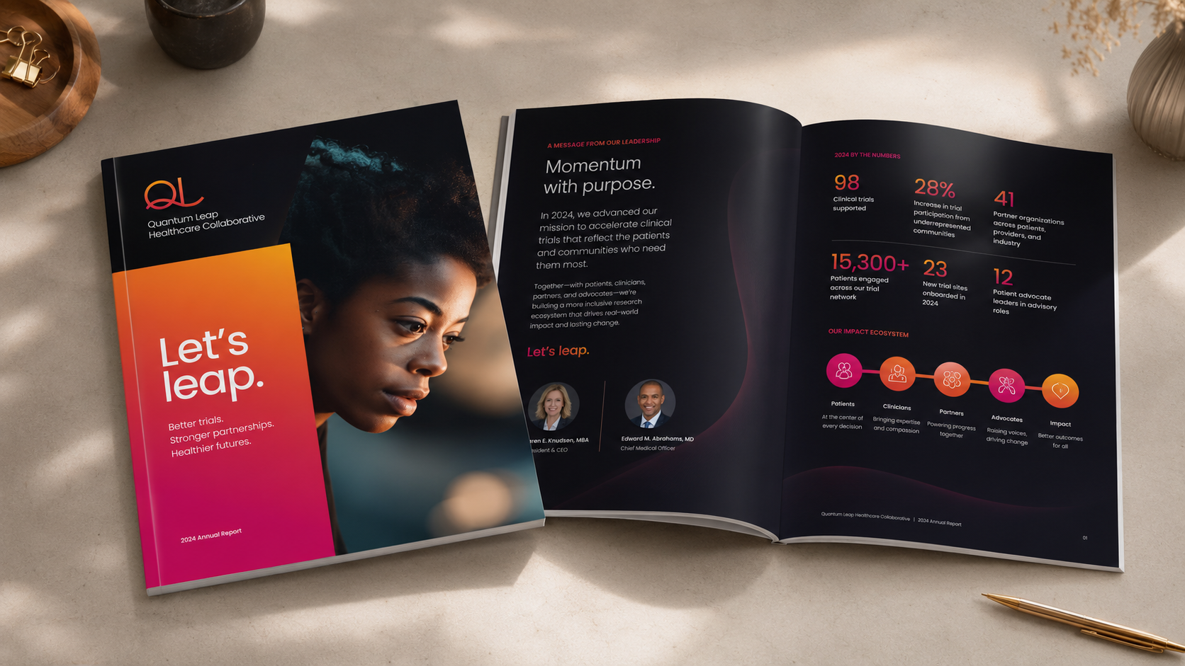
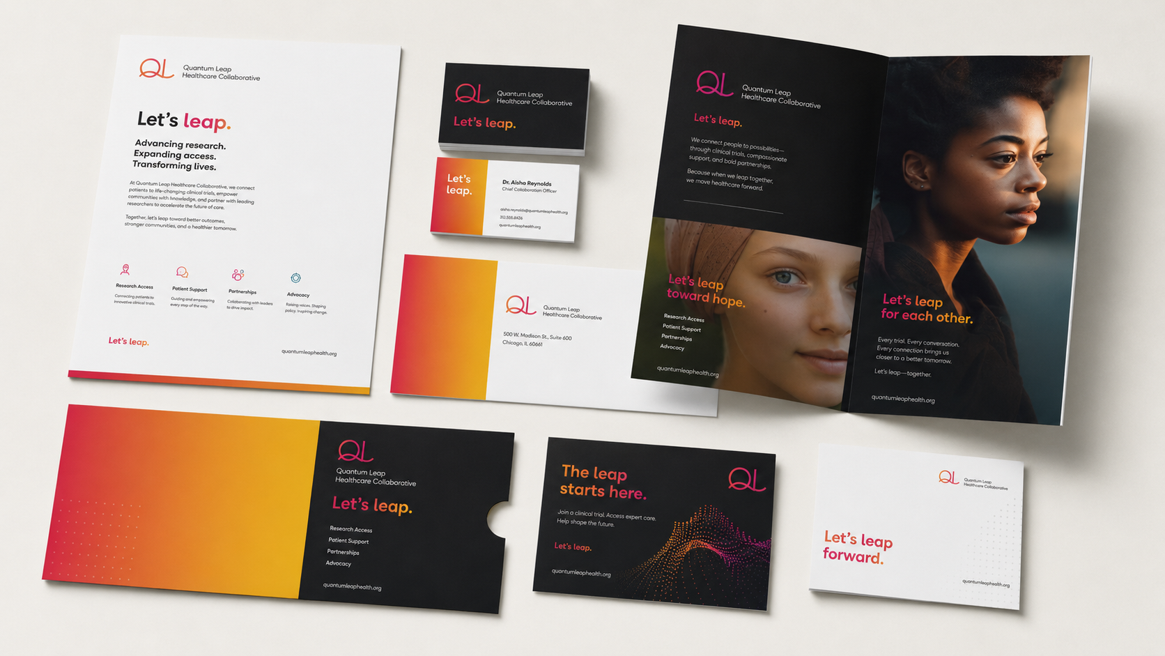
A brand built around a single gesture, the leap, carried from the logotype’s springboard through the gradient system to the photography.
“Cooper, Levy & Partners helped us bring more optimism and clarity to our brand story, energizing both our internal team and our constituents.”
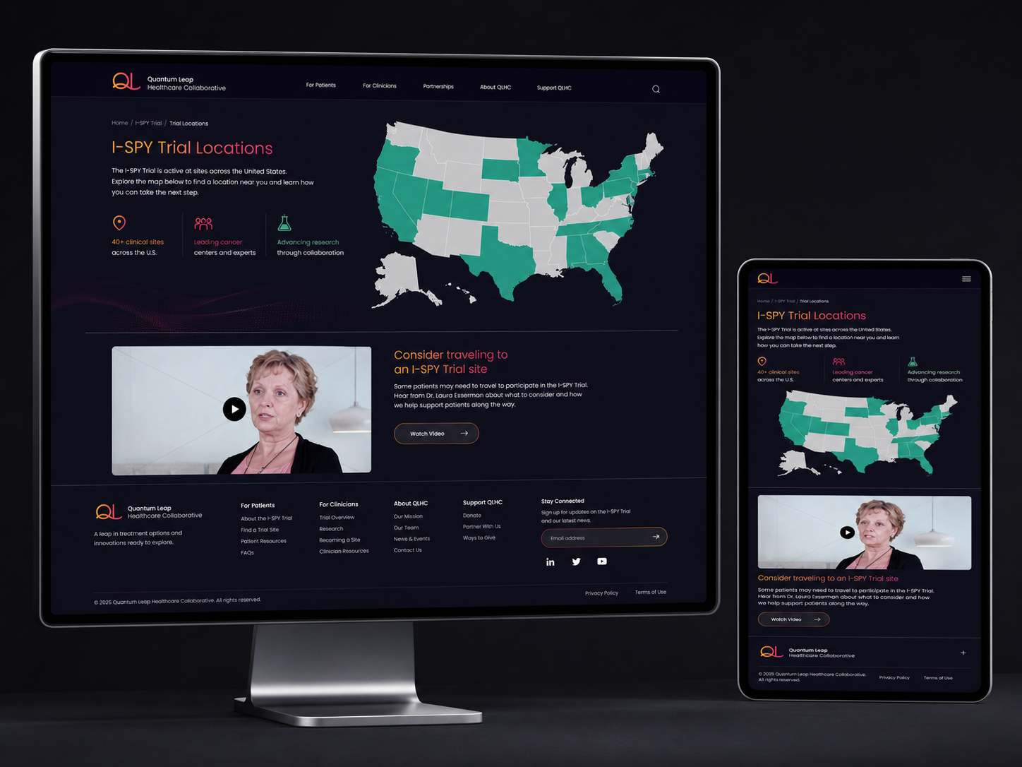
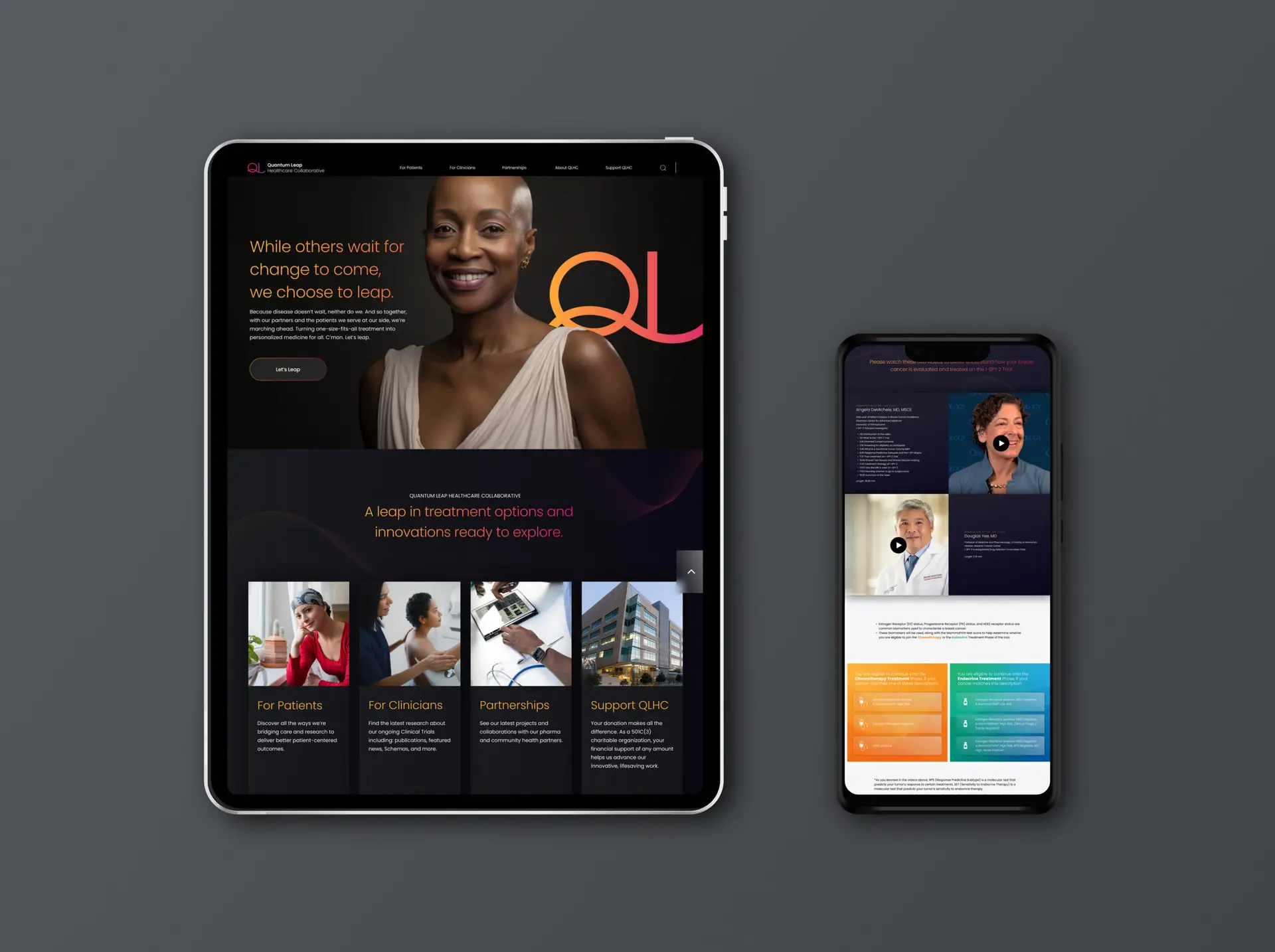
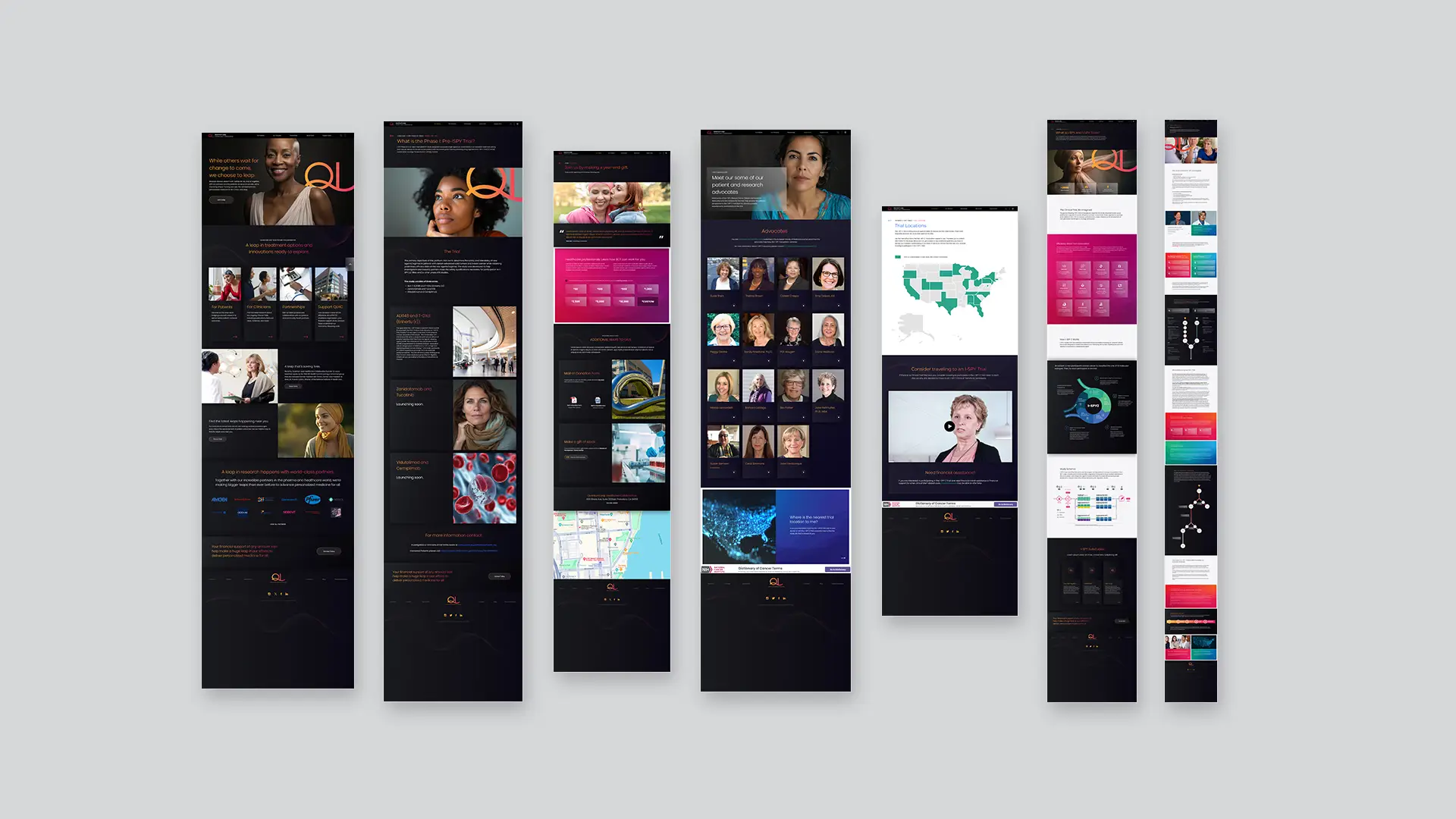
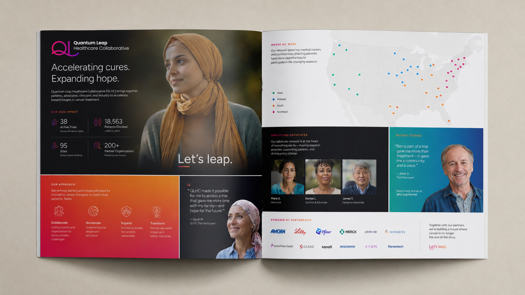
Quantum Leap Healthcare Collaborative is a research organization build on the belief cancer treatment shouldn’t be one-size-fits-all and that the path to better outcomes runs through bold, personalized clinical science driven by Ai. They leap what traditional cancer research is doing, so we created a brand design that leaps the category.
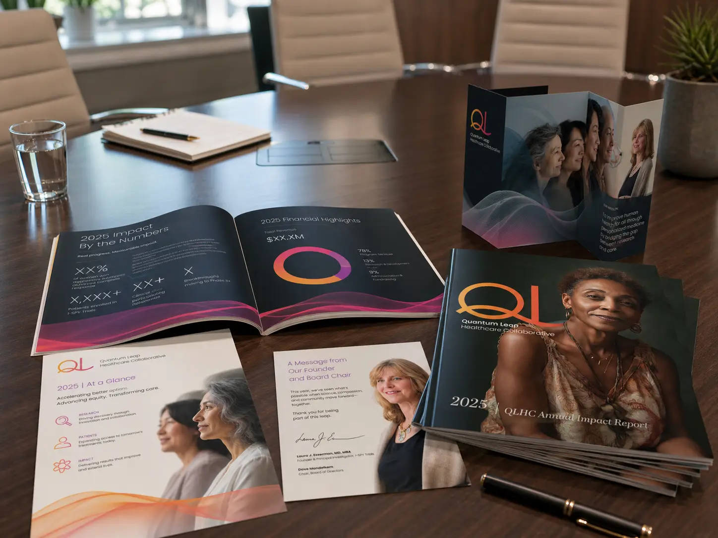
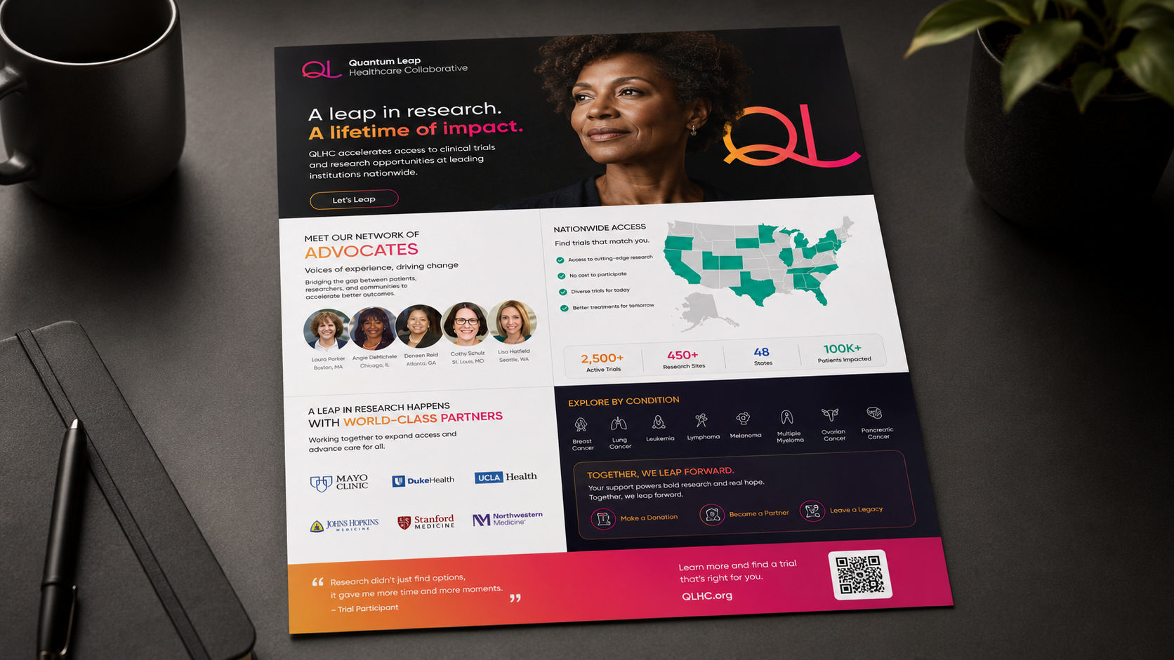
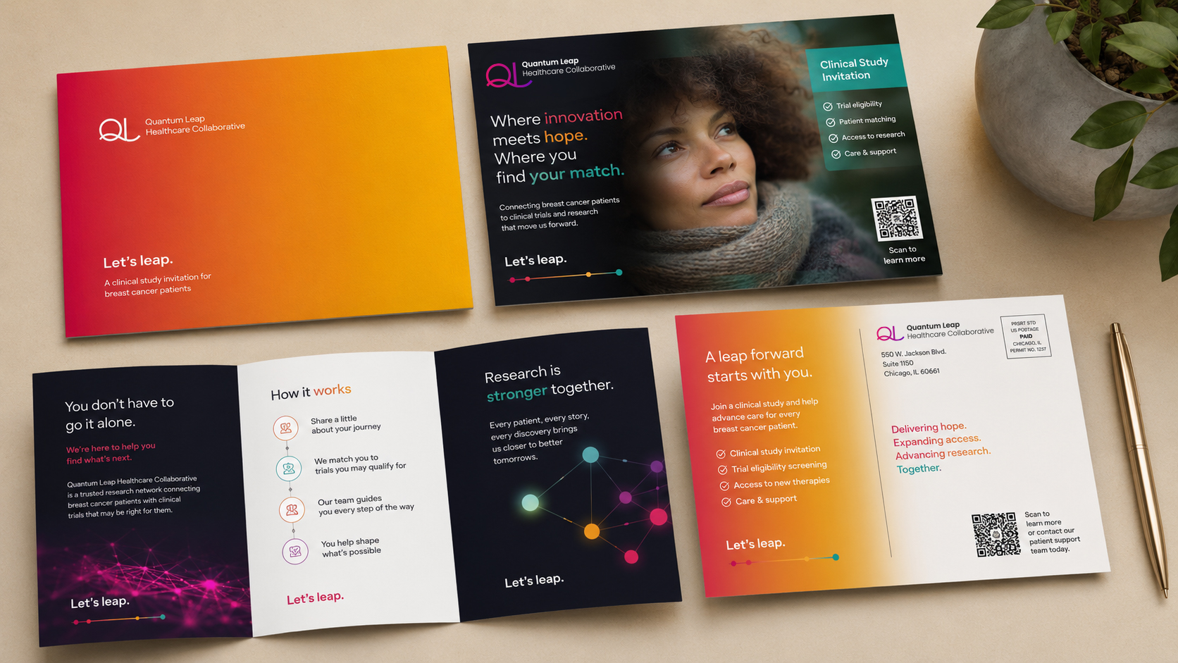
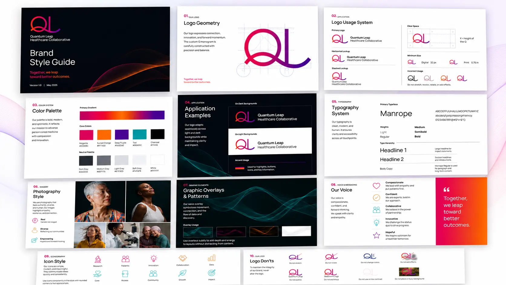
The leap is built into the mark itself. The tail of the L extends into a springboard, a single confident gesture that doubles as the central graphic device for the entire system. From it, ribbons of saturated color (magenta, coral, deep purple) flow across every surface the brand touches: annual reports, impact reports, donation cards, gala signage, conference booths, transit, OOH, fleet, web, and a refreshed sales and partnership toolkit. The palette trades nonprofit pastel for something with actual energy without losing the warmth the work requires. And the voice holds steady across the system ("A leap in access. A leap in options." "Together, we leap further." "The future doesn't wait. We leap.") so the brand reads as one organization with one point of view, whether it's a billboard or a business card.
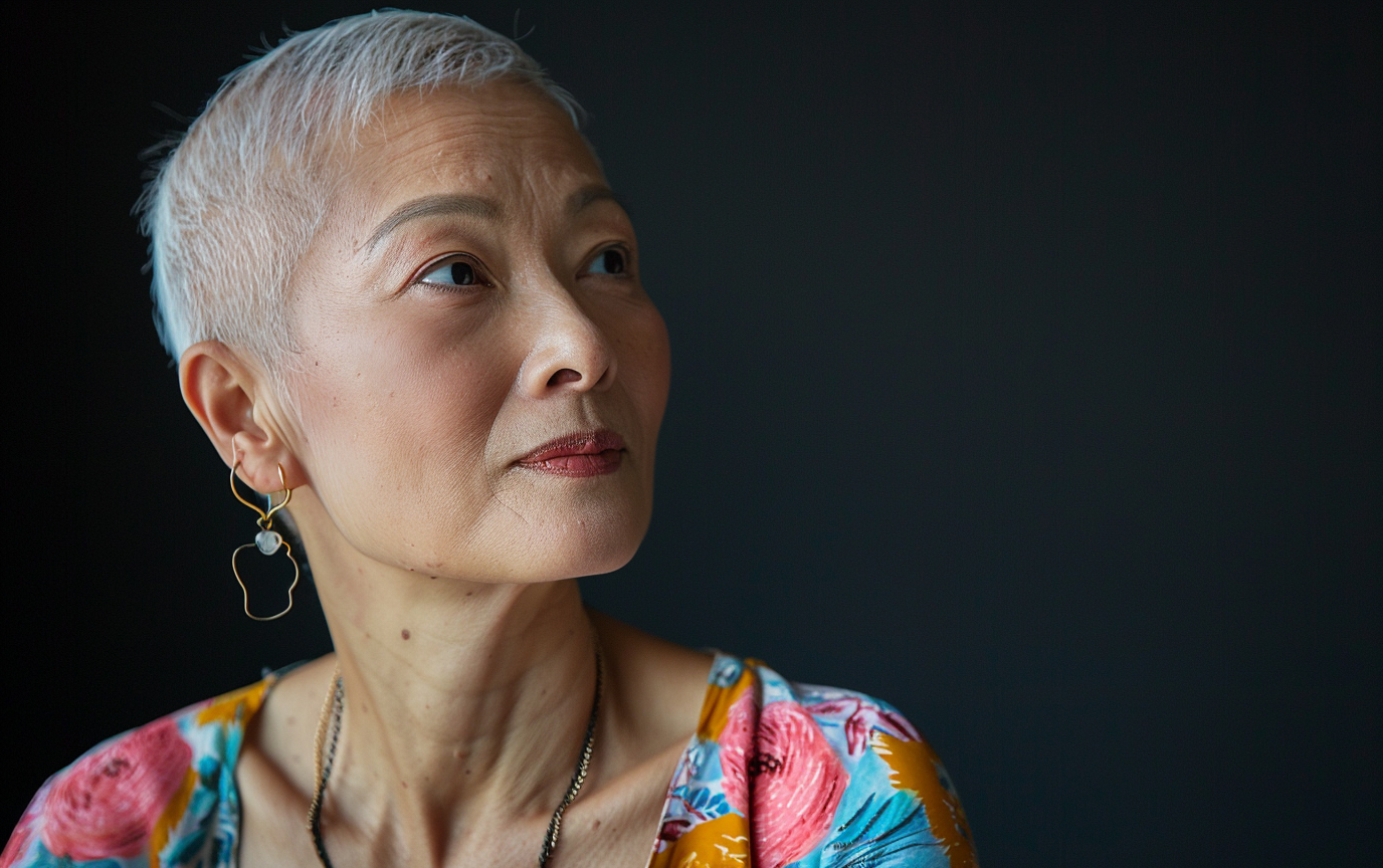
Healthcare branding has a habit of flattening the people it serves into archetypes of suffering or recovery. The QLHC system refuses that move. The patients in the work look like people, the researchers look like researchers, and the whole system reads as forward motion rather than careful reverence. The leap metaphor does both jobs a good brand idea has to do. It's specific enough to own (no other cancer-research organization is built around forward propulsion), and flexible enough to scale across every audience QLHC talks to: patients, partners, donors, internal teams, and the broader research community. As the client put it, "Cooper, Levy & Partners helped us bring more optimism and clarity to our brand story, energizing both our internal team and our constituents." That's the brief, met.