Design With Purpose®

Gu-Shoes

Product and Packaging Design.

It’s not often you get asked to help design apparel the top athlete in their profession will wear during competition. When we were asked by The Curling Group to design shoes for world #1 curler Brad Gushue, as assignments go, the shoe fit, and we delivered a design that showed the world his Newfoundland pride as well as looked pretty darn cool. 

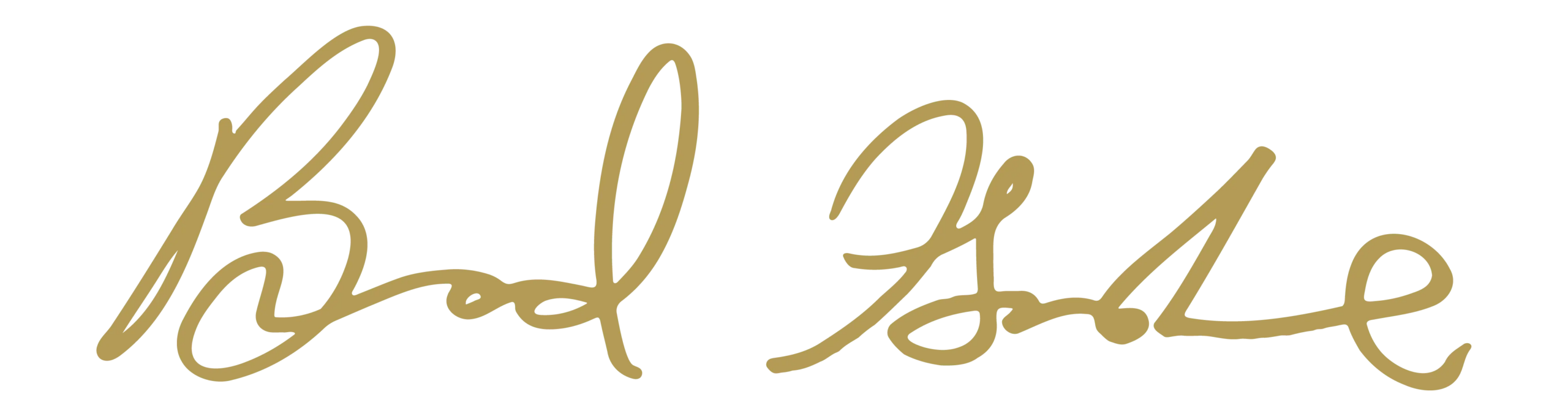
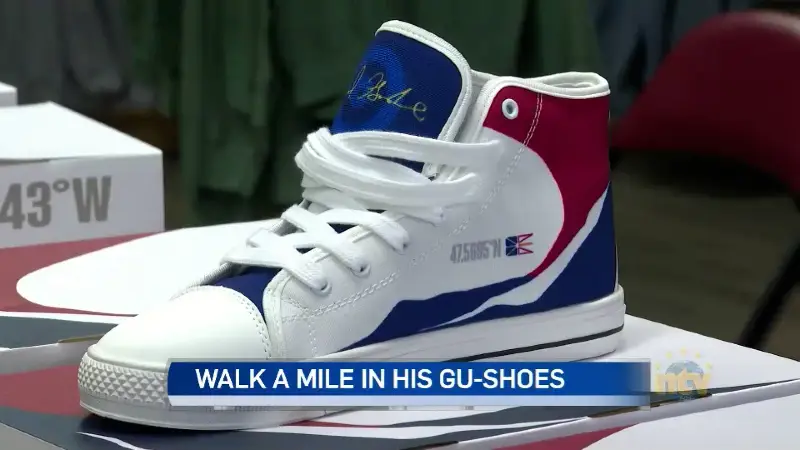
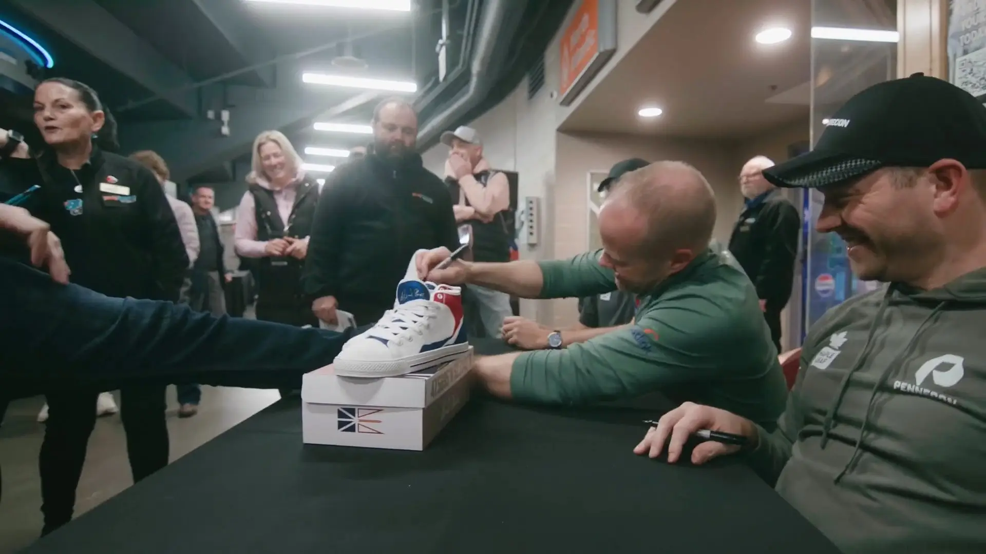
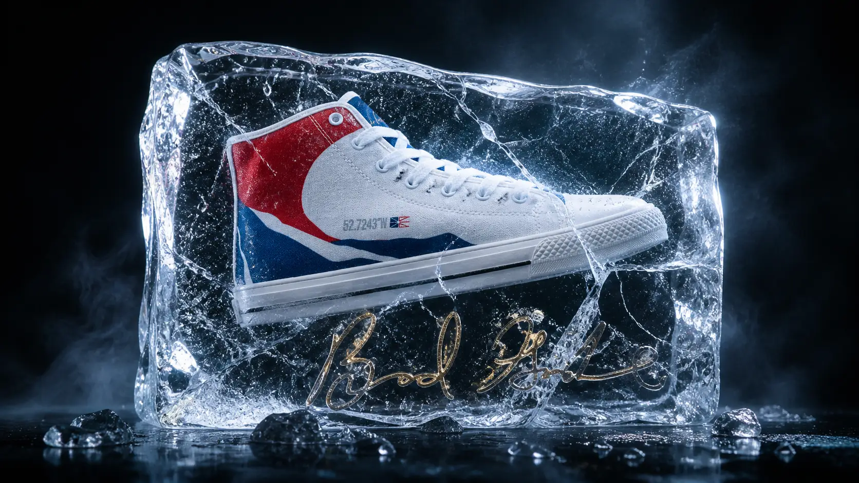
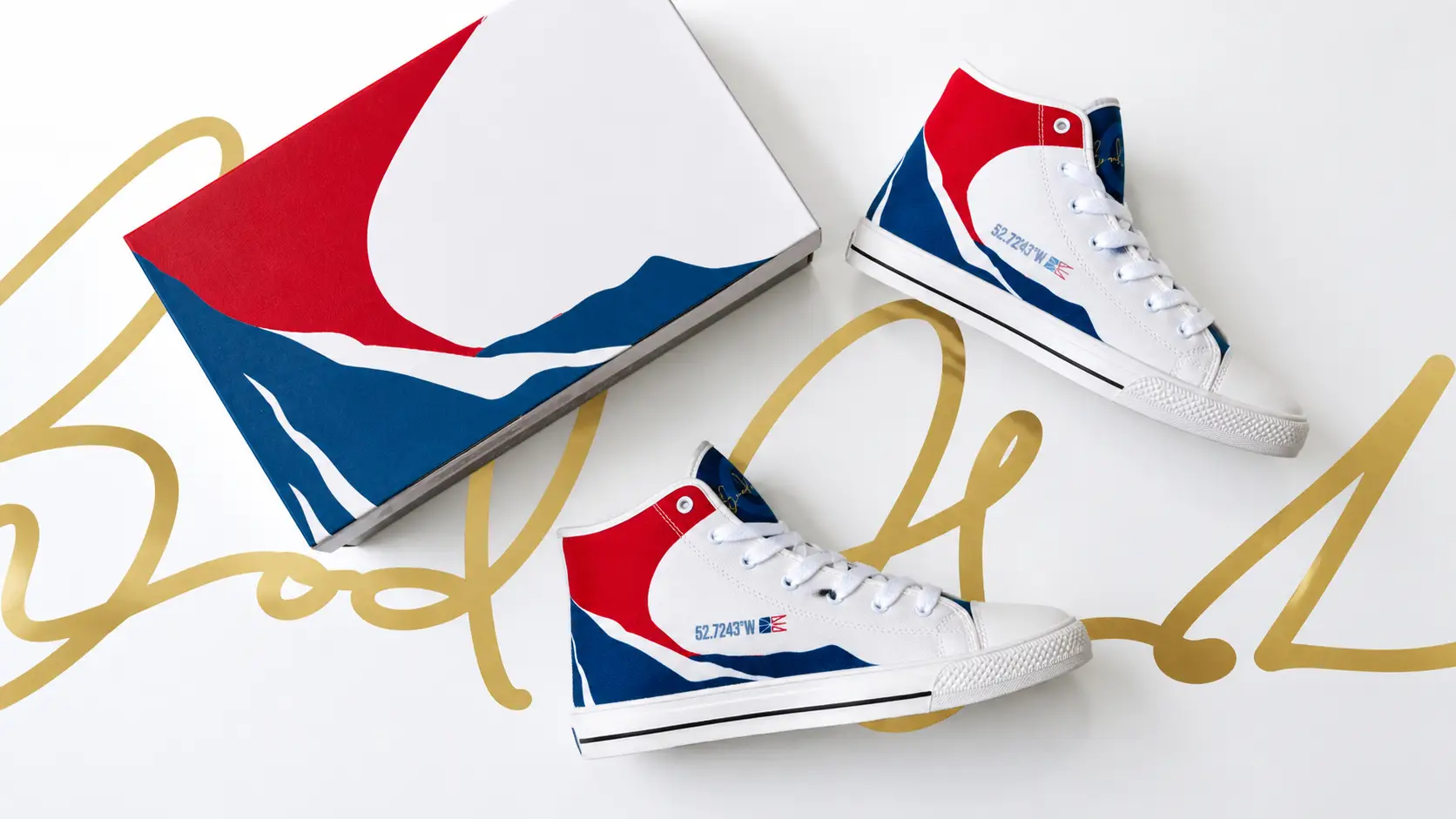
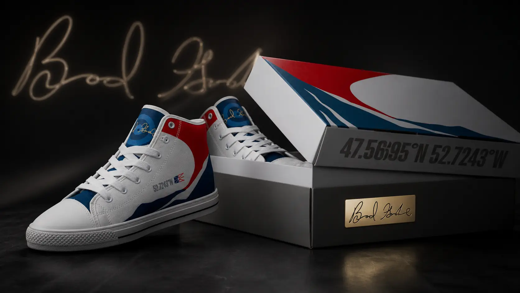
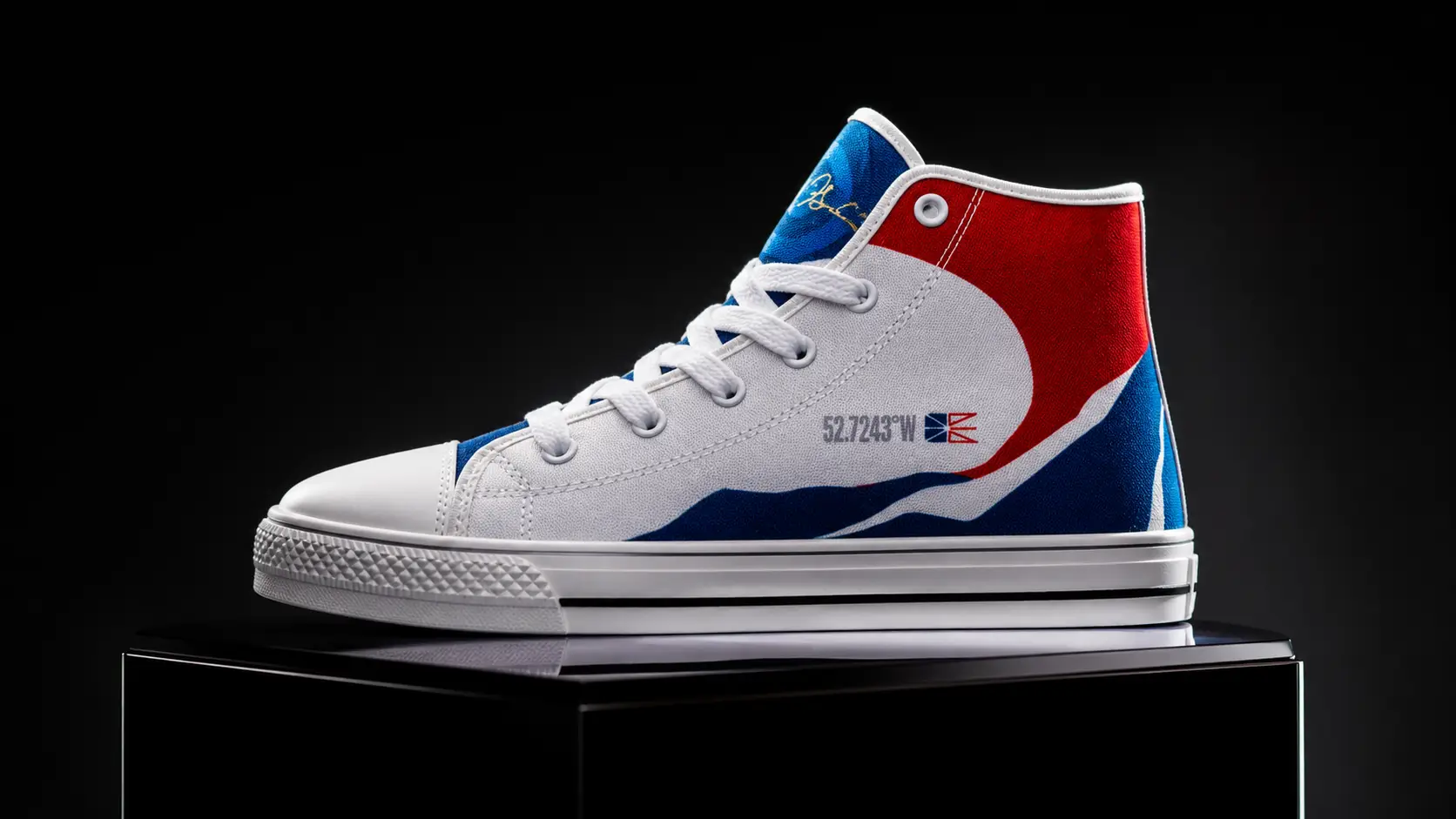
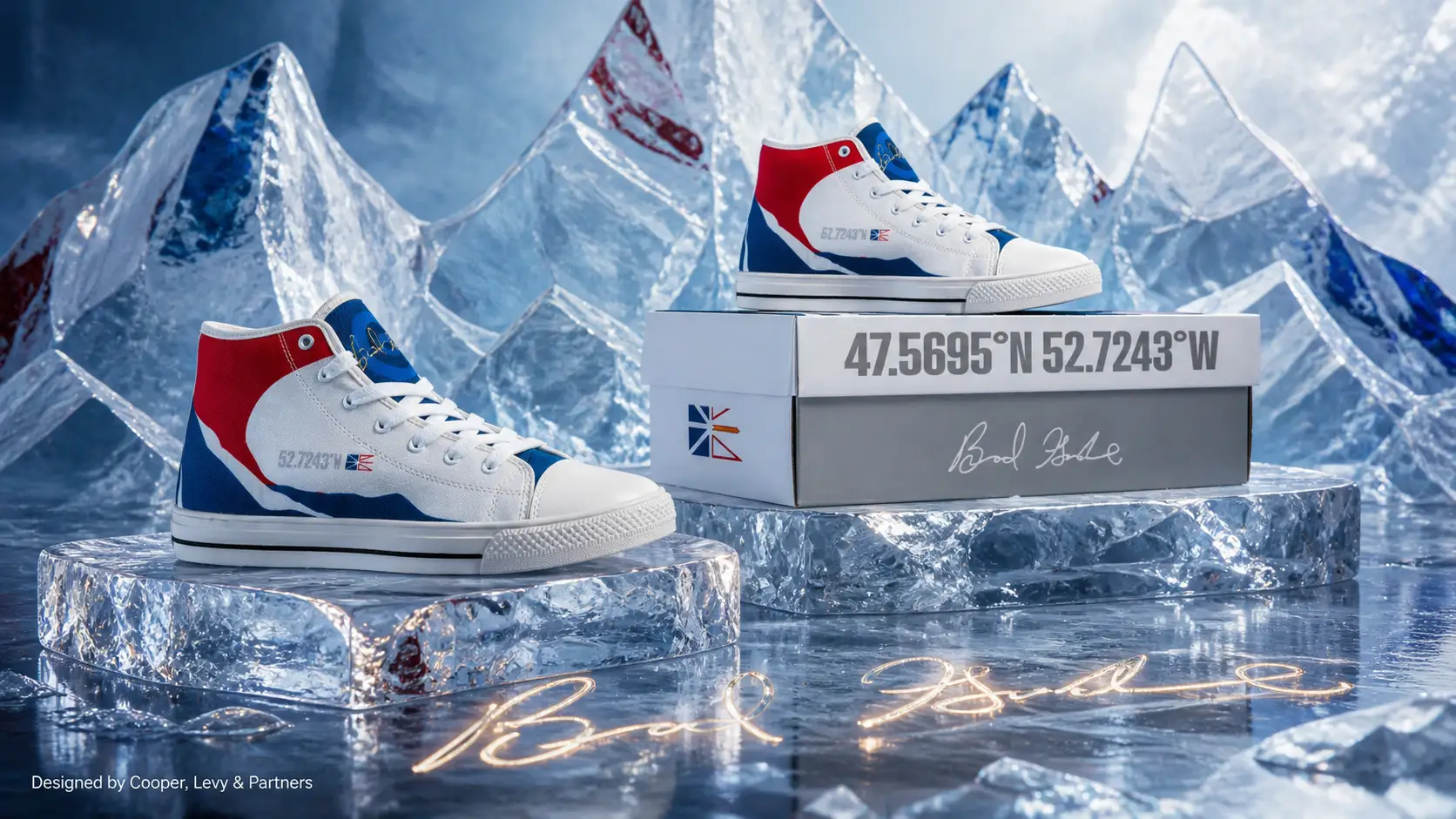
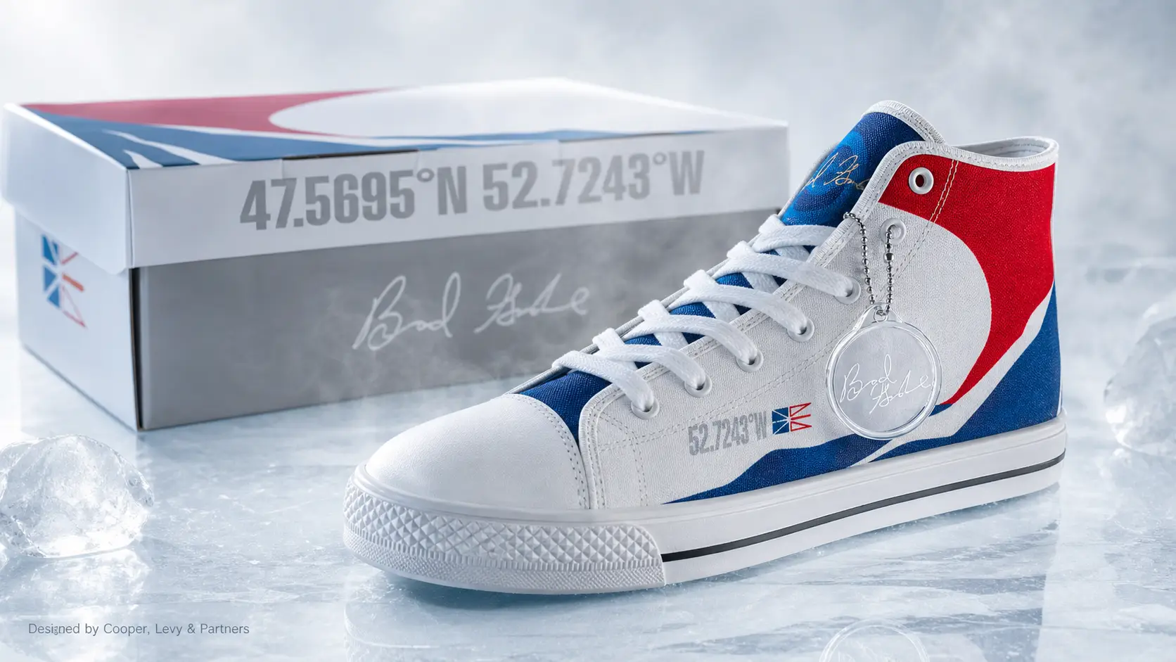
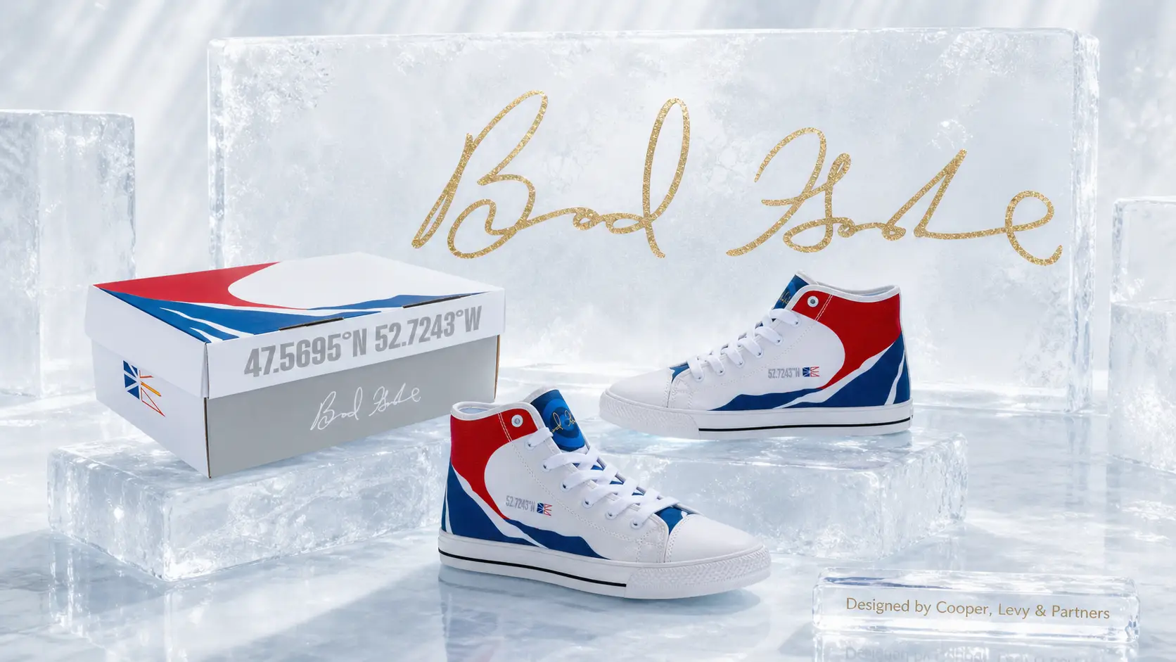
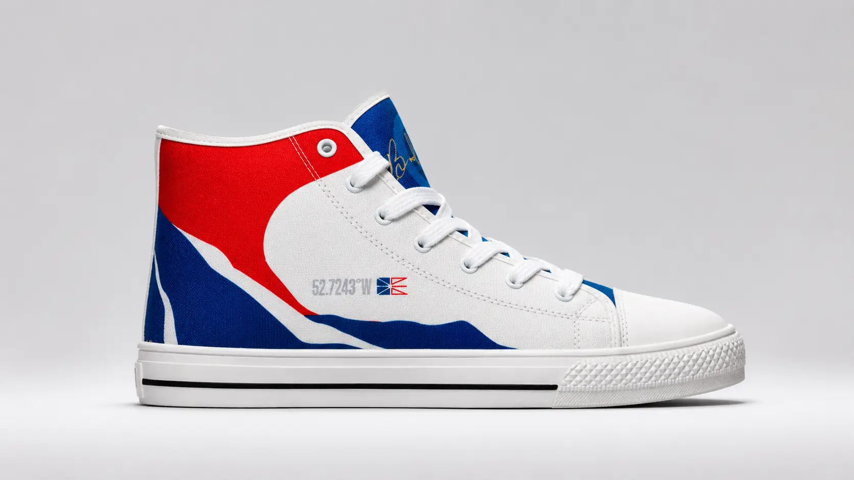
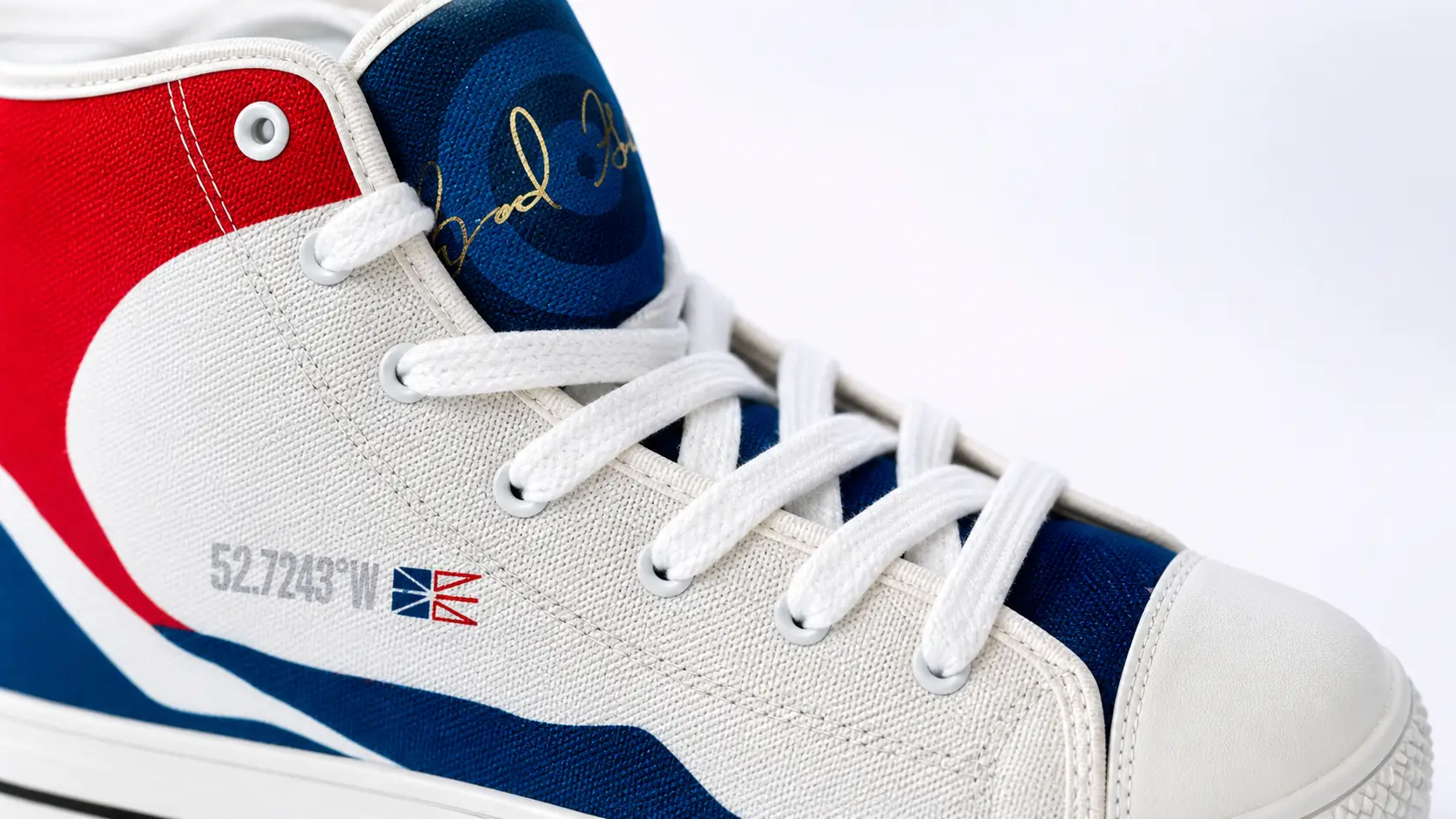
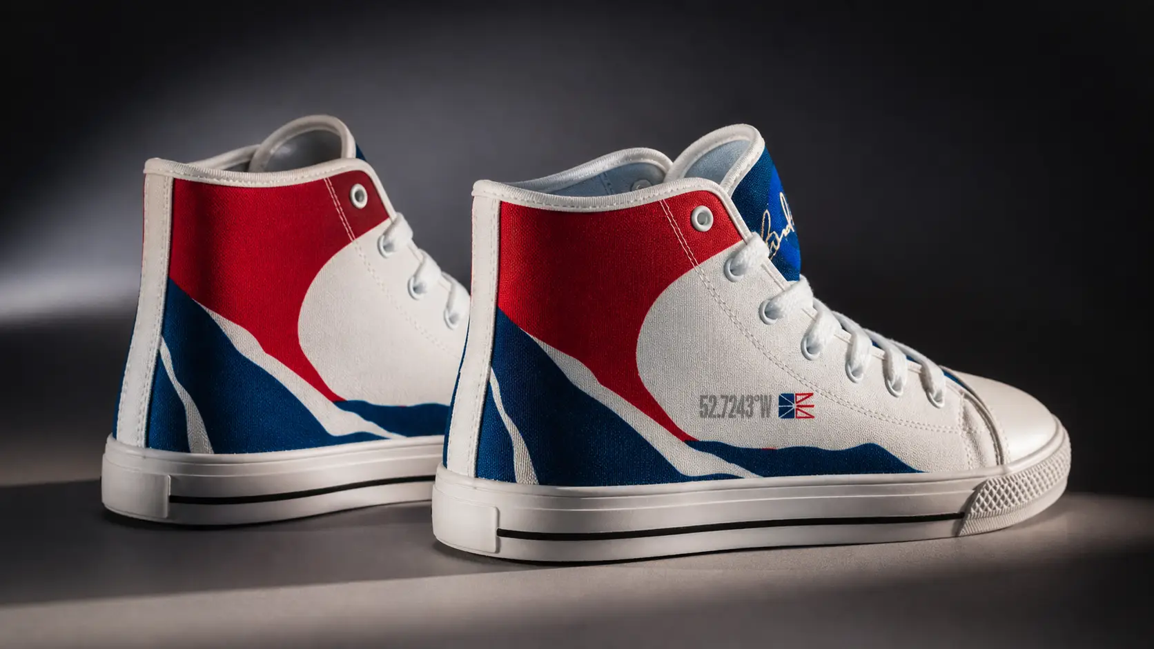
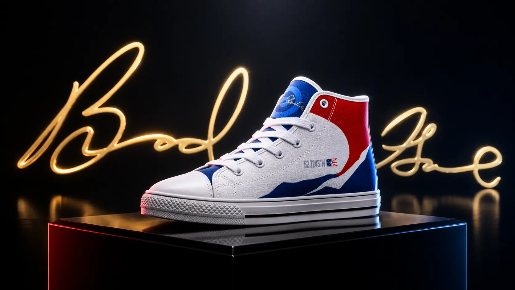
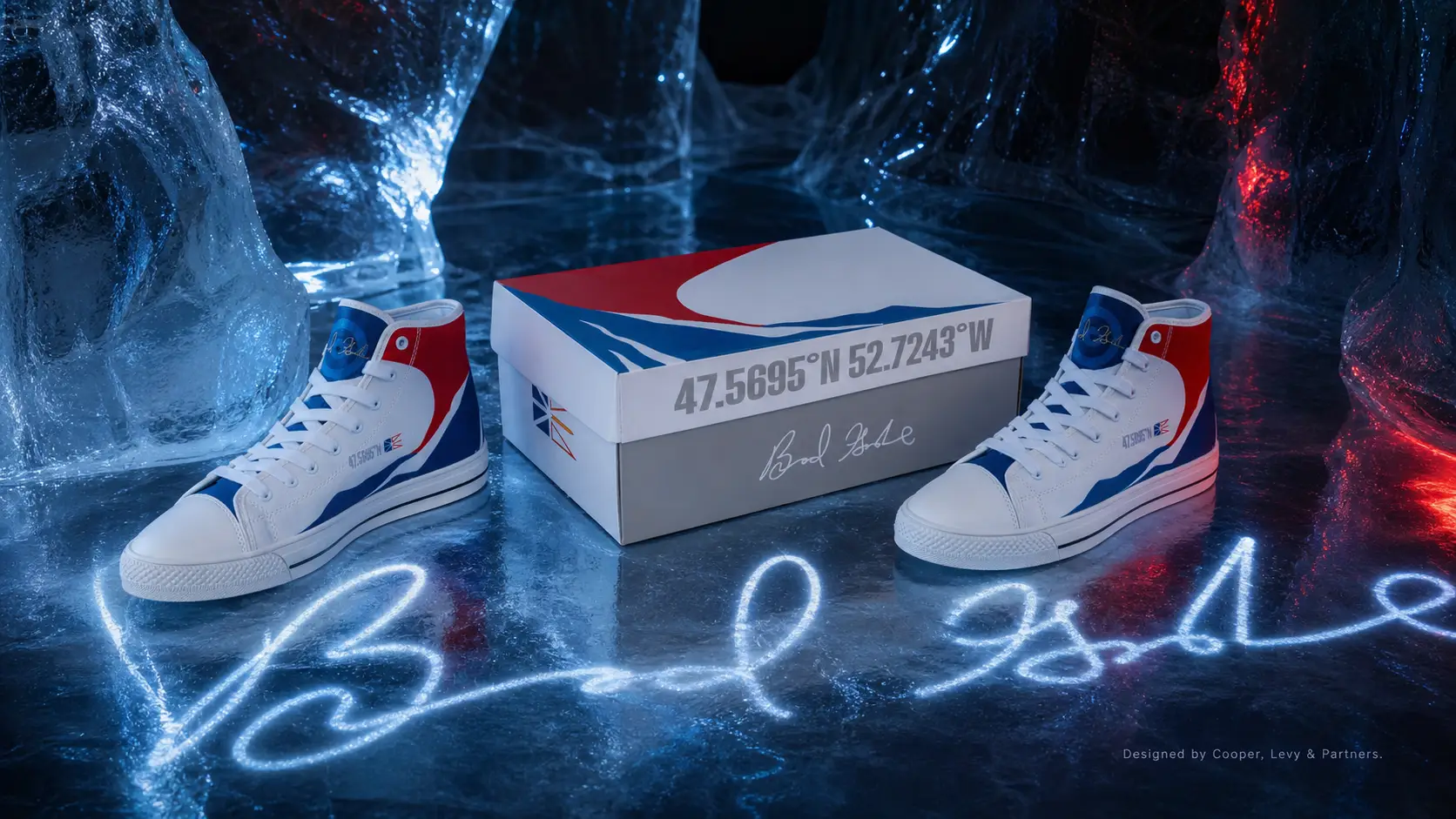
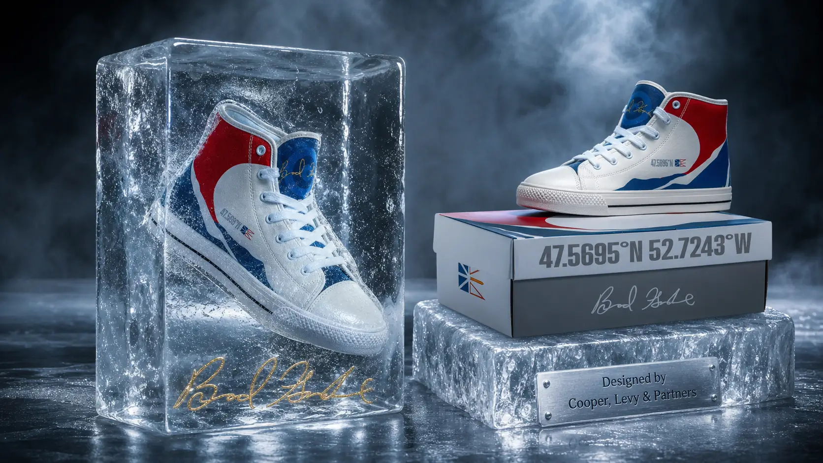
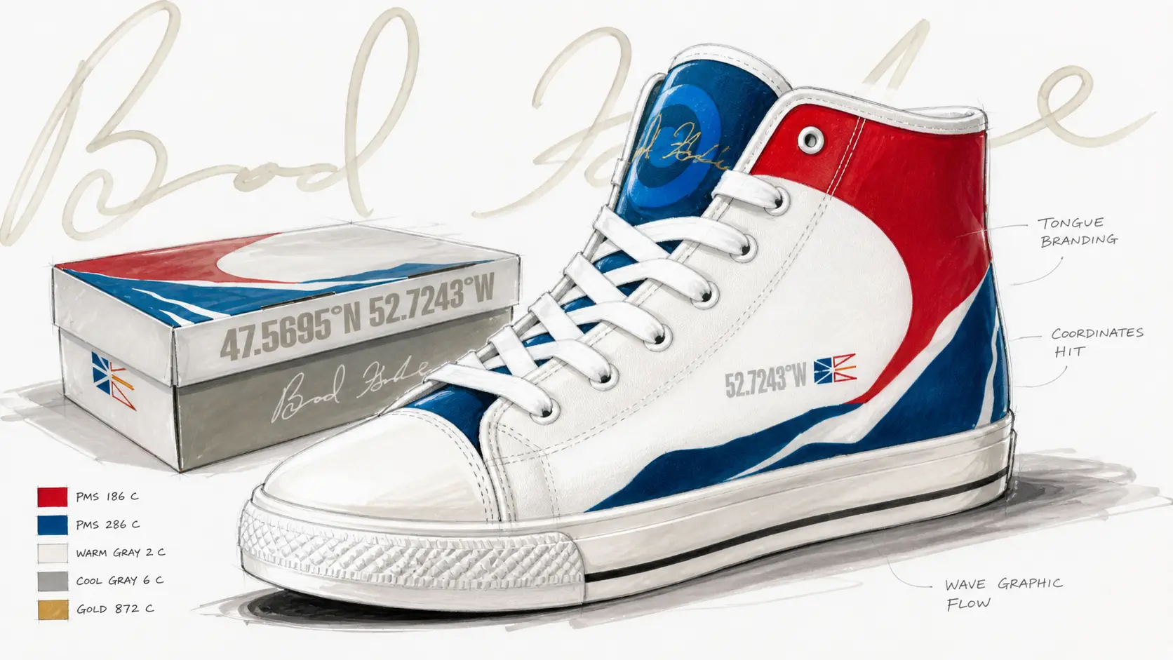
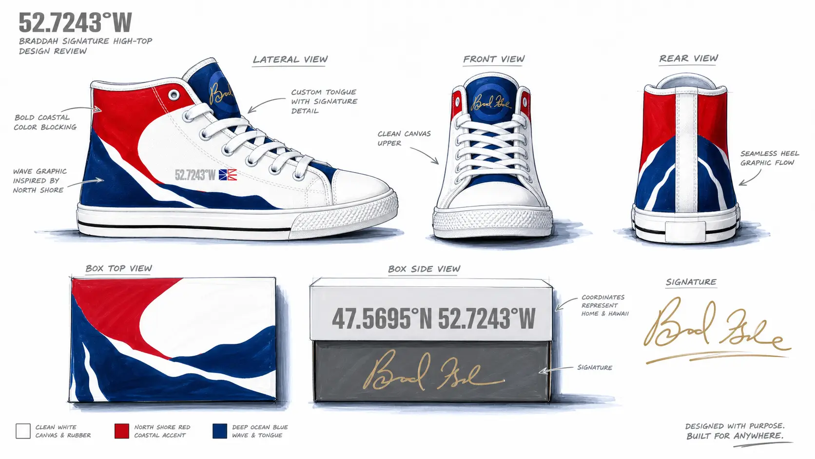
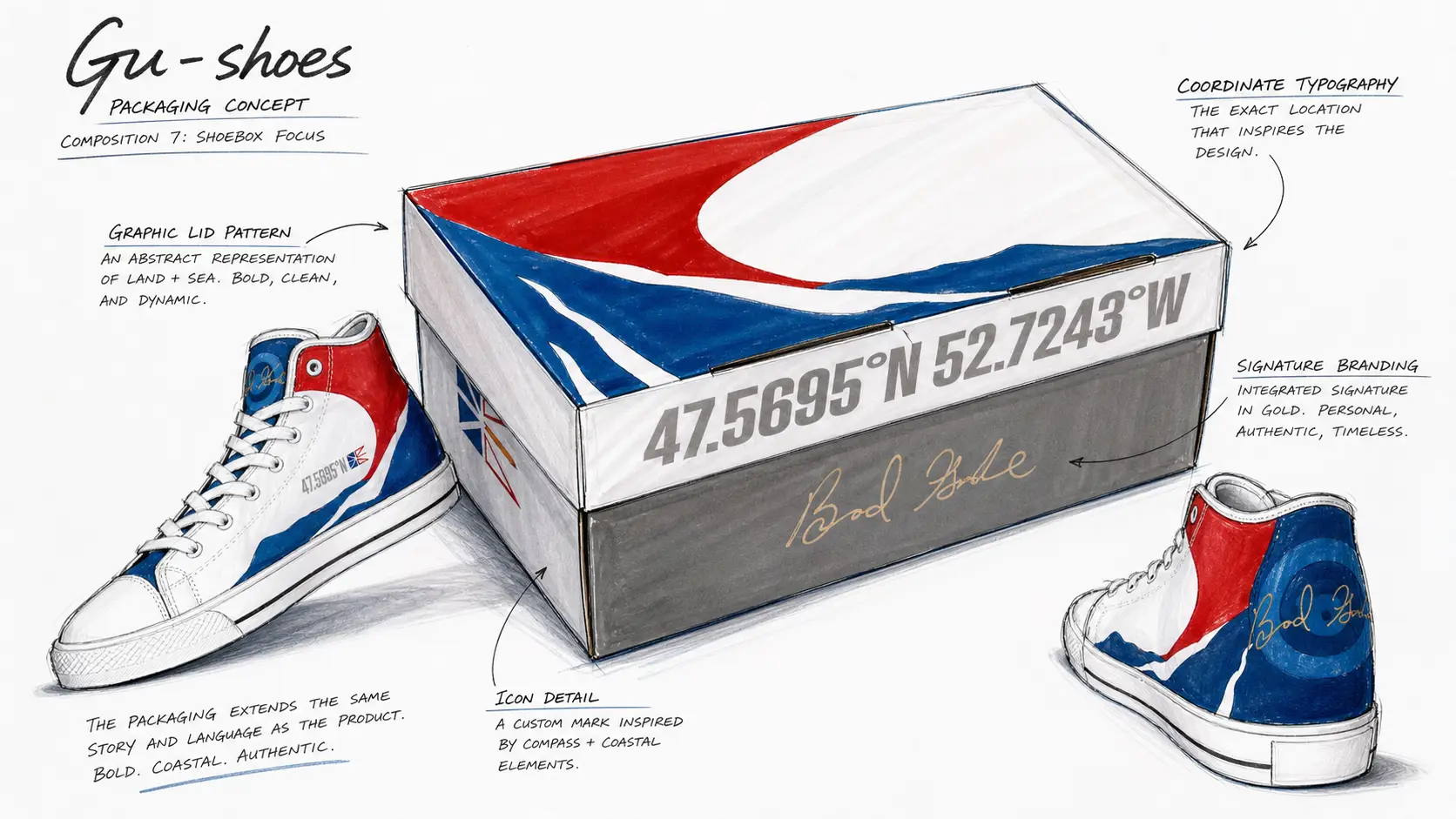
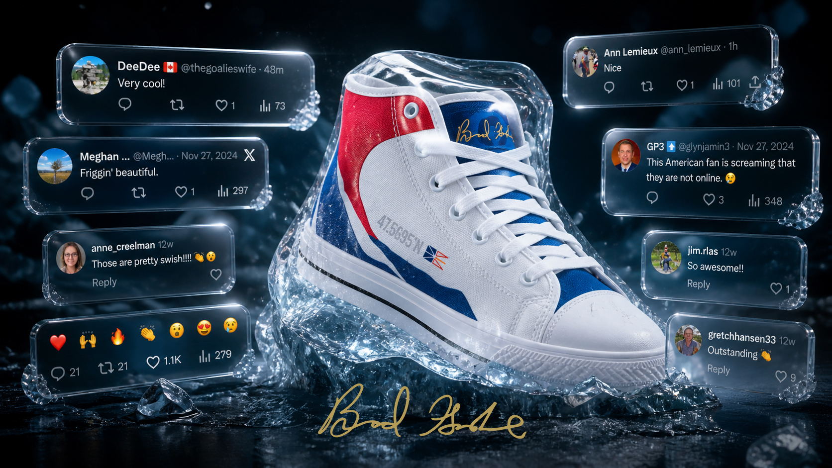
The shoe is a love letter to where Brad's career started. The colorway pulls directly from the Newfoundland flag, red and royal blue cutting across a clean white silhouette in a single confident sweep. The coordinates 47.5695° N, 52.7243° W (the Bally Haly Curling Club in St. John's, where Gushue first picked up a broom) are stamped on the heel and printed across the box. Brad's signature anchors the side panel in gold foil and reappears on the packaging, the boxes, and the campaign imagery as a personal mark rather than a graphic flourish.

A quick look at marker renderings and the detailed thinking that went into the design process.

The shoes received plenty of news coverage, went viral across social, and sold out in less than two days. The internet response was the part that mattered most. Curling fans, sneakerheads, and Newfoundlanders showed up in the comments at the same time, which is not a sentence you get to write often. The project did what the best signature-athlete work is supposed to do. It honored the person it was made for, opened a category that doesn’t usually get this kind of design attention, and proved that a sport doesn’t have to be mainstream to deserve mainstream-quality craft. One of the best creative opportunities we’ve ever had. Thanks again, Brad and TCG.