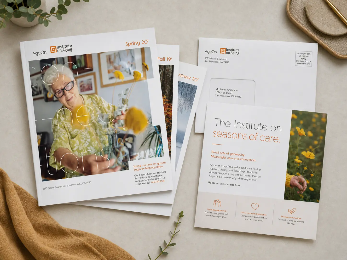
Institute on Aging
The Institute on
Services
Brand & Campaign Development
Result
A more vibrant brand and a clearer messaging system that helped IOA stand out in a crowded category and connect its many services under one voice.
The Institute on Aging or “IOA” had spent decades quietly doing some of the most meaningful work in The Bay Area supporting aging adults and their families. But the space they exist in is crowded, and the innate name of the organization was creating a disconnect. “Your name says institute. Are you a college? Aging can mean a lot of things. What does it mean in this context?” IOA needed to update its brand to both better stand out as it went to market and create greater clarity around its mission and services. We helped them by bringing a more vibrant visual language and messaging structure to their marketing efforts.
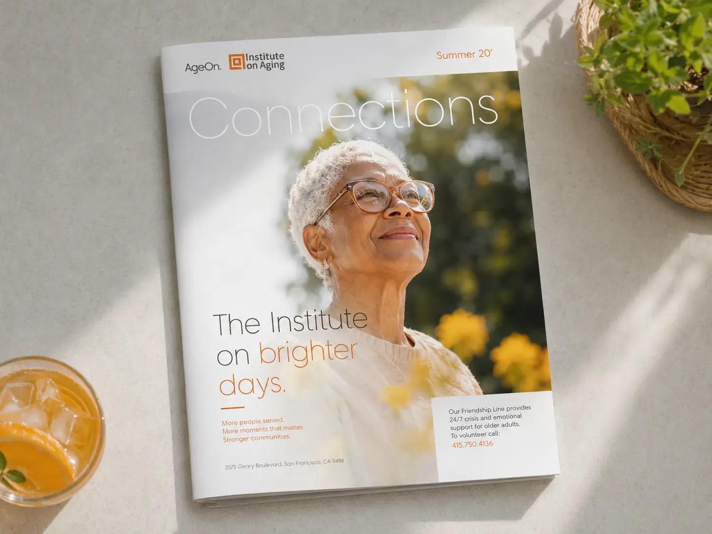
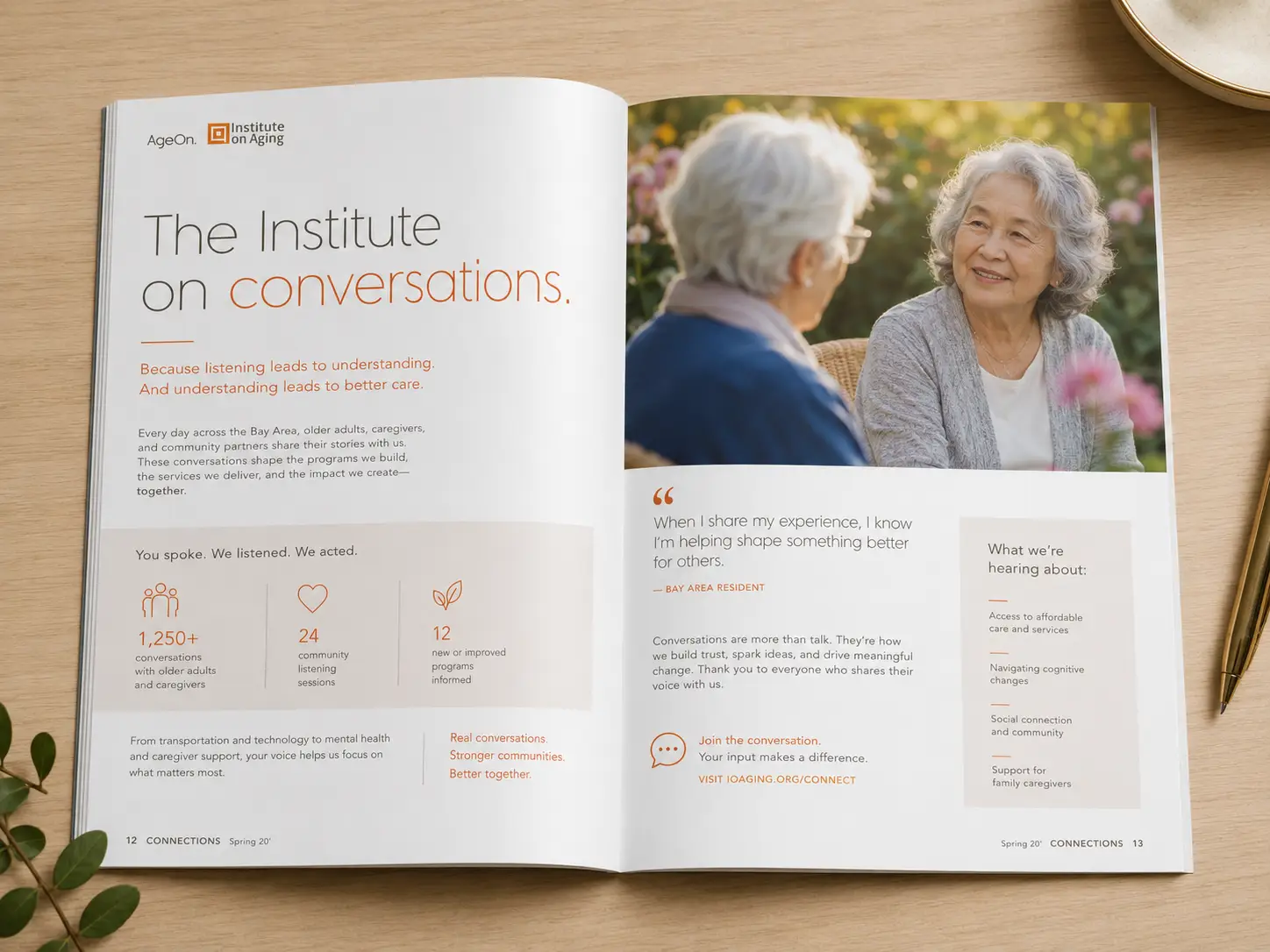
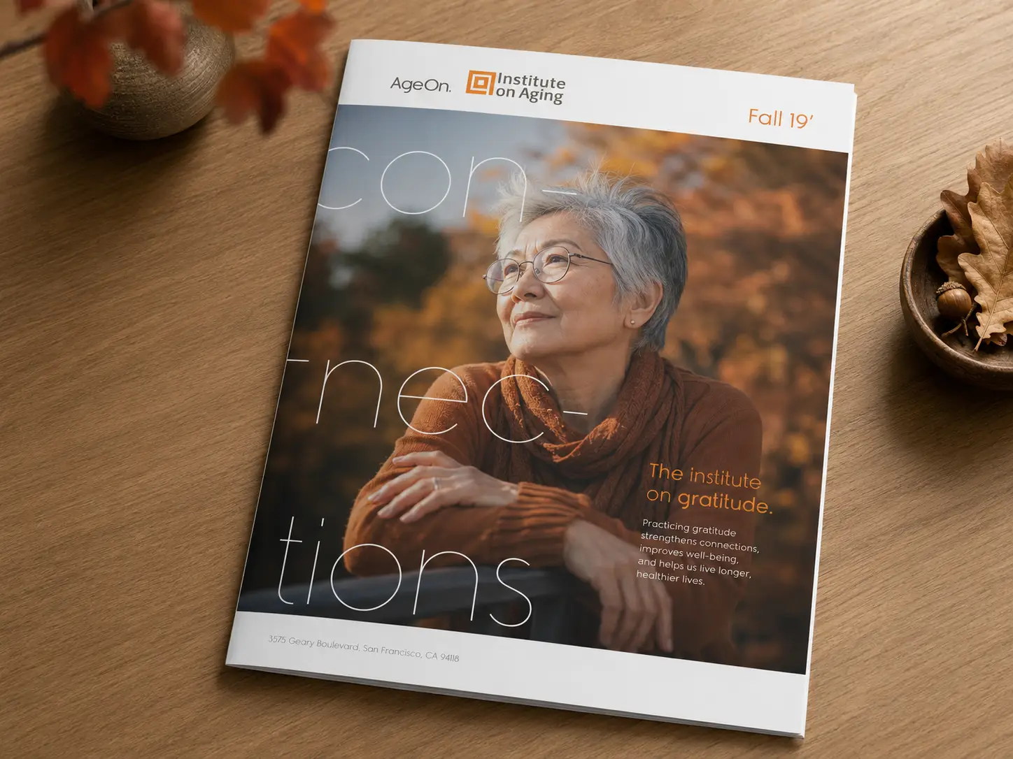
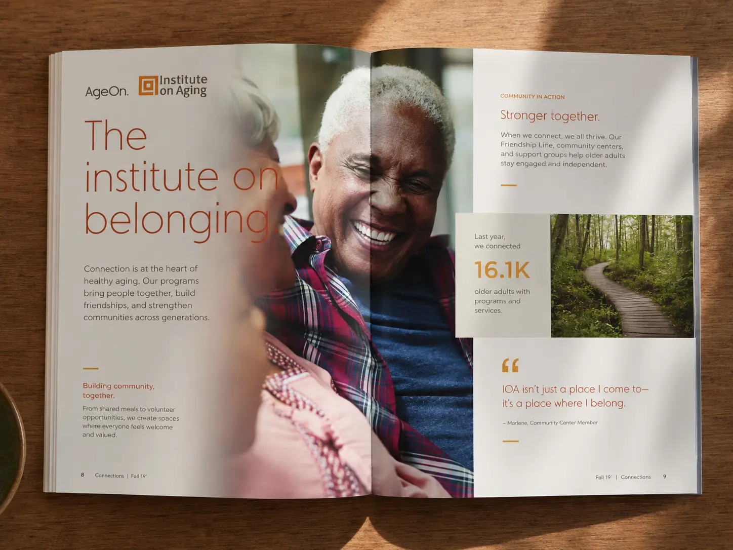
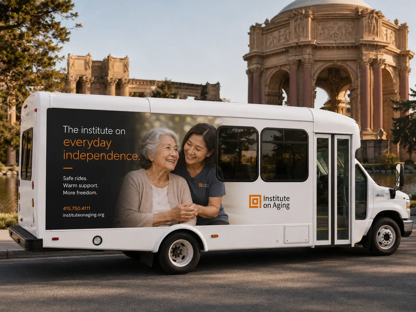
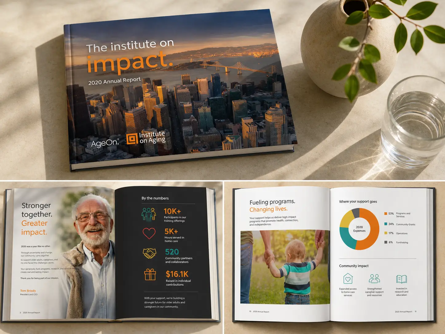
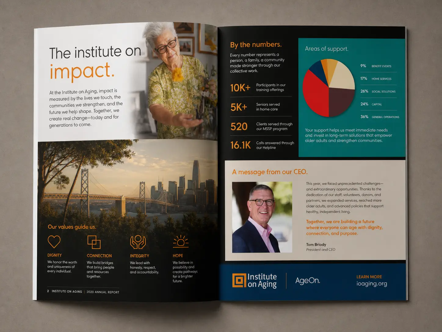
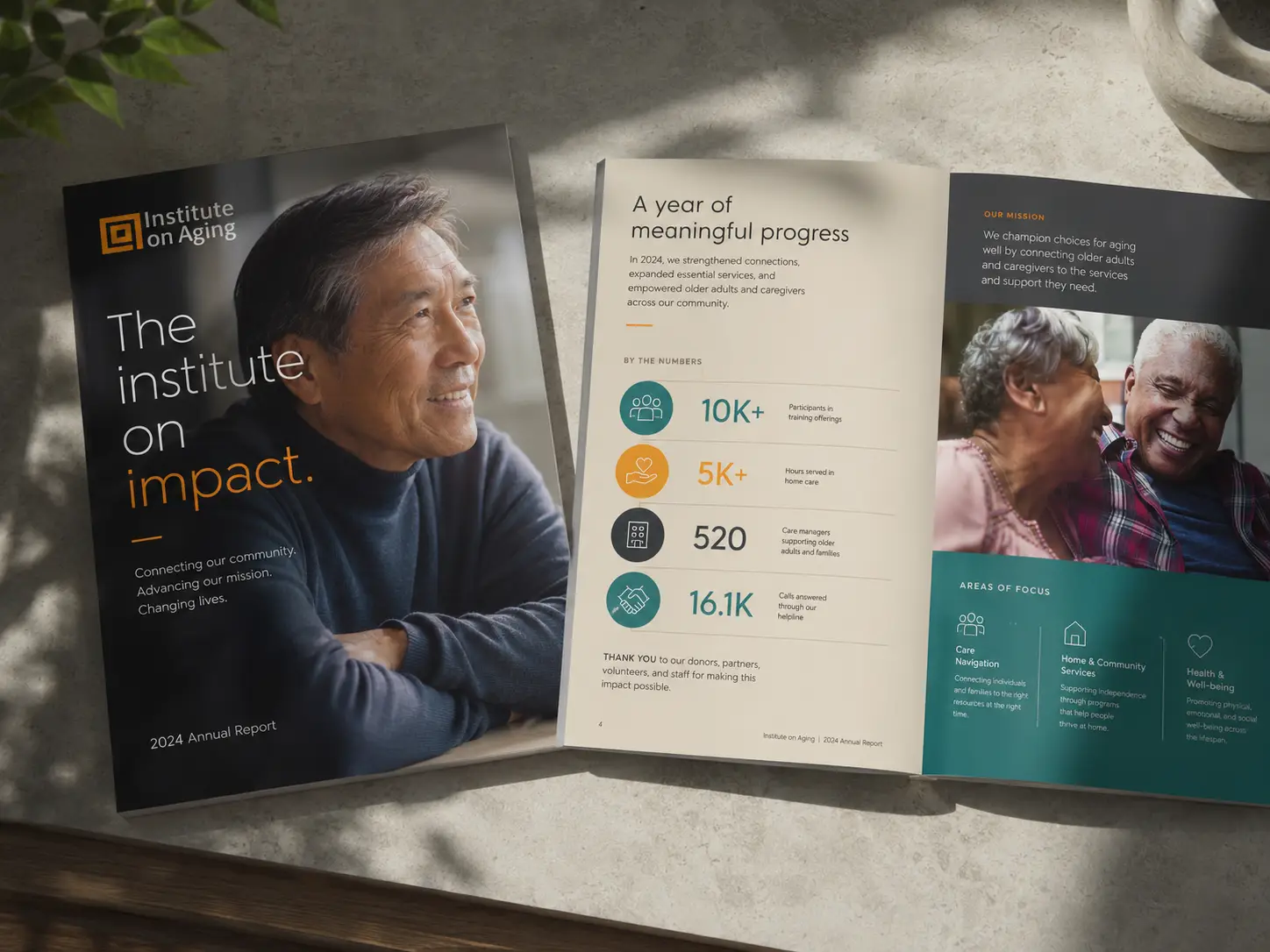
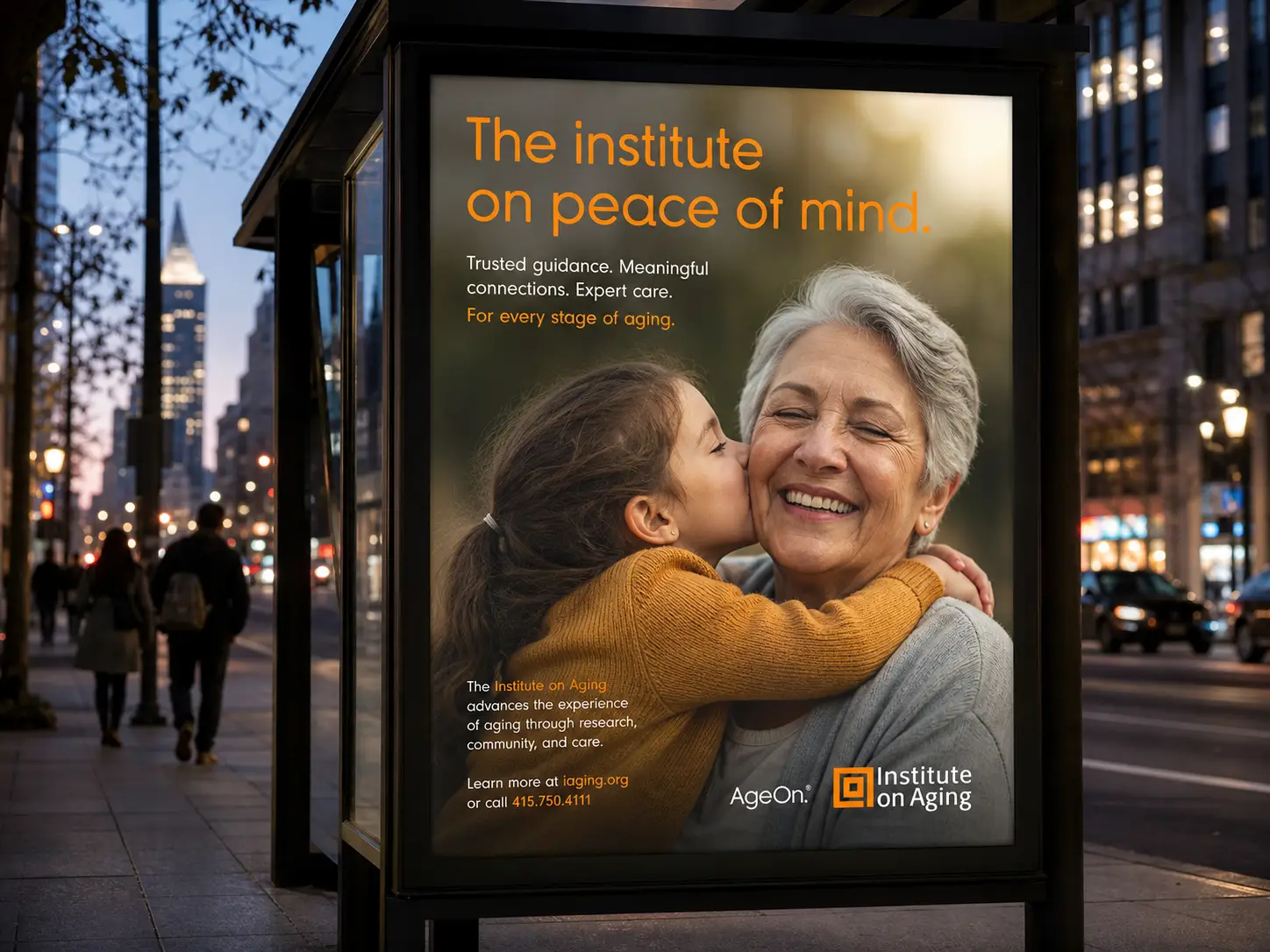
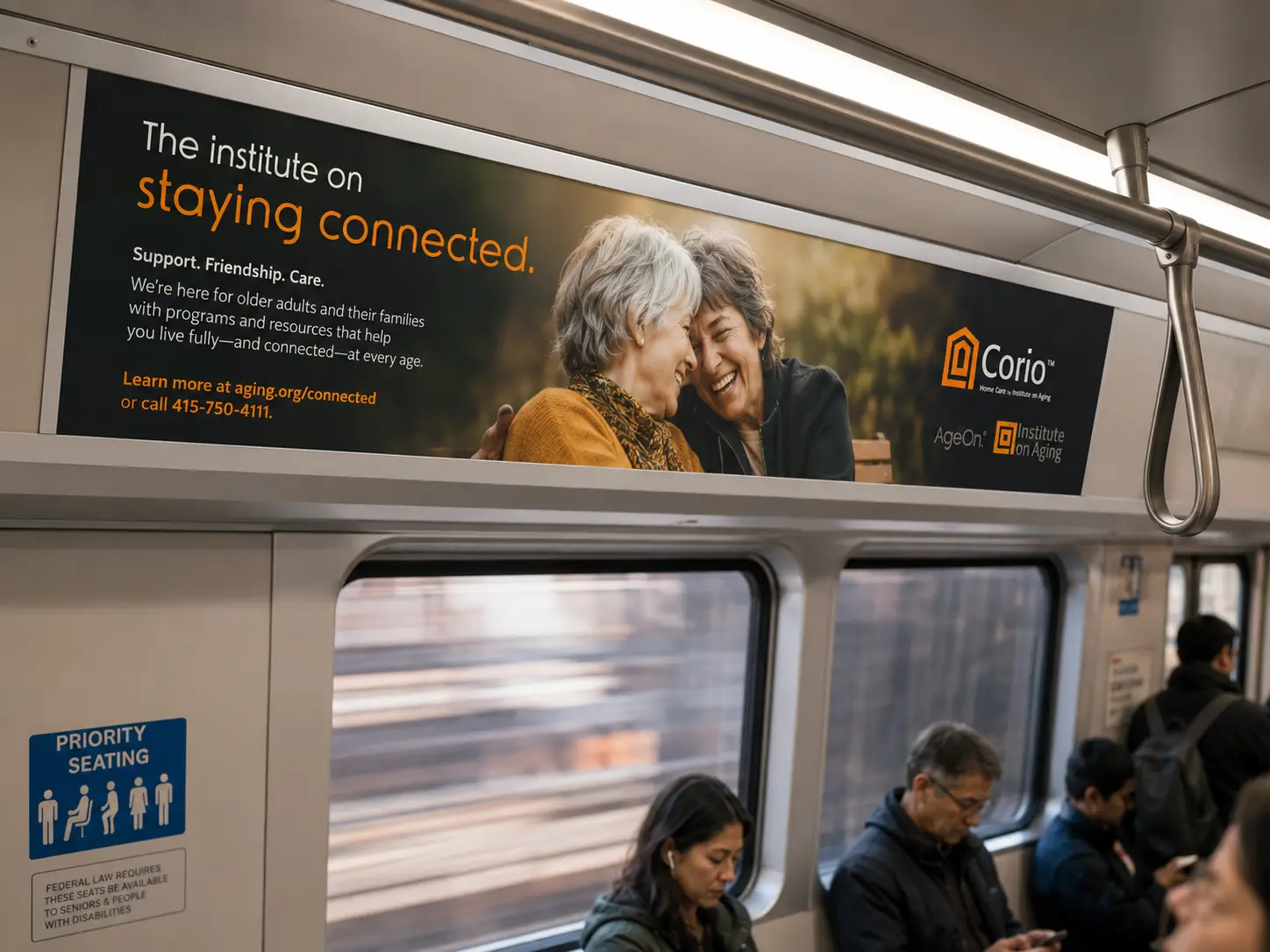
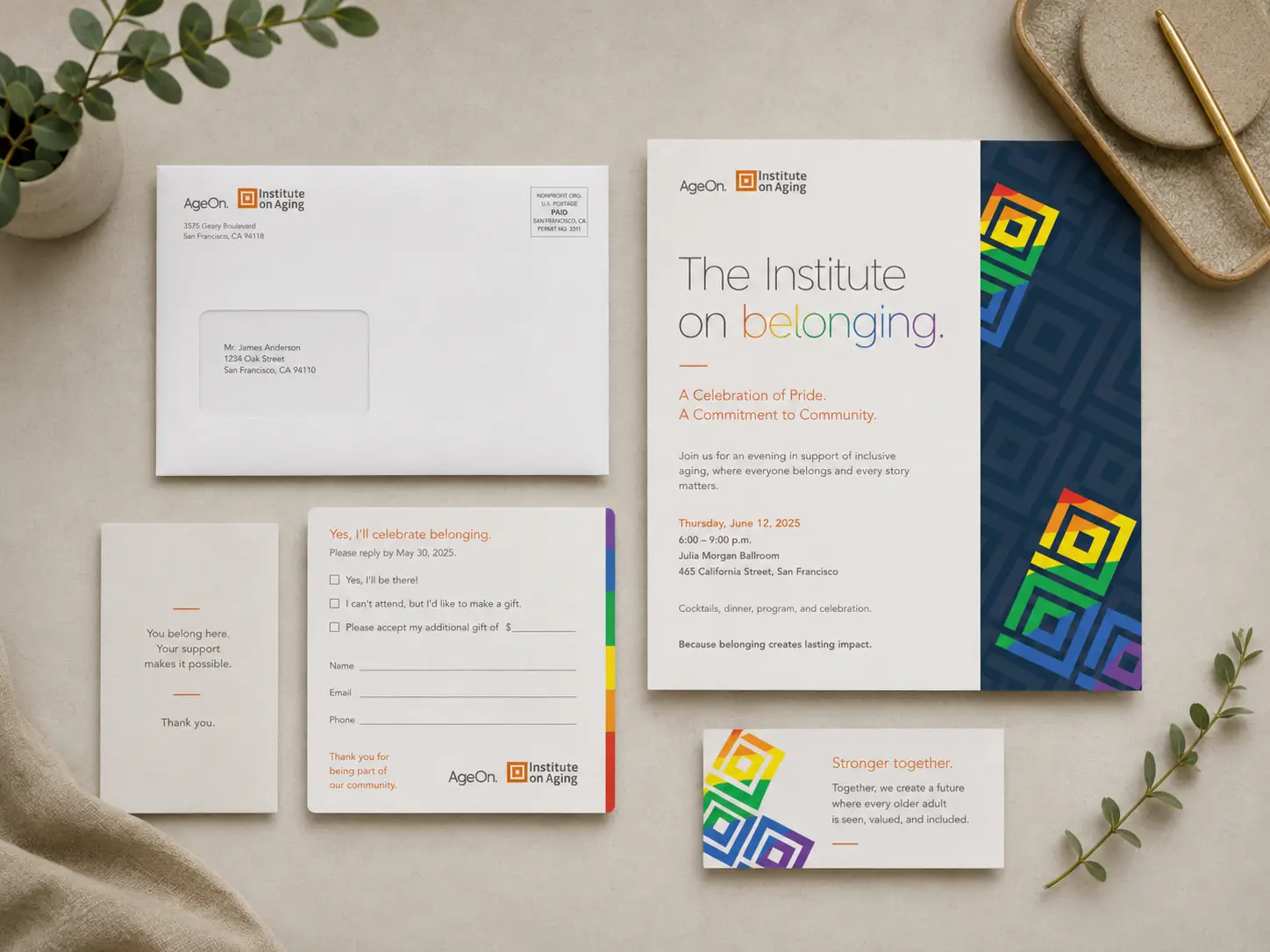
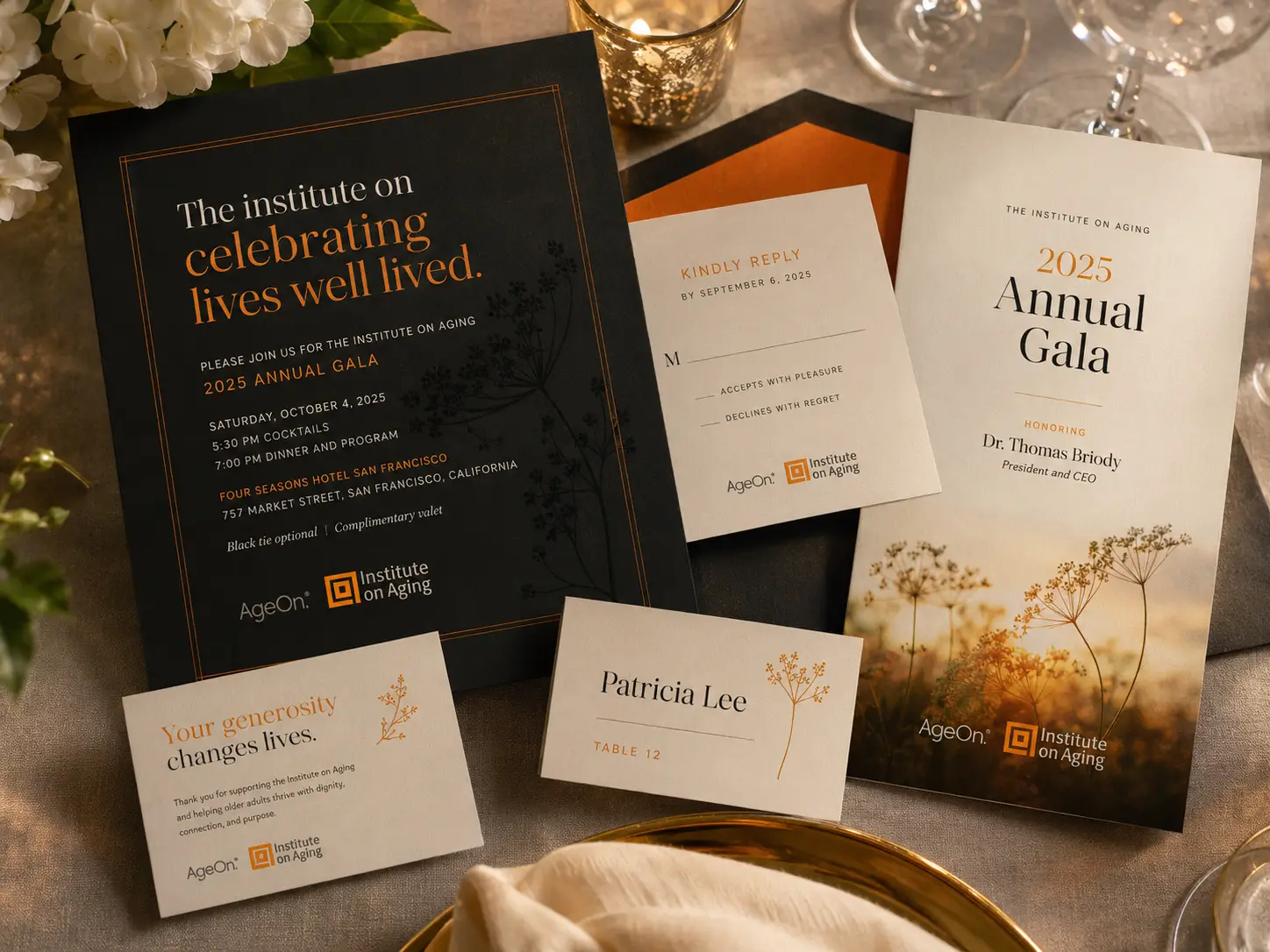
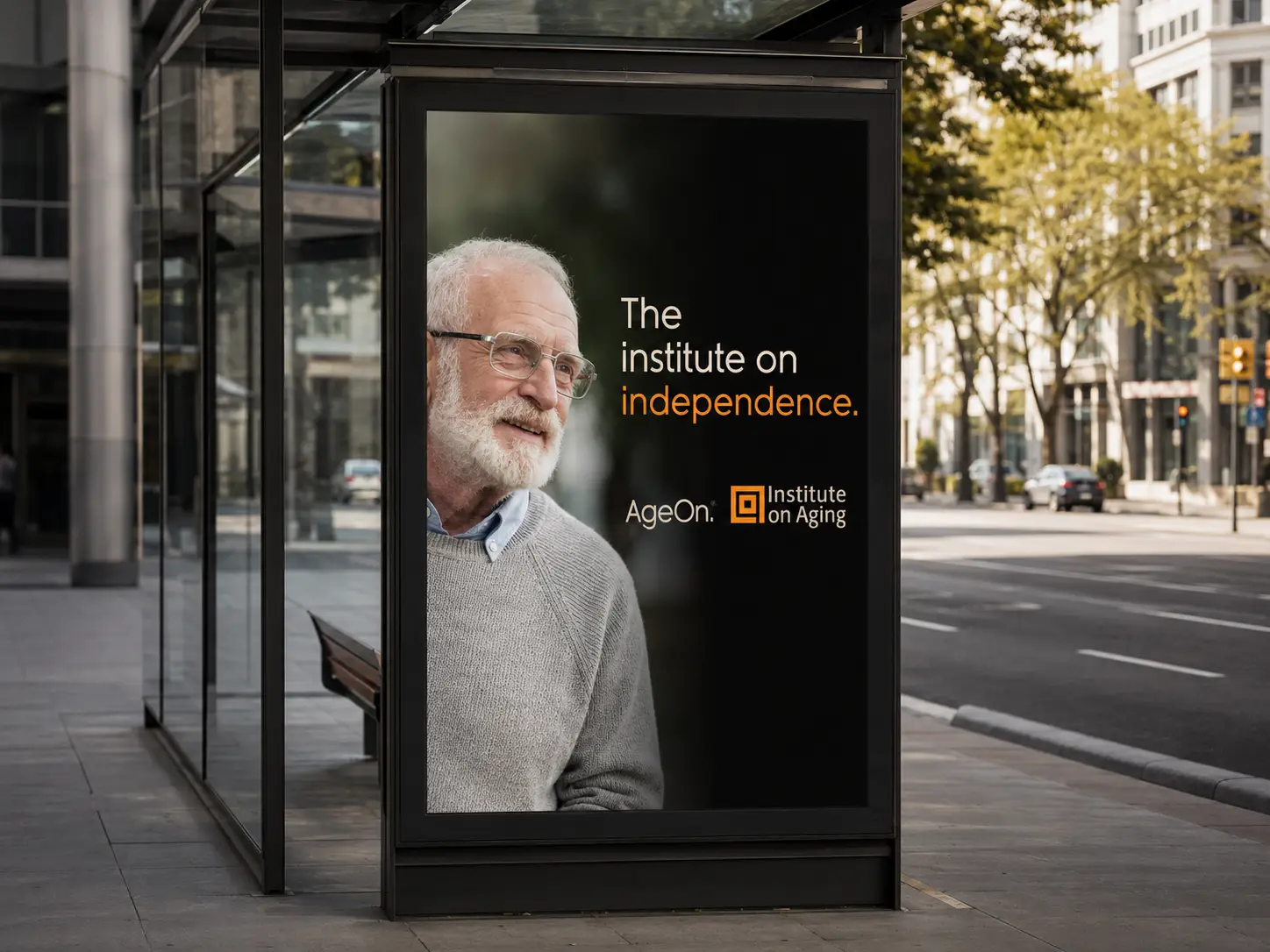
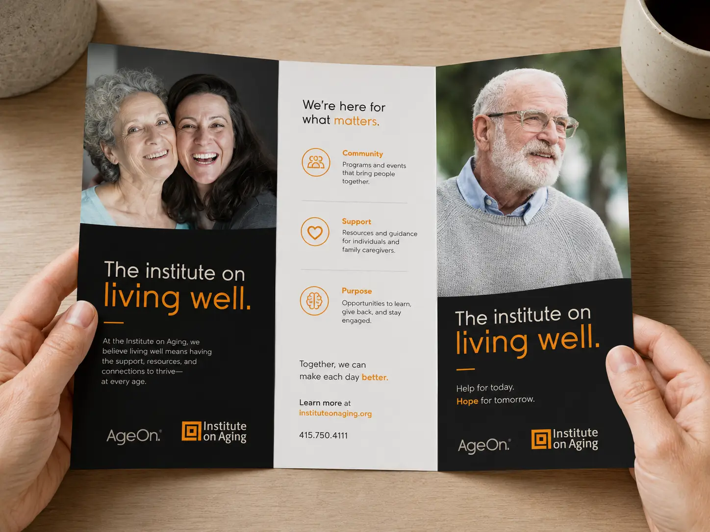
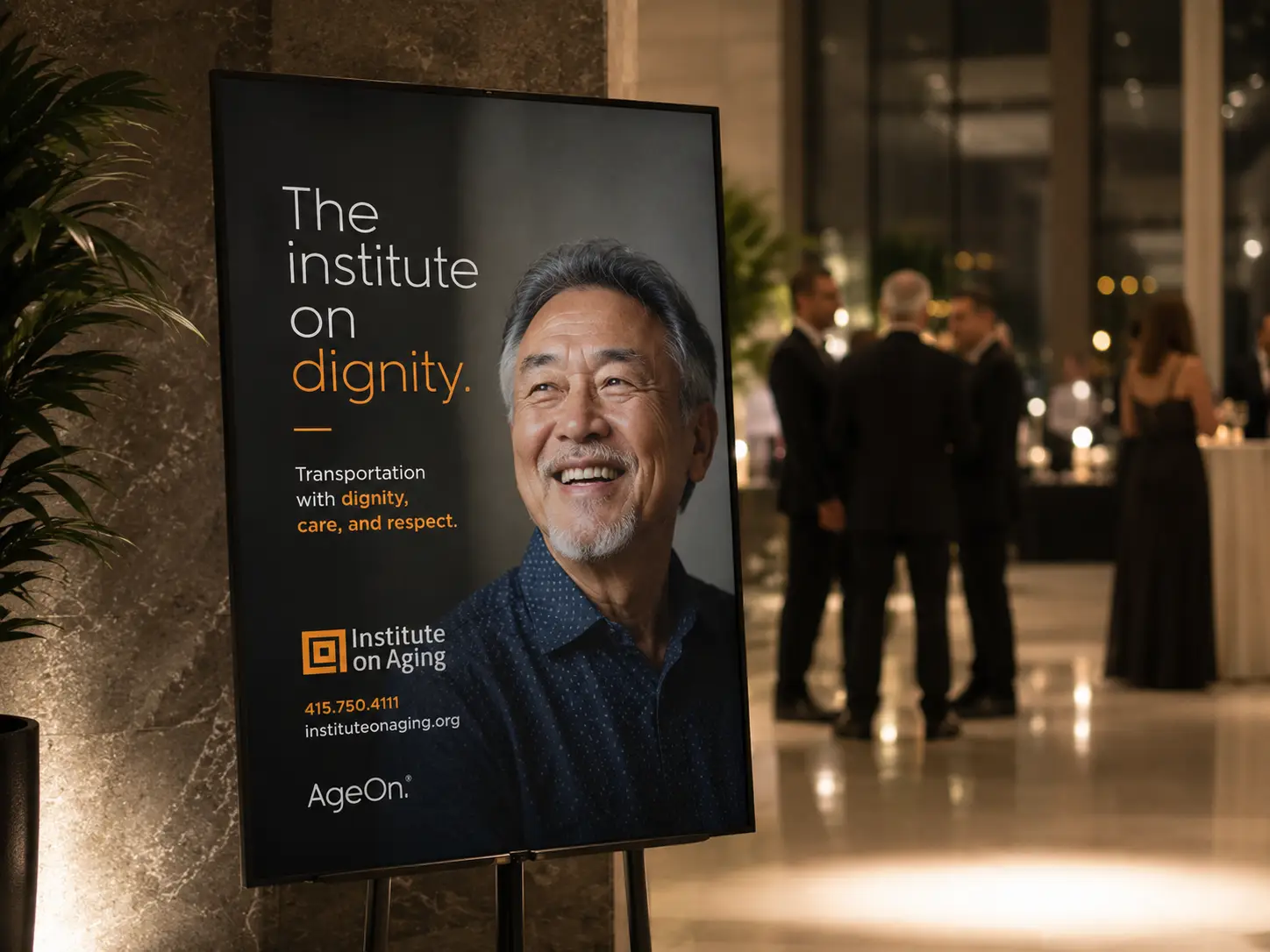
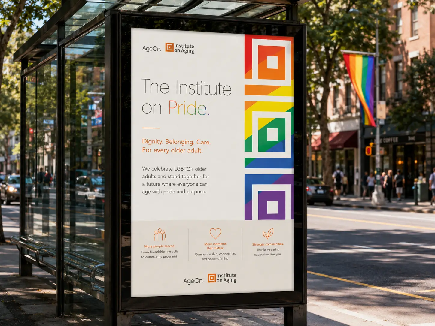
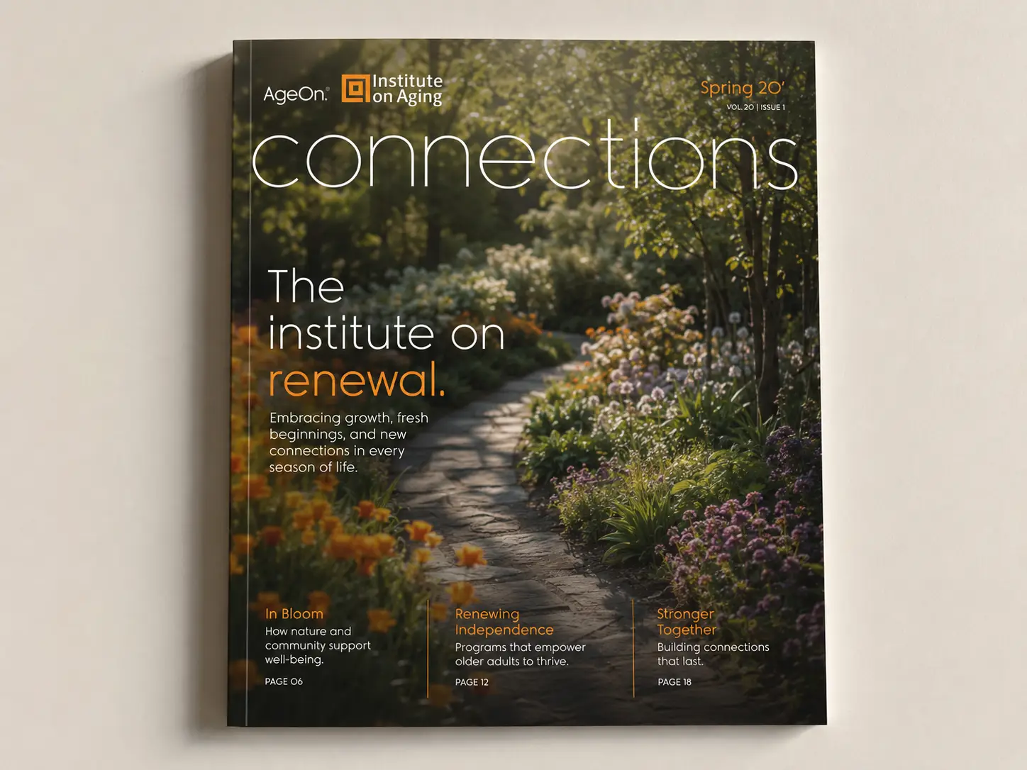
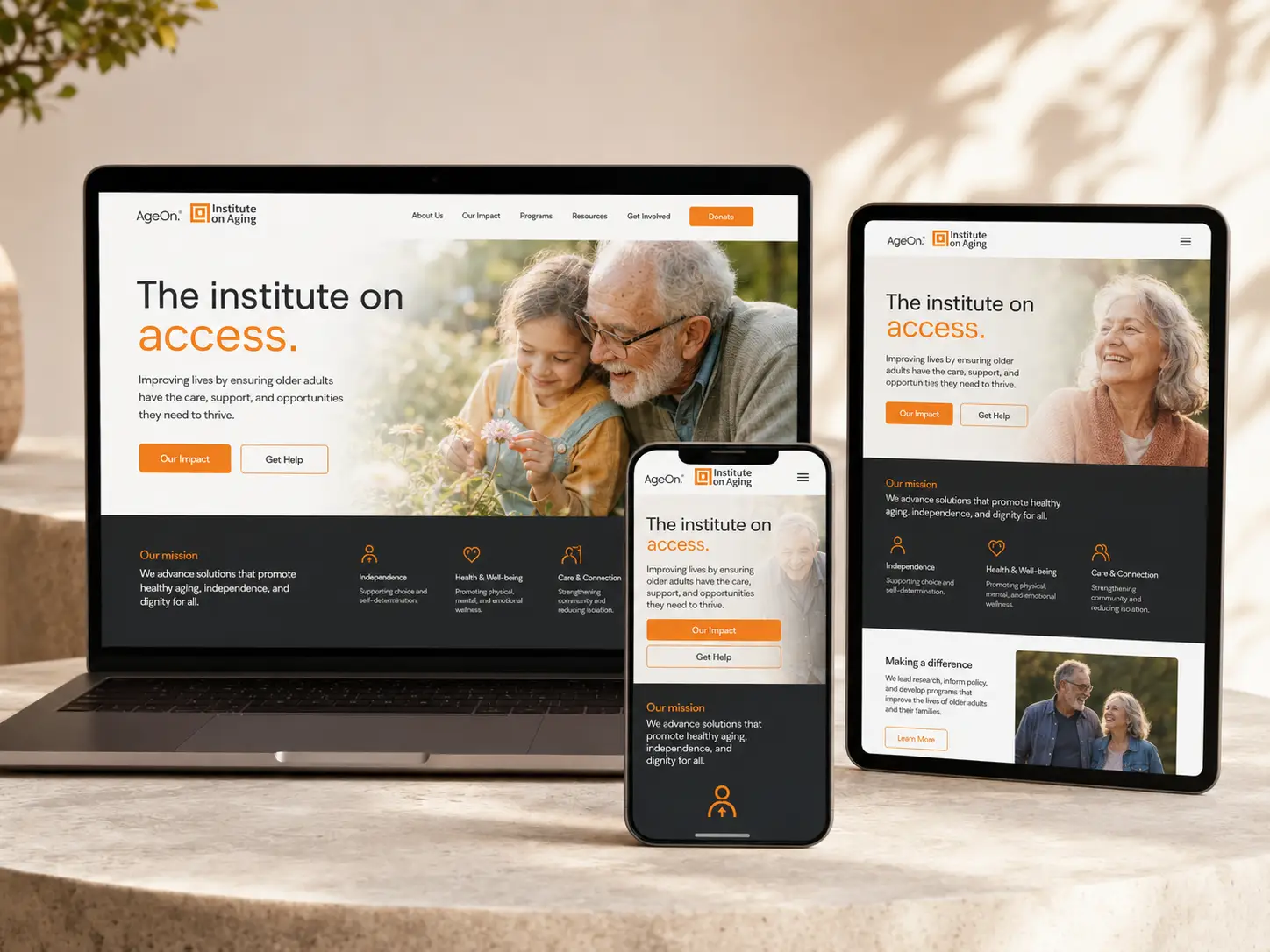
The campaign idea is built right into the headline. The institute on _____. The blank is the whole point. It bends to fit the moment, the audience, and the story being told. The institute on brighter days. The institute on conversations. The institute on seasons of care. The institute on everyday independence. One simple structural device became a flexible language carried across annual reports, the member magazine, direct mail, the shuttle fleet, gala invitations, transit, OOH, and the website. It gives every team across IOA a way to write headlines that all feel like family, without anyone having to file a brand request to do it. The visual system holds it all together: warm cream backgrounds, real candid photography of real older adults, an unmistakable orange that signals optimism without ever tipping into cheerful, and the square mark that quietly frames every page.
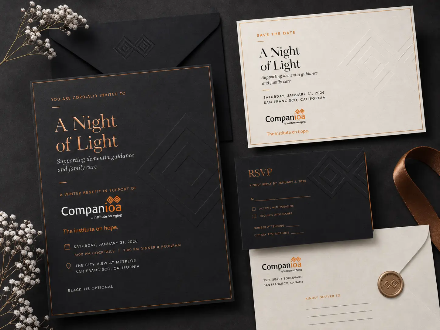
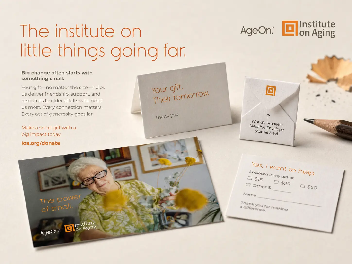
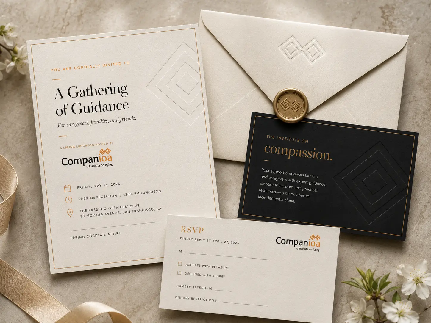
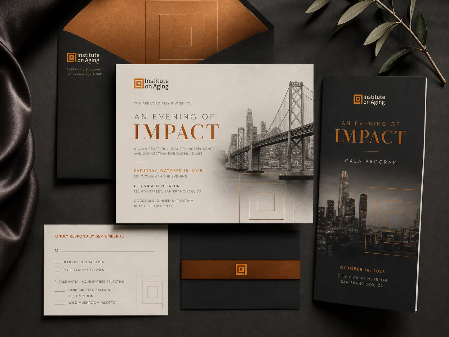
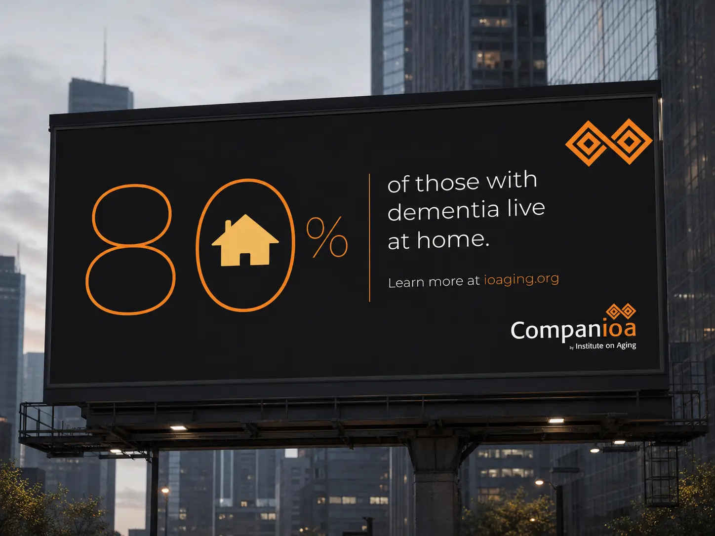
The Institute’s work shows up in a lot of different forms (companionship visits, caregiver support, dementia care, transportation, fundraising galas, Pride celebrations) and the system was built to give each of those programs its own clear identity without ever breaking the parent brand. CompanIOA carries the gatherings: A Night of Light, A Gathering of Guidance, the annual Evening of Impact. AgeOn® sits alongside the Institute as the umbrella expression of the work. The stewardship materials lean into the small, intimate moments that make generosity feel personal: a tiny envelope (literally the world’s smallest mailable size), a handwritten thank-you, a single line about the power of small. Big change often starts with something small. Giving in this world isn’t transactional. It’s a relationship, and every piece of stewardship the Institute sends out reads like one.
