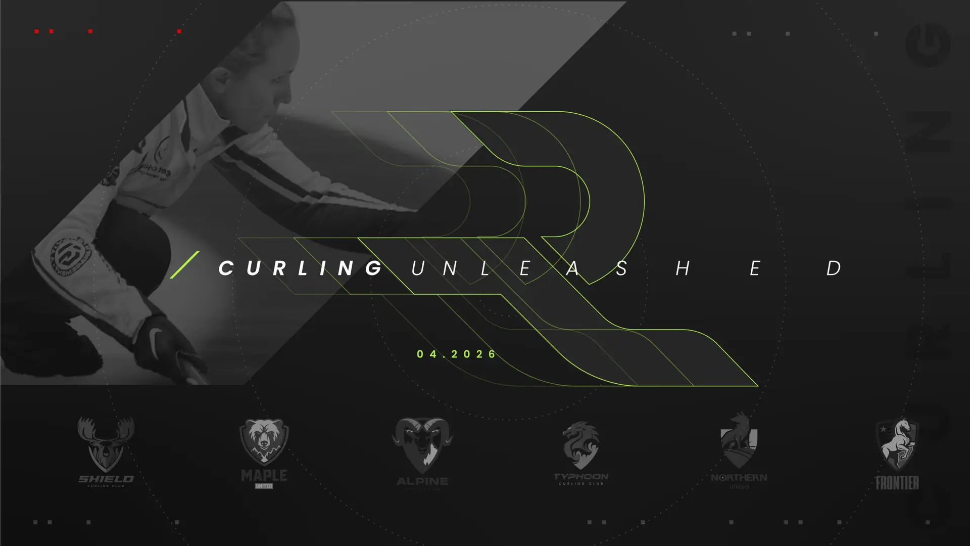
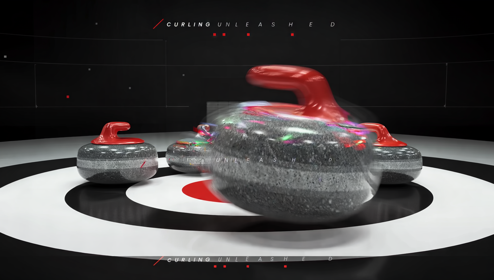
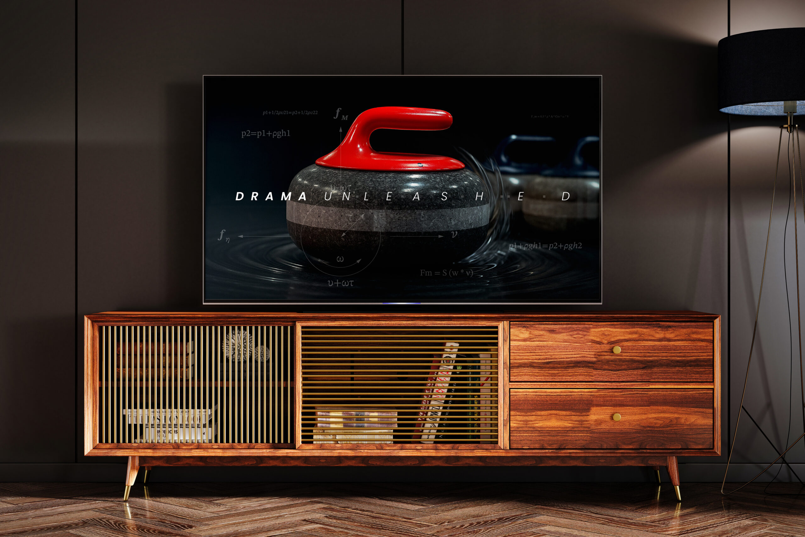
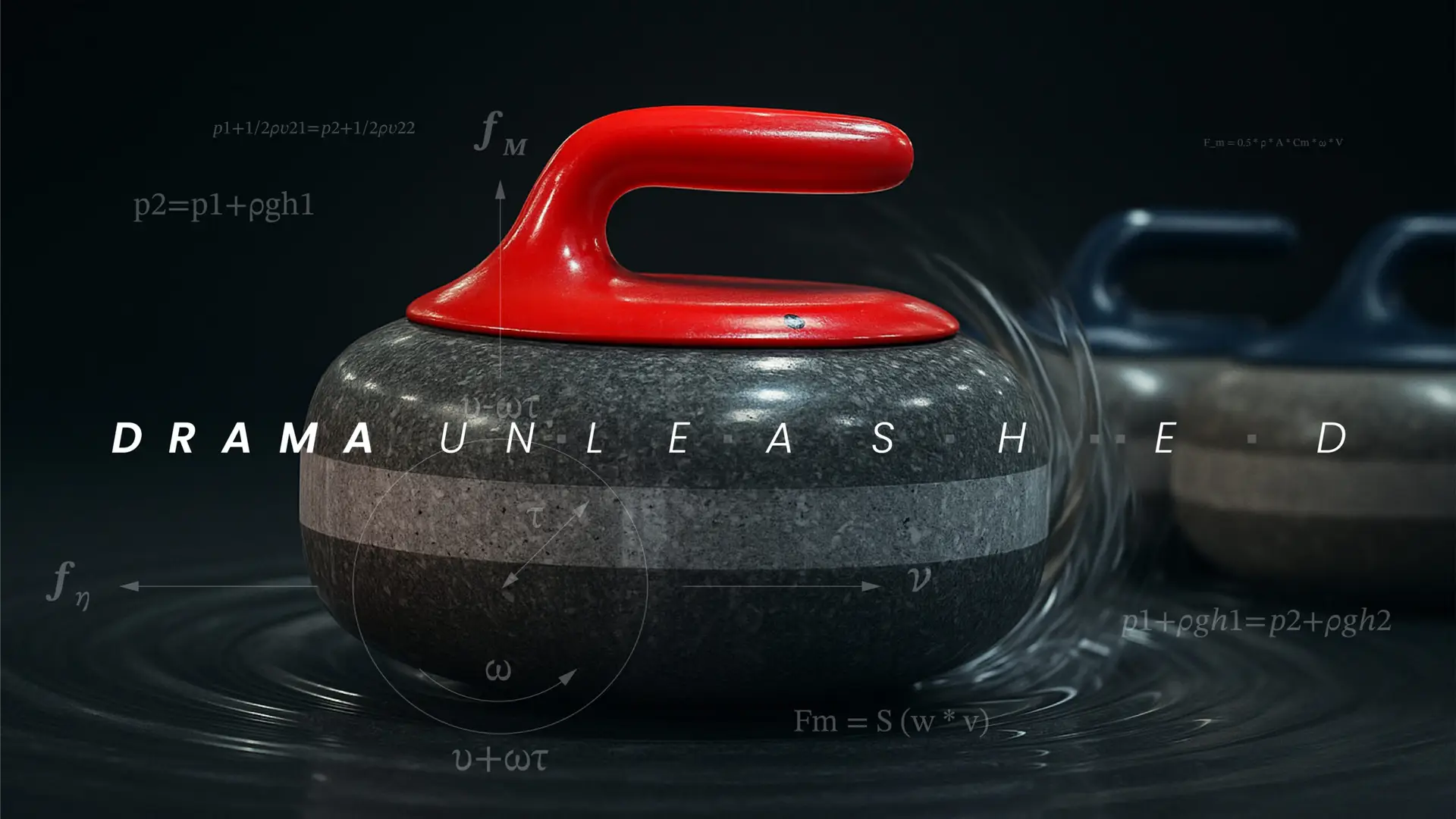
It’s not often you get tasked with helping to launch a new professional sports league. When our partners at The Curling Group came to us with their bold vision of creating the world’s first mixed gender professional curling league, it was the creative equivalent of being handed the keys to a Lambo with a full tank. We got to work creating a name, logo mark, brand positioning, and unified design system that could work well globally across different curling audiences. The following elements represent a sampling of all the ways we’ve been tasked to bring the league to life.
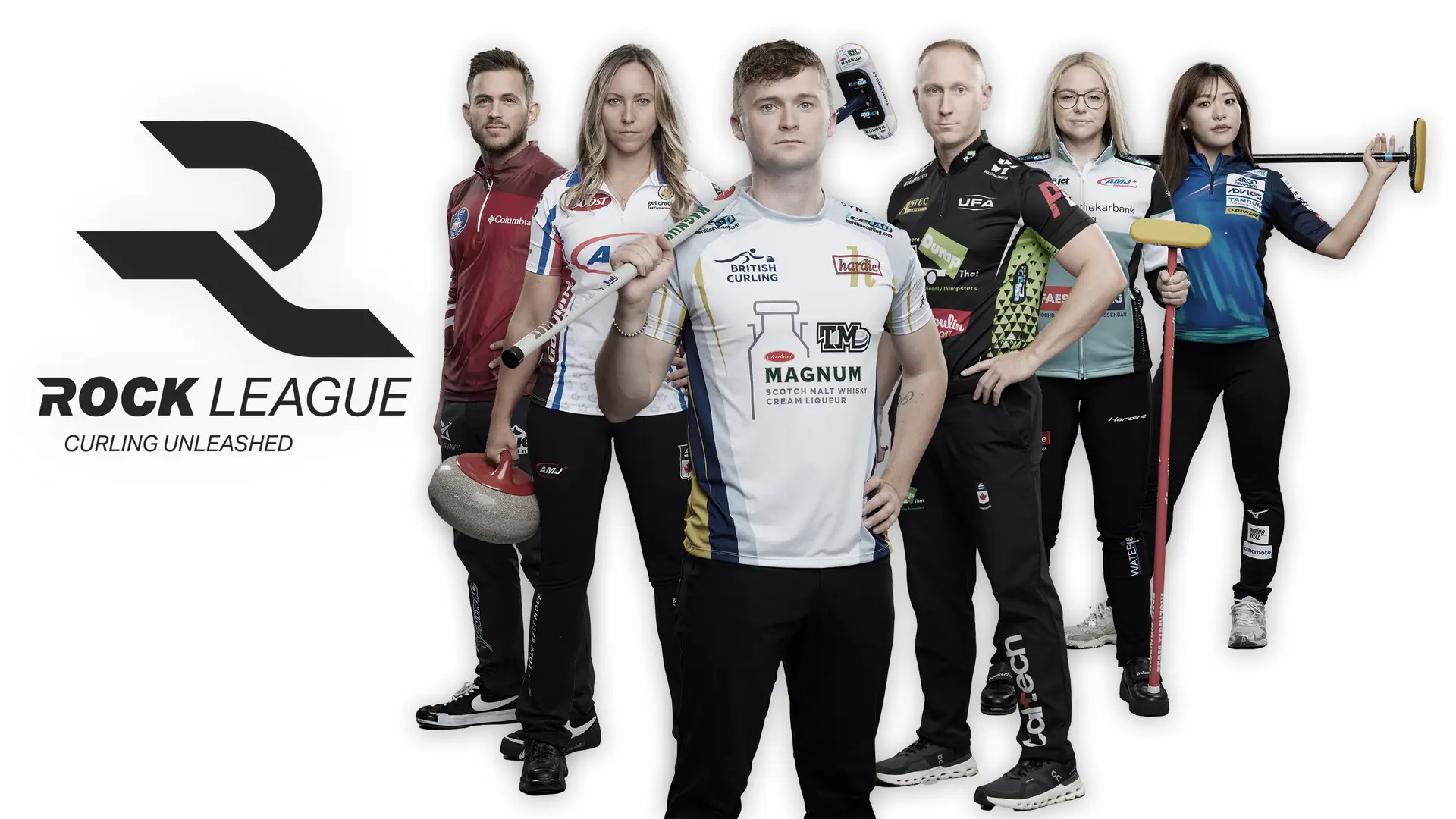
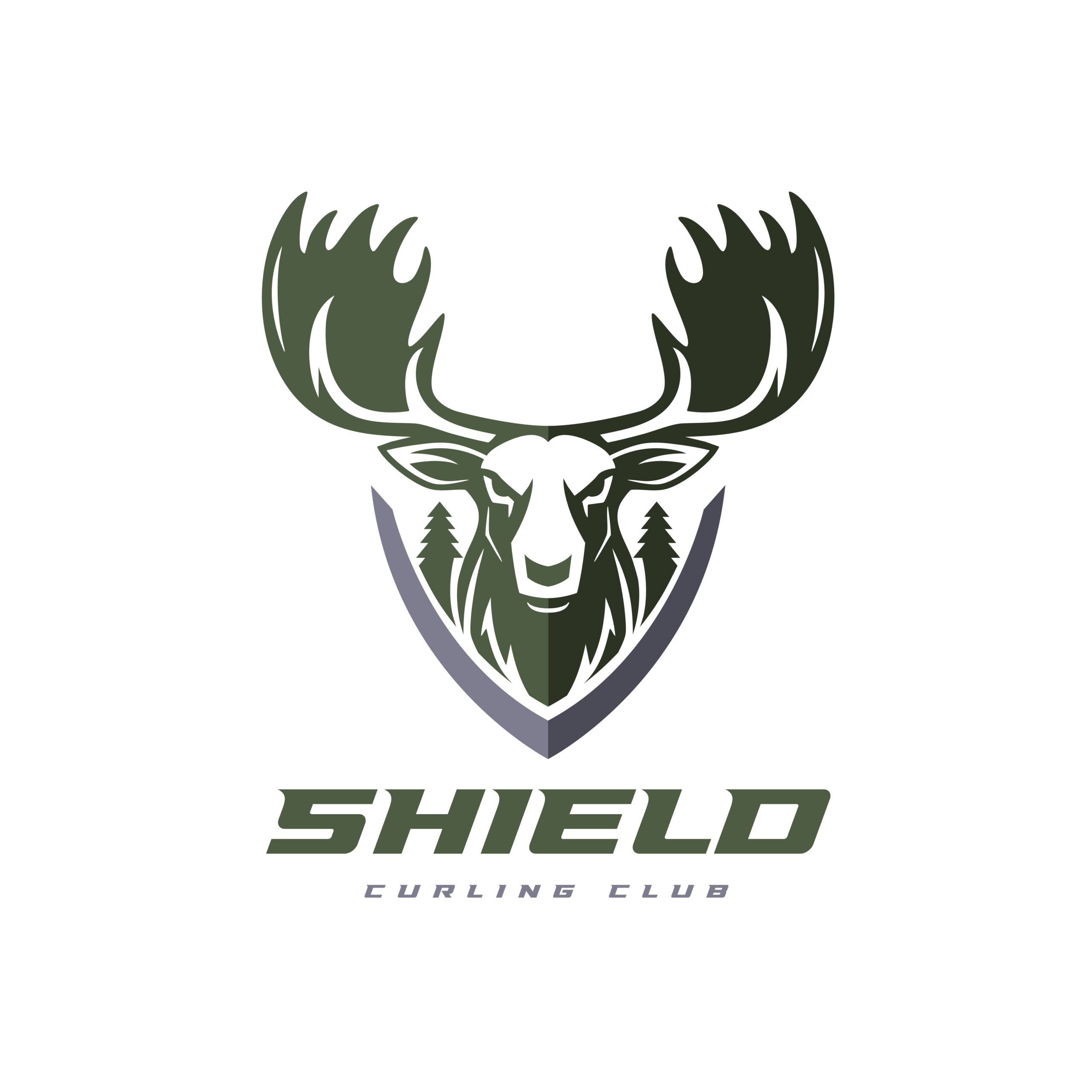
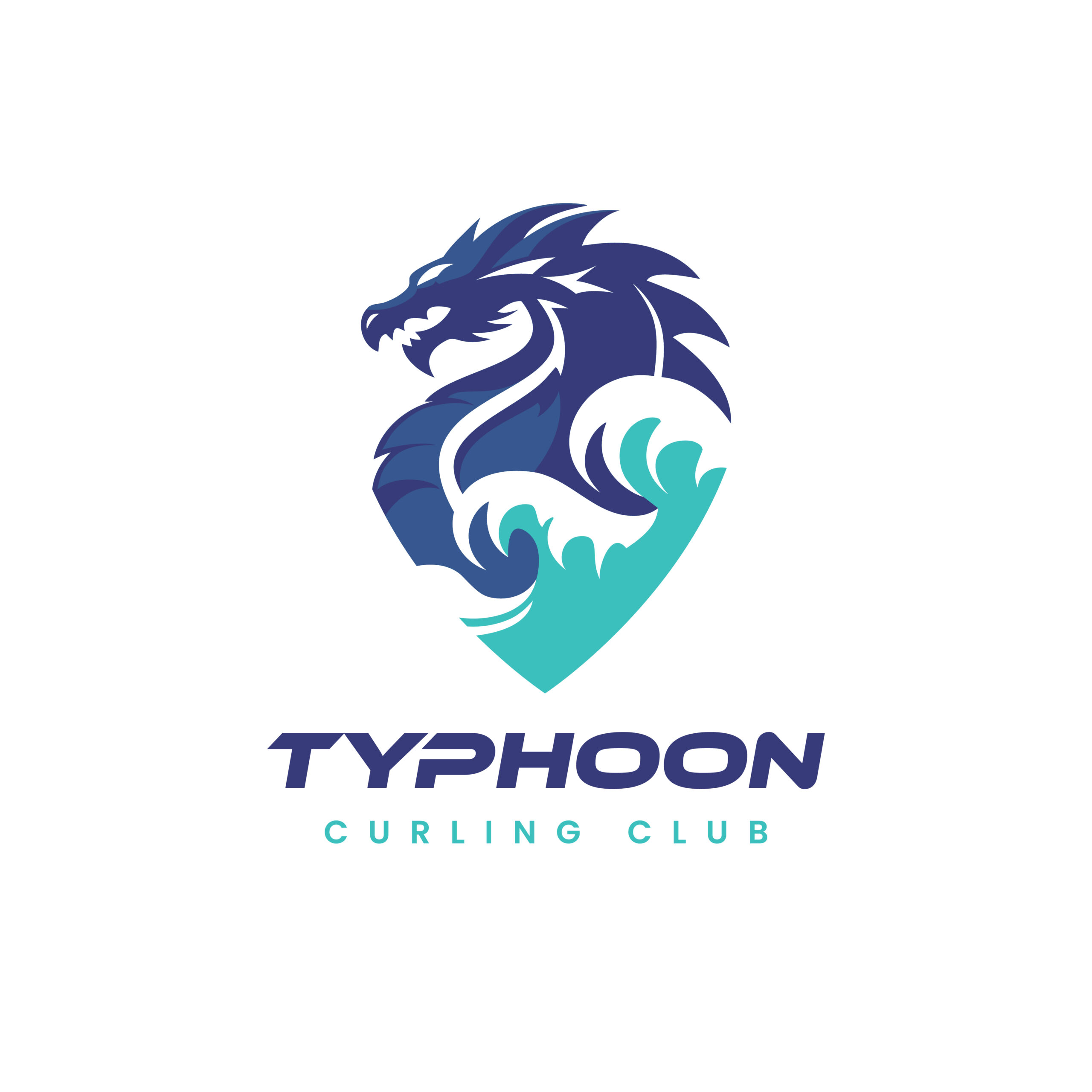
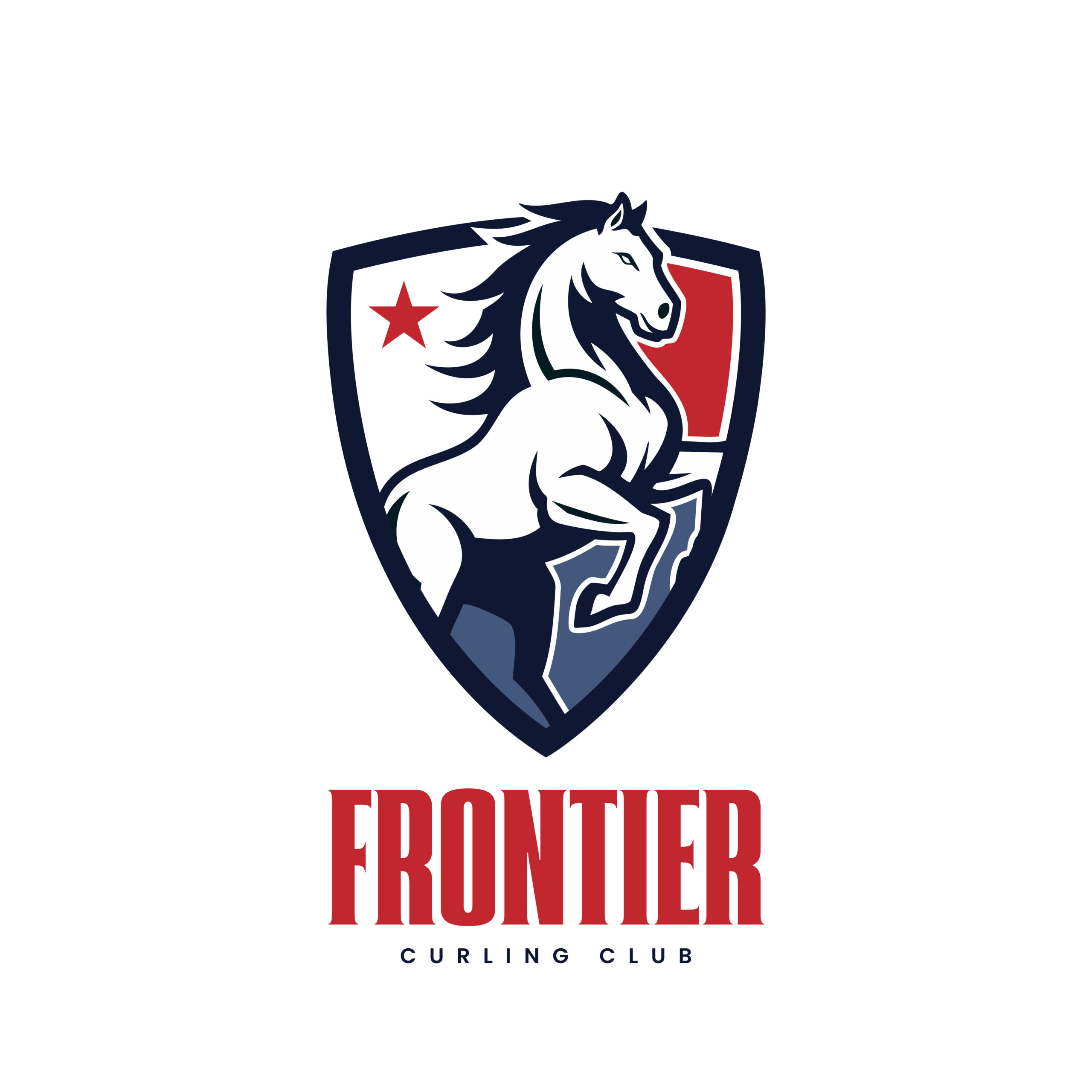
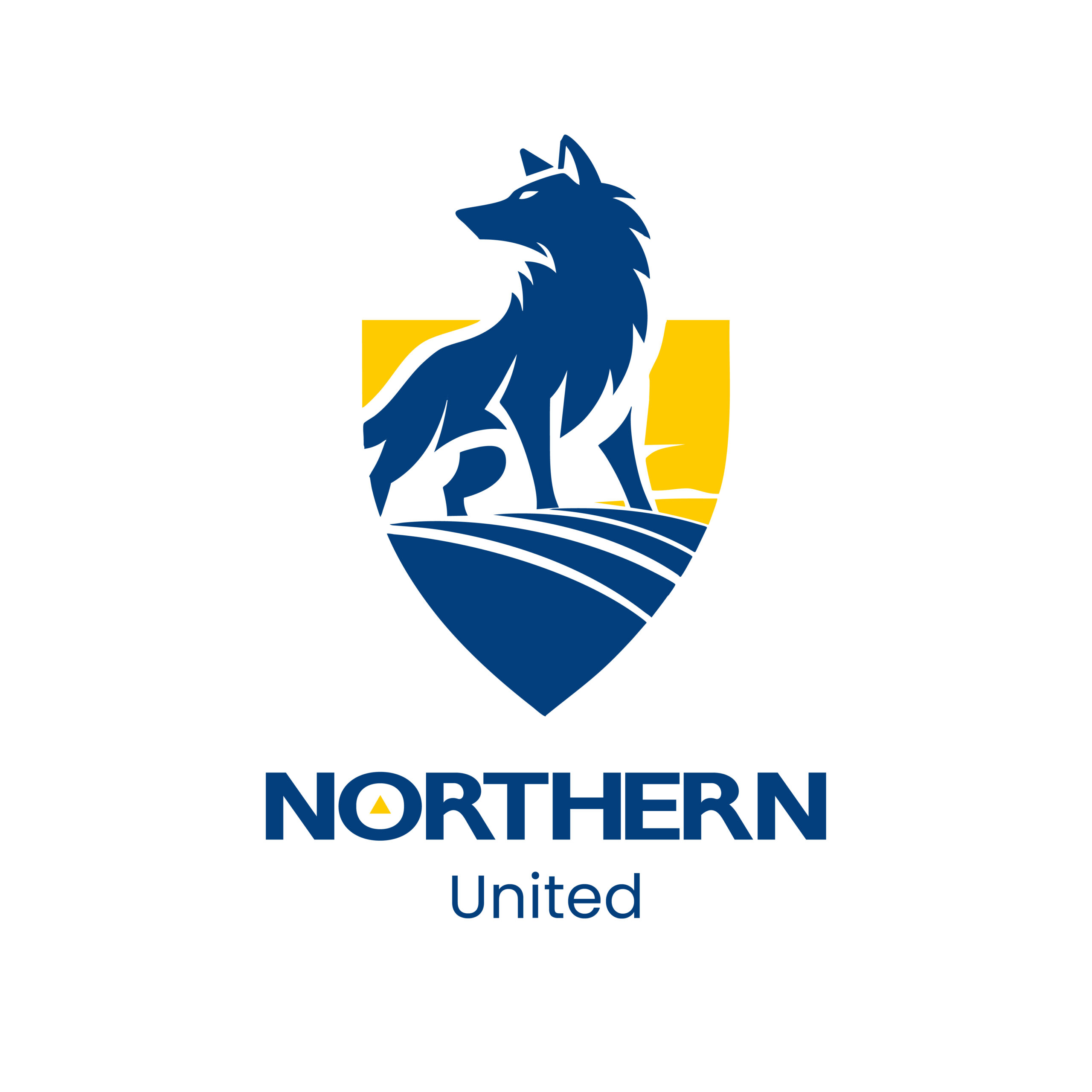
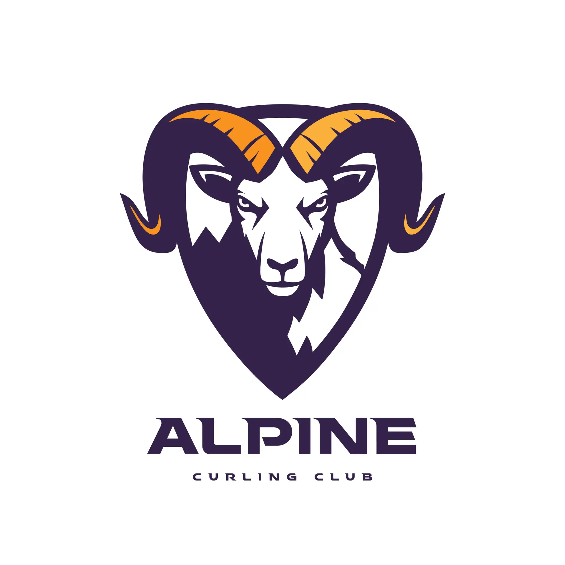
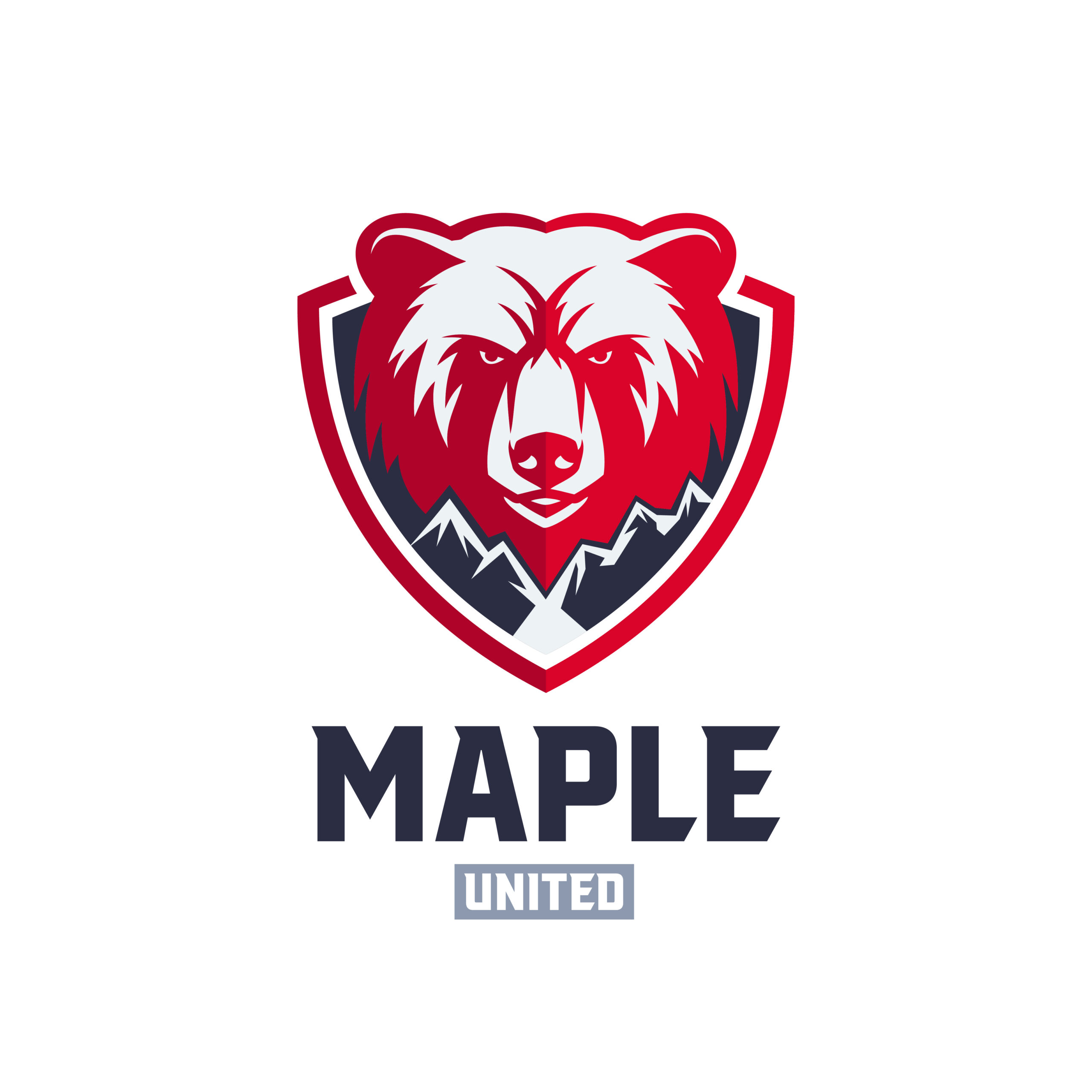
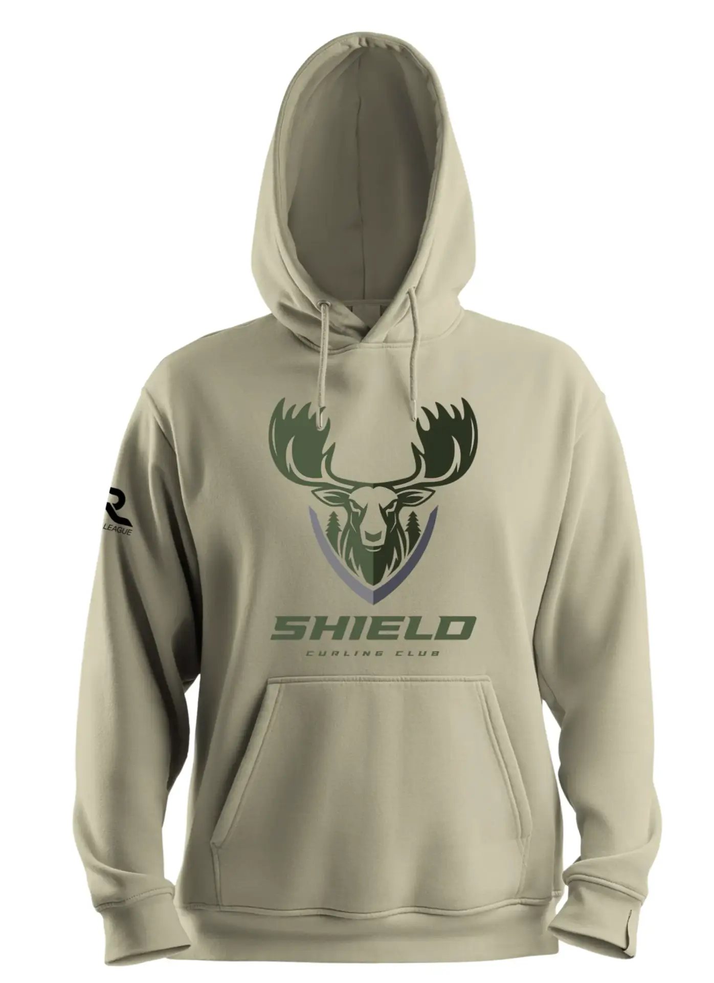
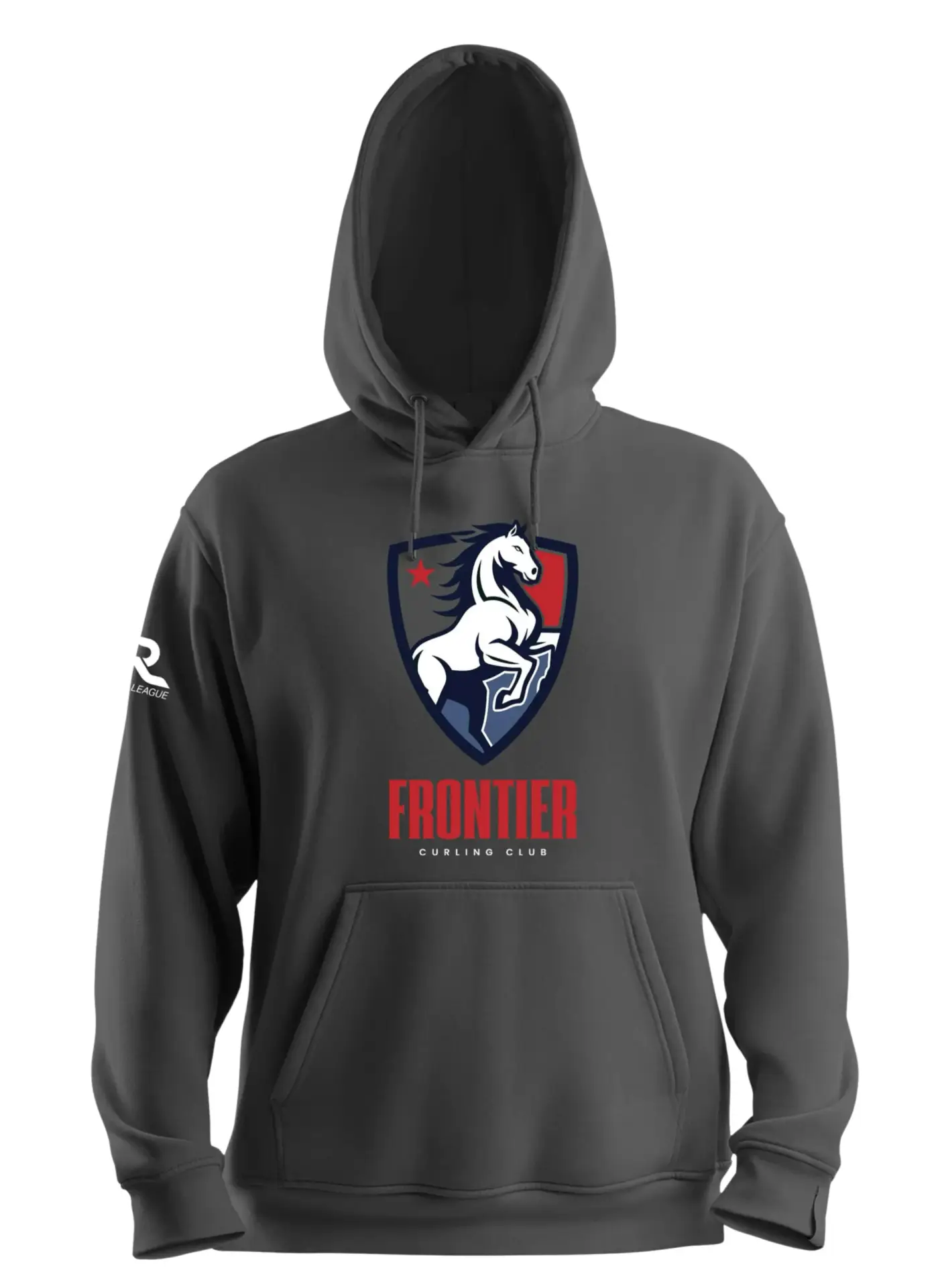
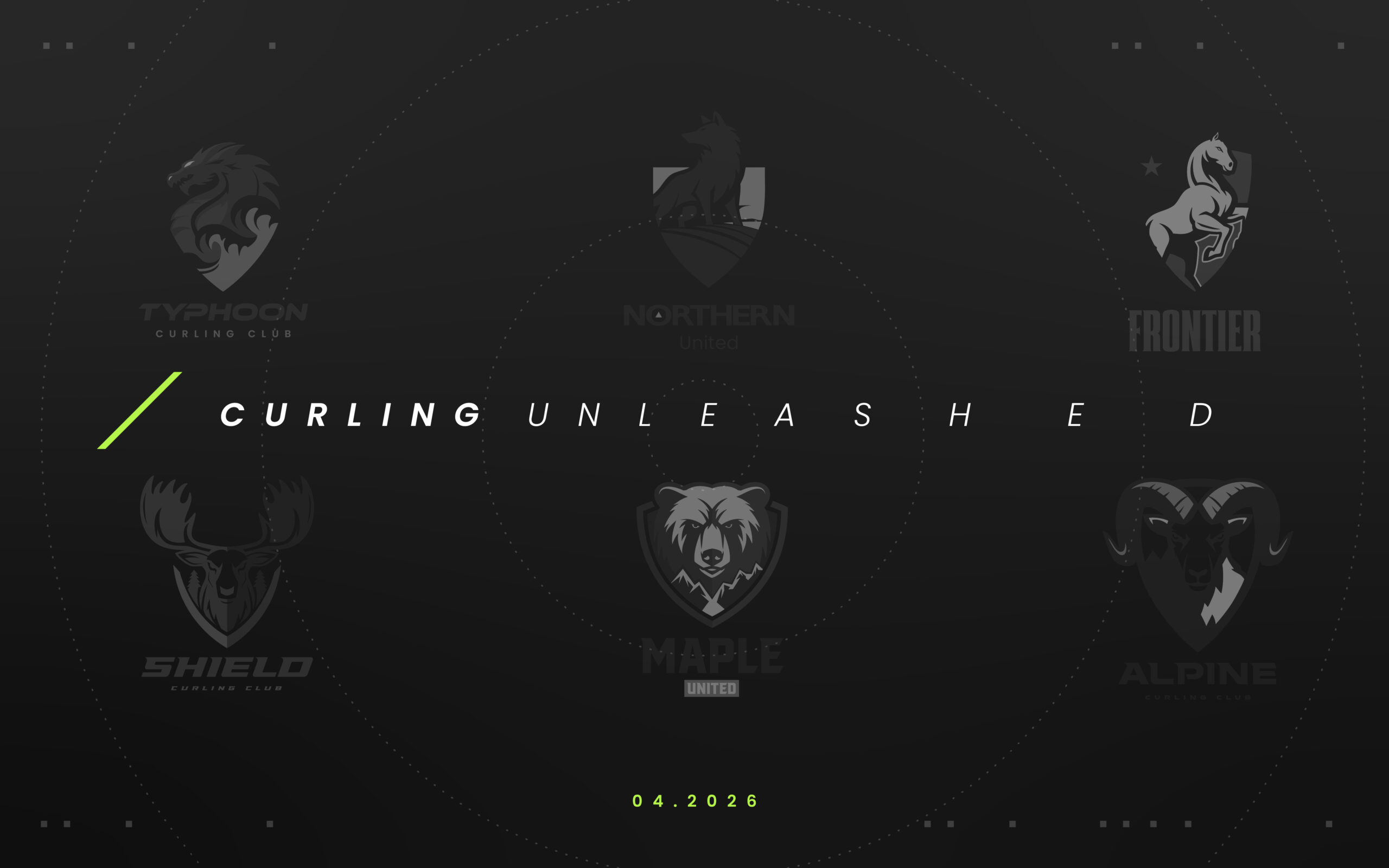
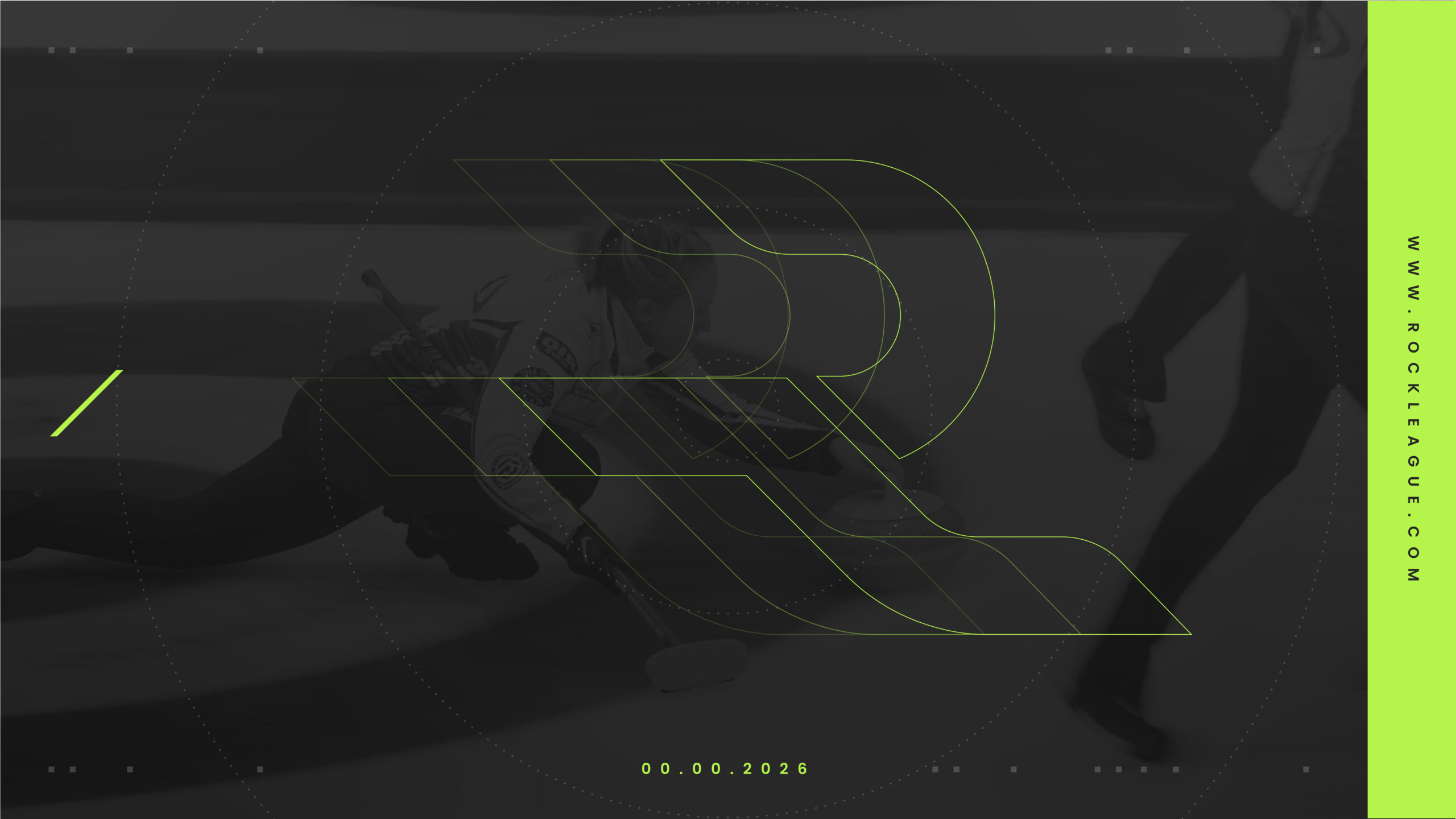
We designed the identity for each of the initial 6 teams. Every team has an icon that is culturally relevant to the region the team exists in. All the names and logomarks evoke energy which is important for a league called Rock League as if they were more staid/classic FC logos they might feel less exciting. The names are easy to transcreate in different languages. Because Rock League is global, this is very important as meaning can get lost in things like colloquialisms.
Rock League Captains Promo :30
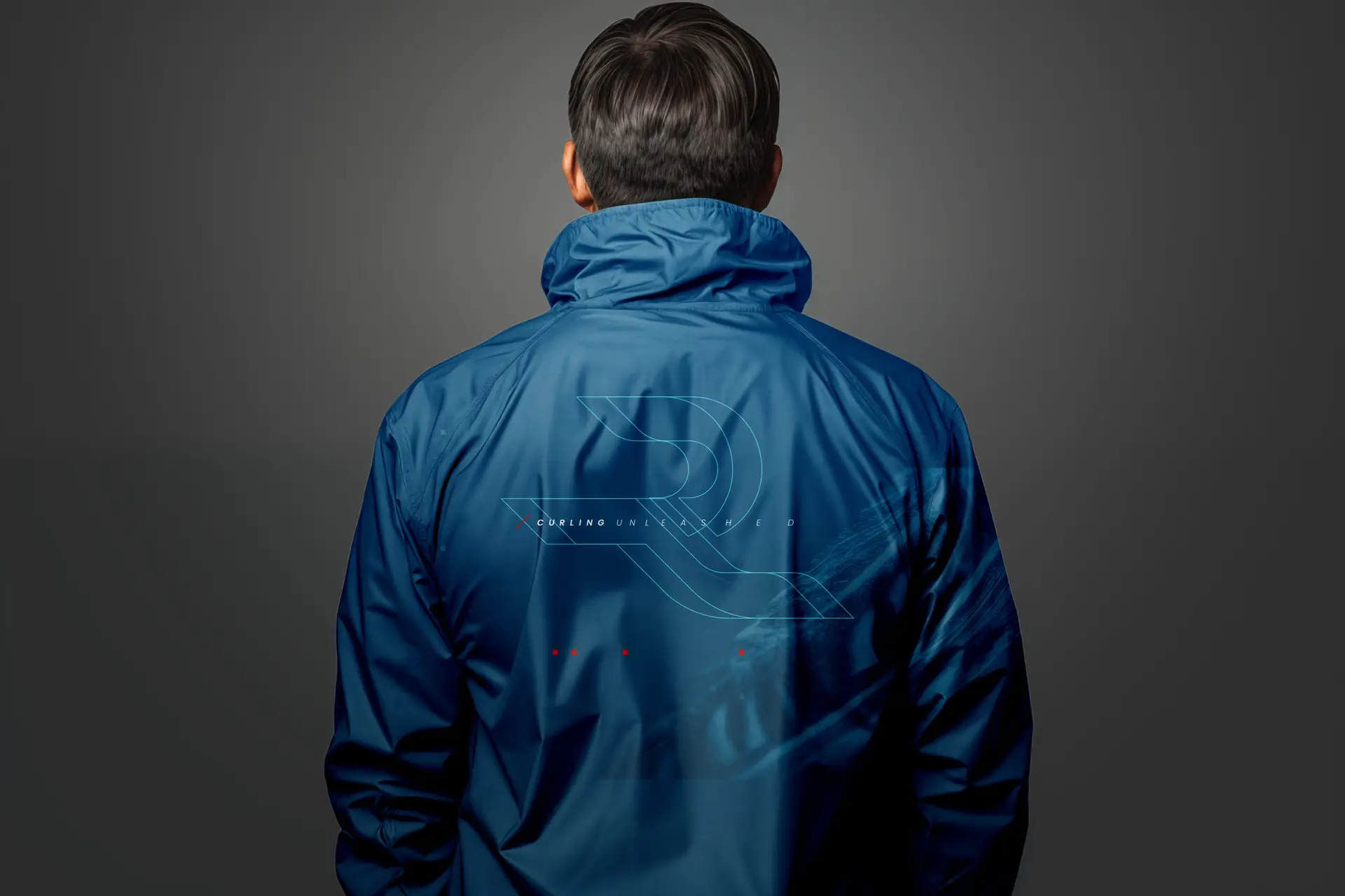
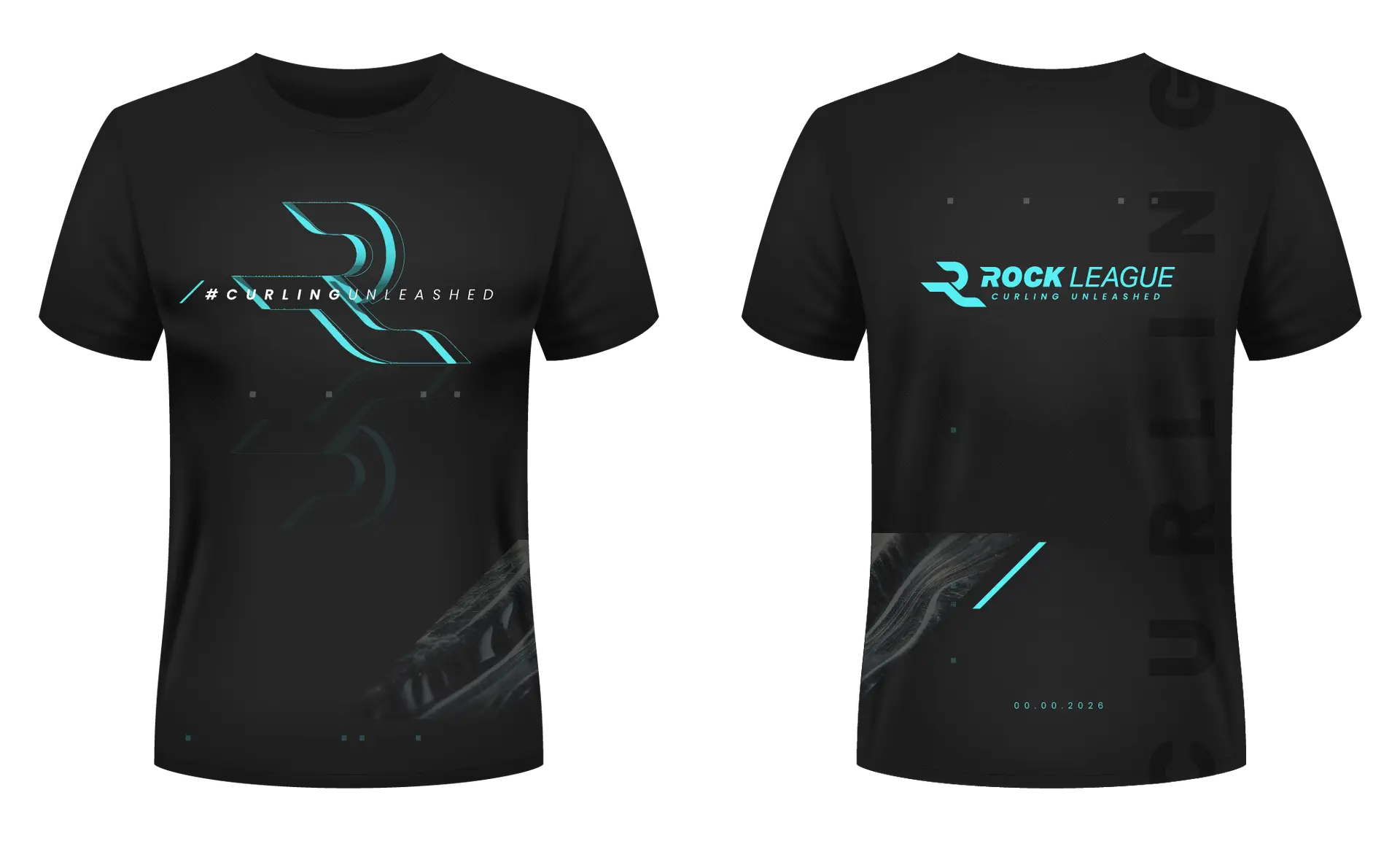
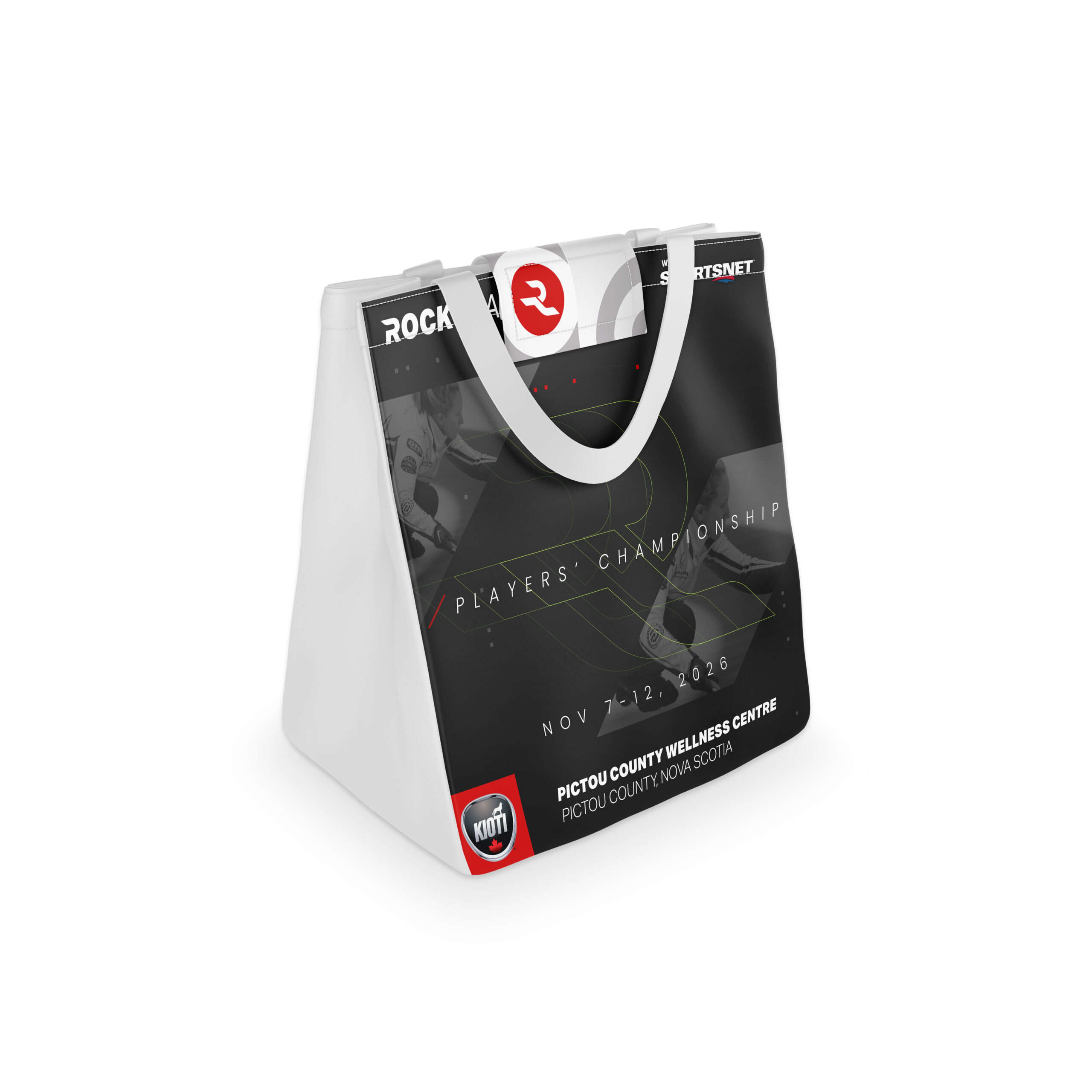
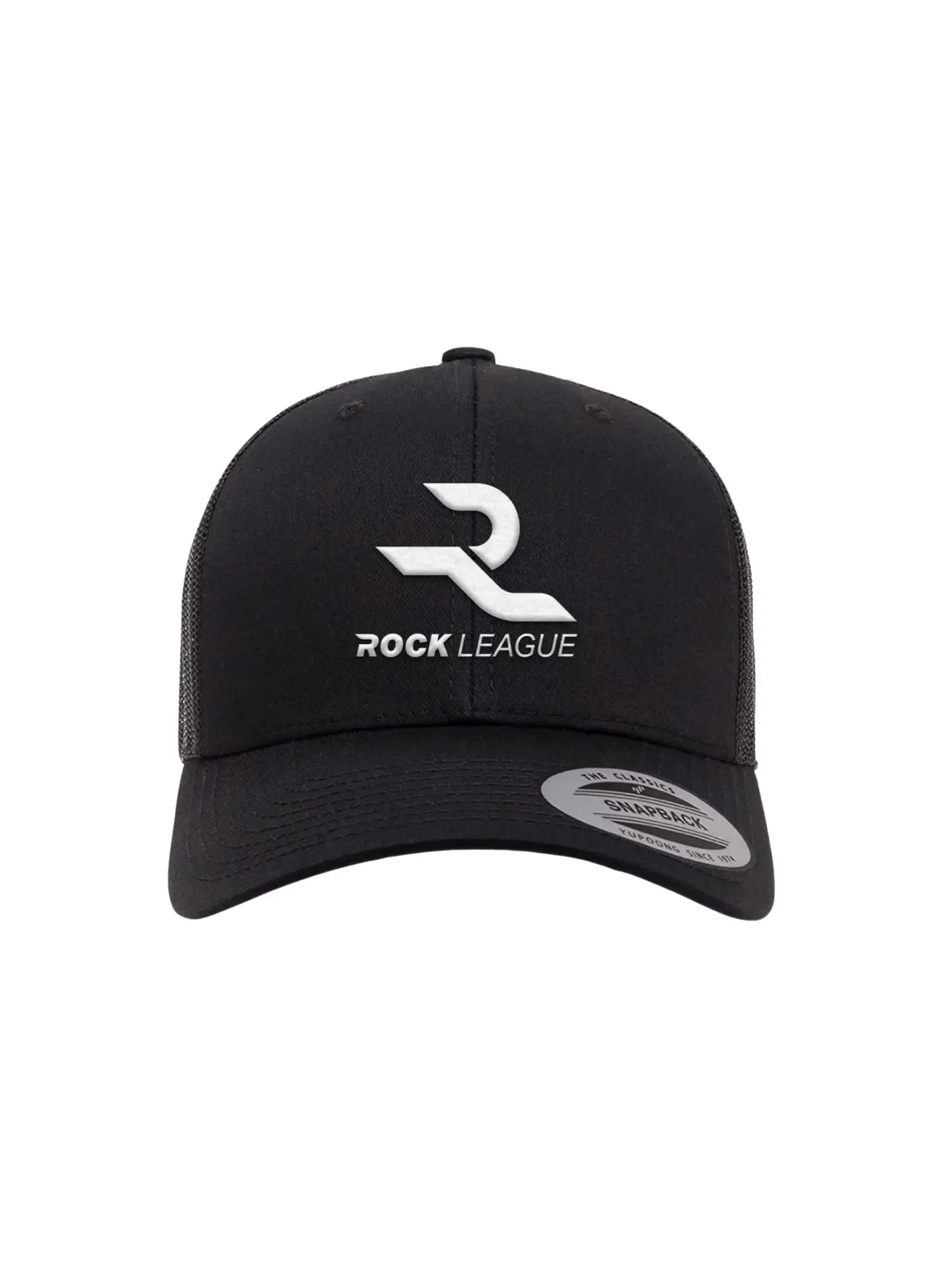
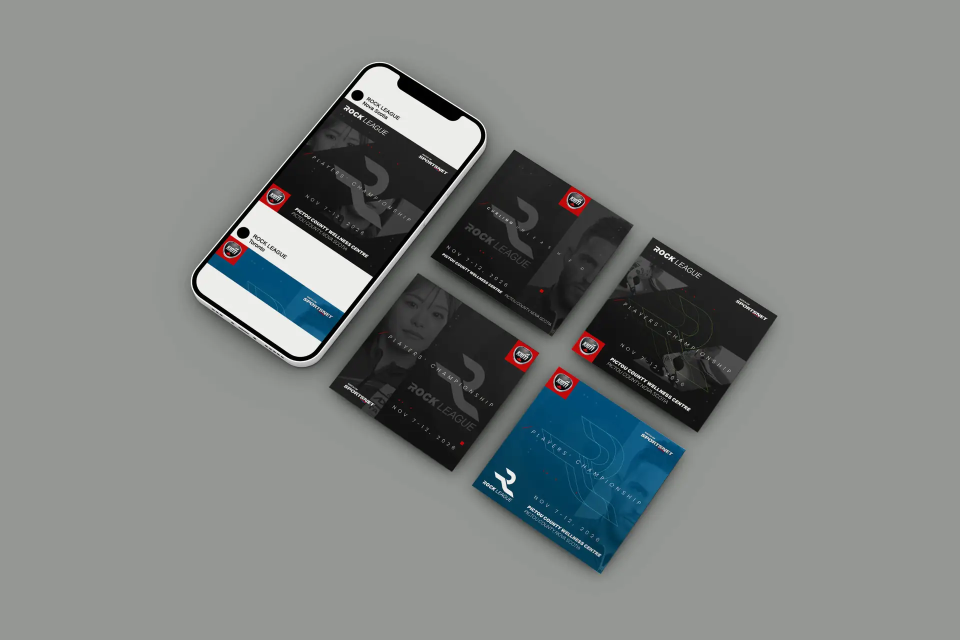
Examples of Rock League branding as well as team identities on products, clothing and collateral.
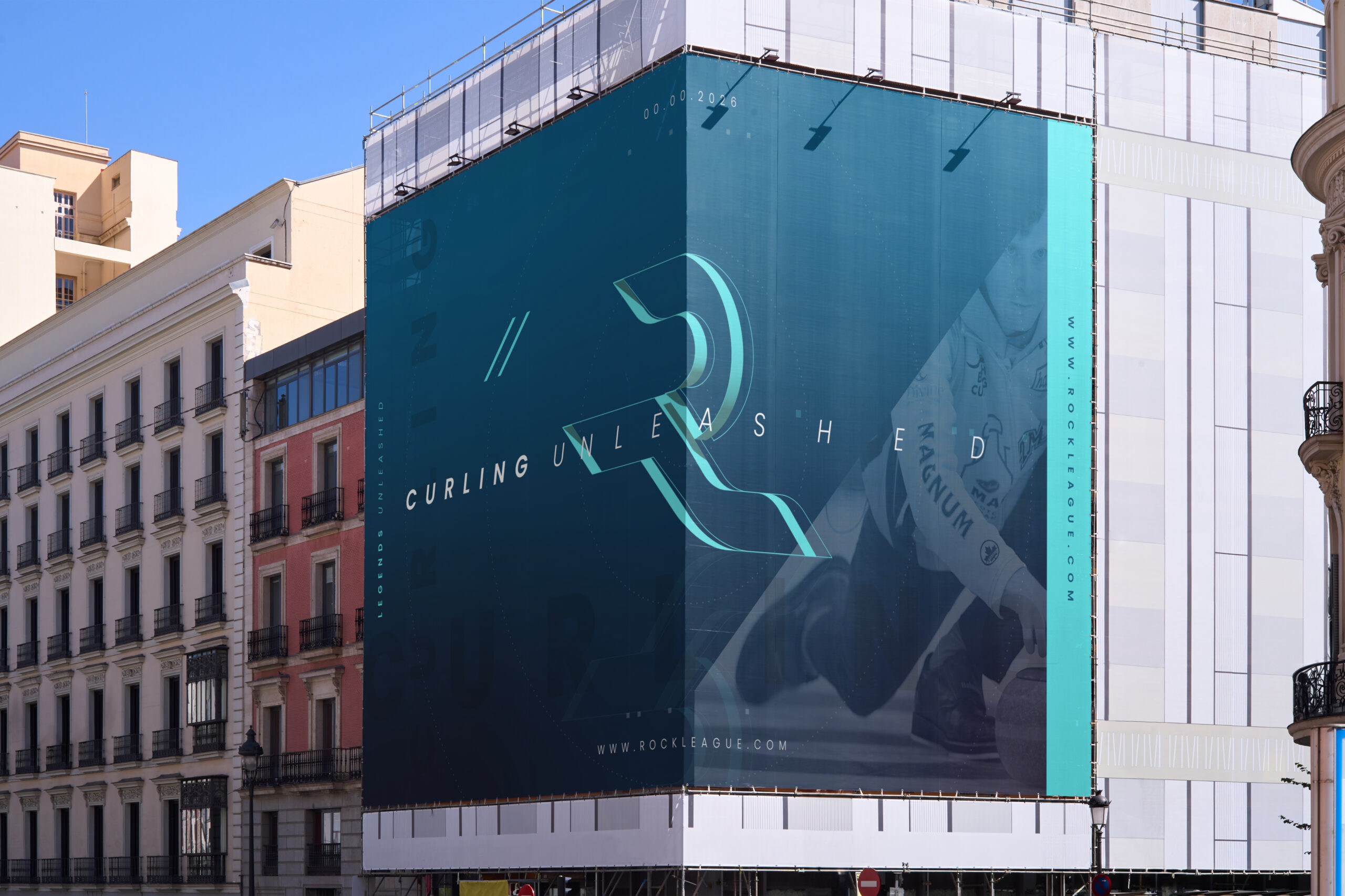
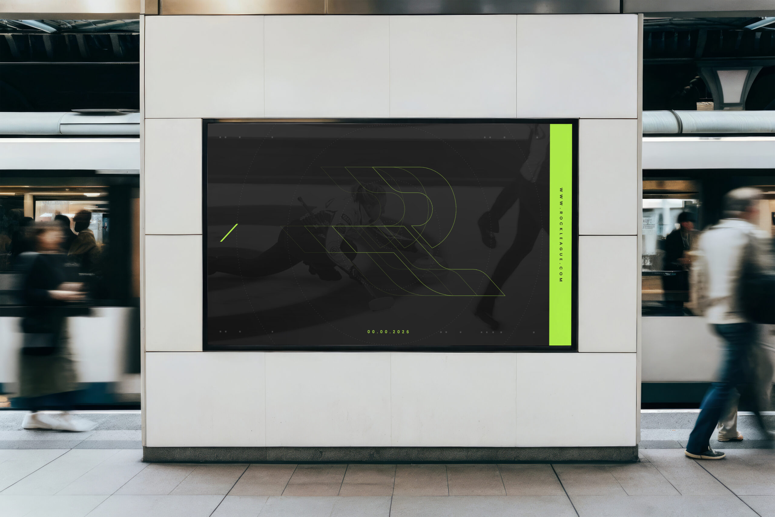
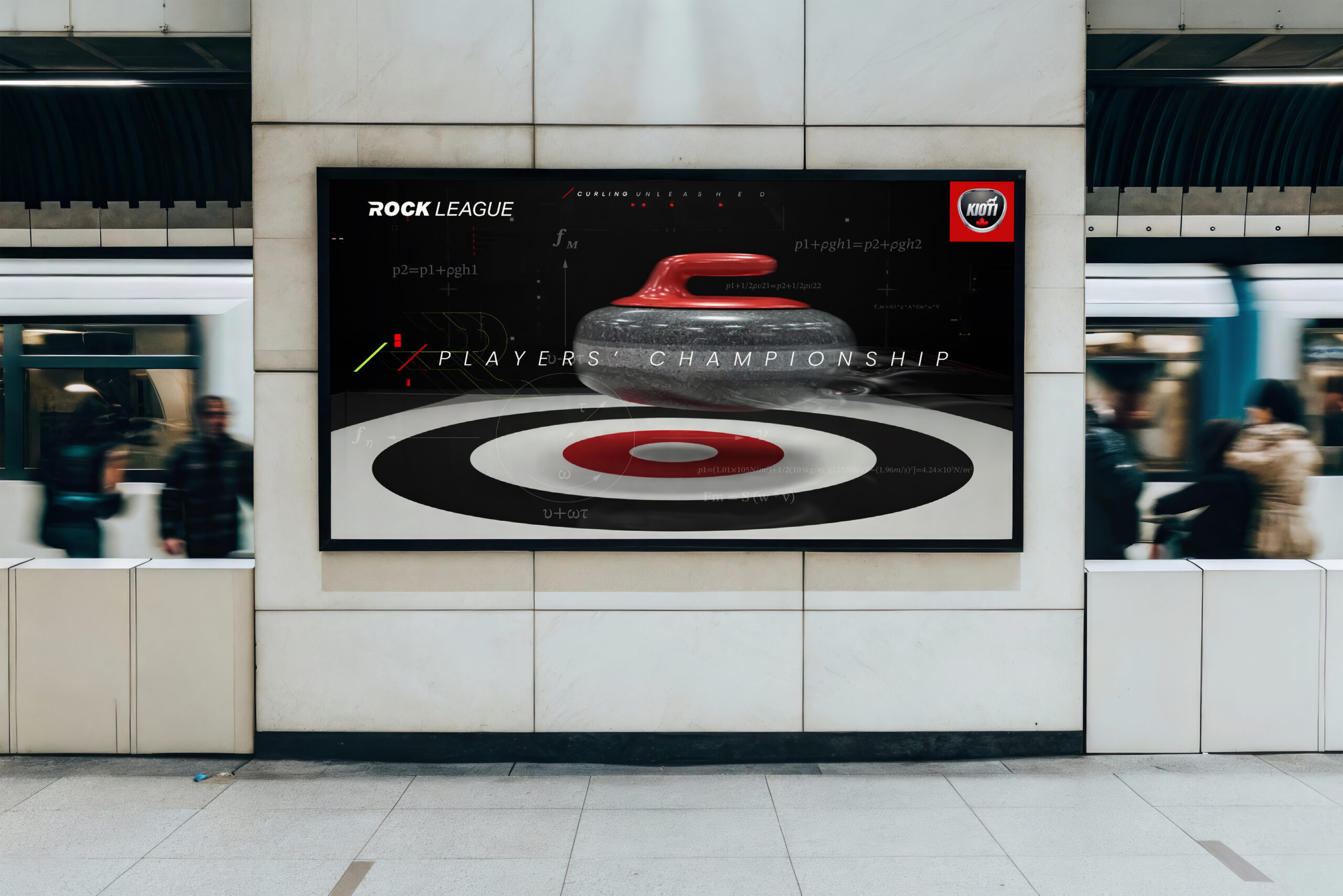
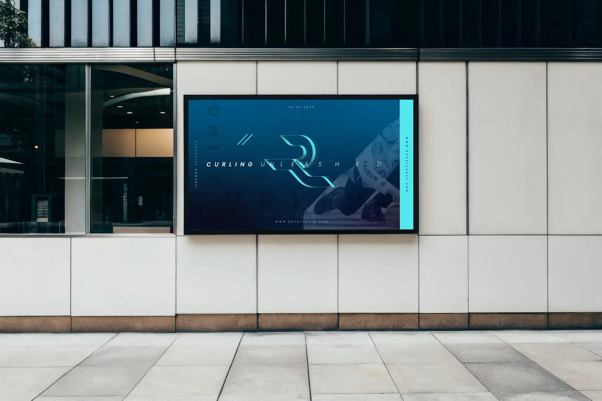
Stadium signage, in-venue collateral, street signage, flyers and badges.
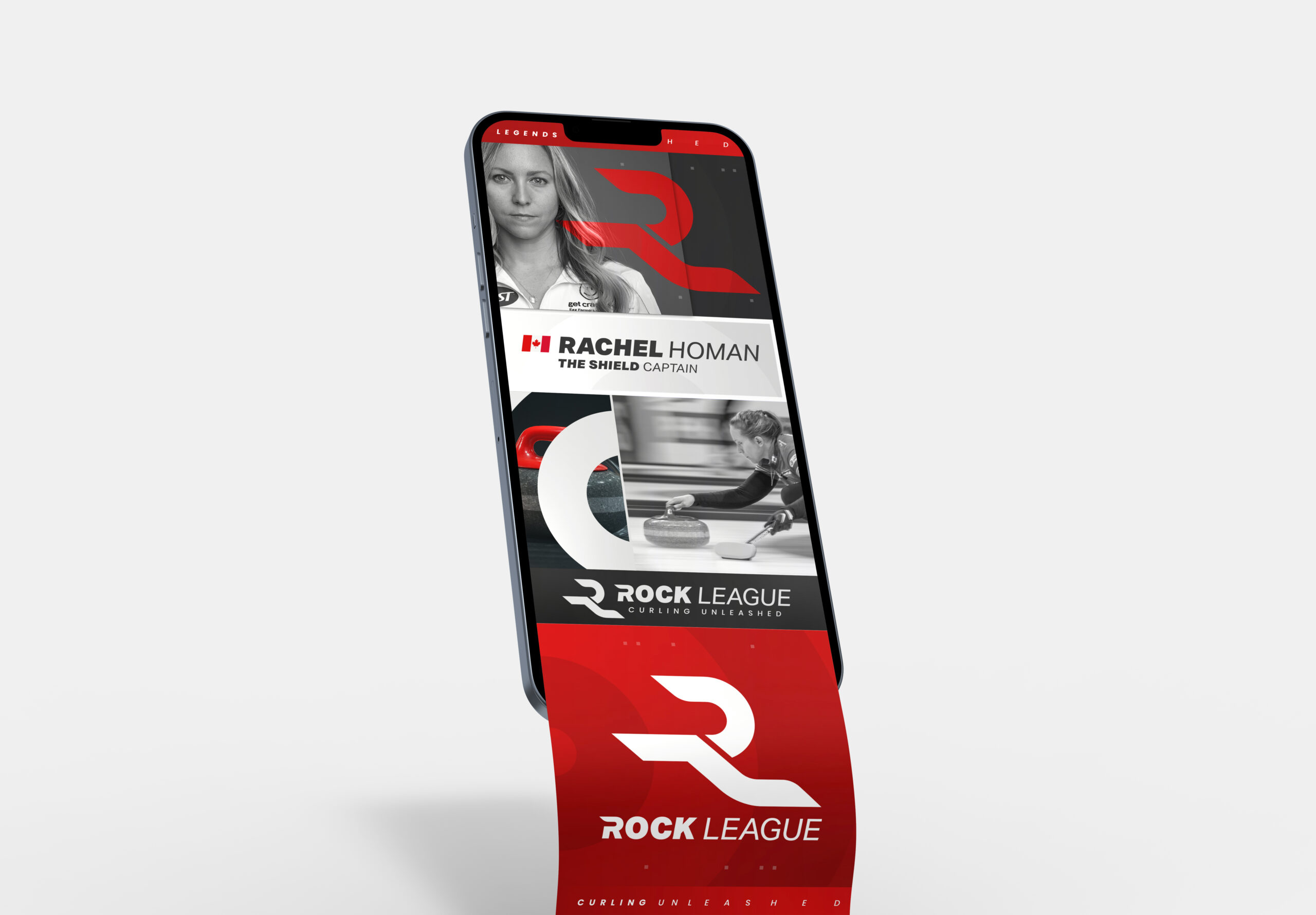
Brand positioning, brand identity, look& feel, in-venue graphics, motion graphics for broadcast interstitials, commercials, merchandise, and more coming soon.

