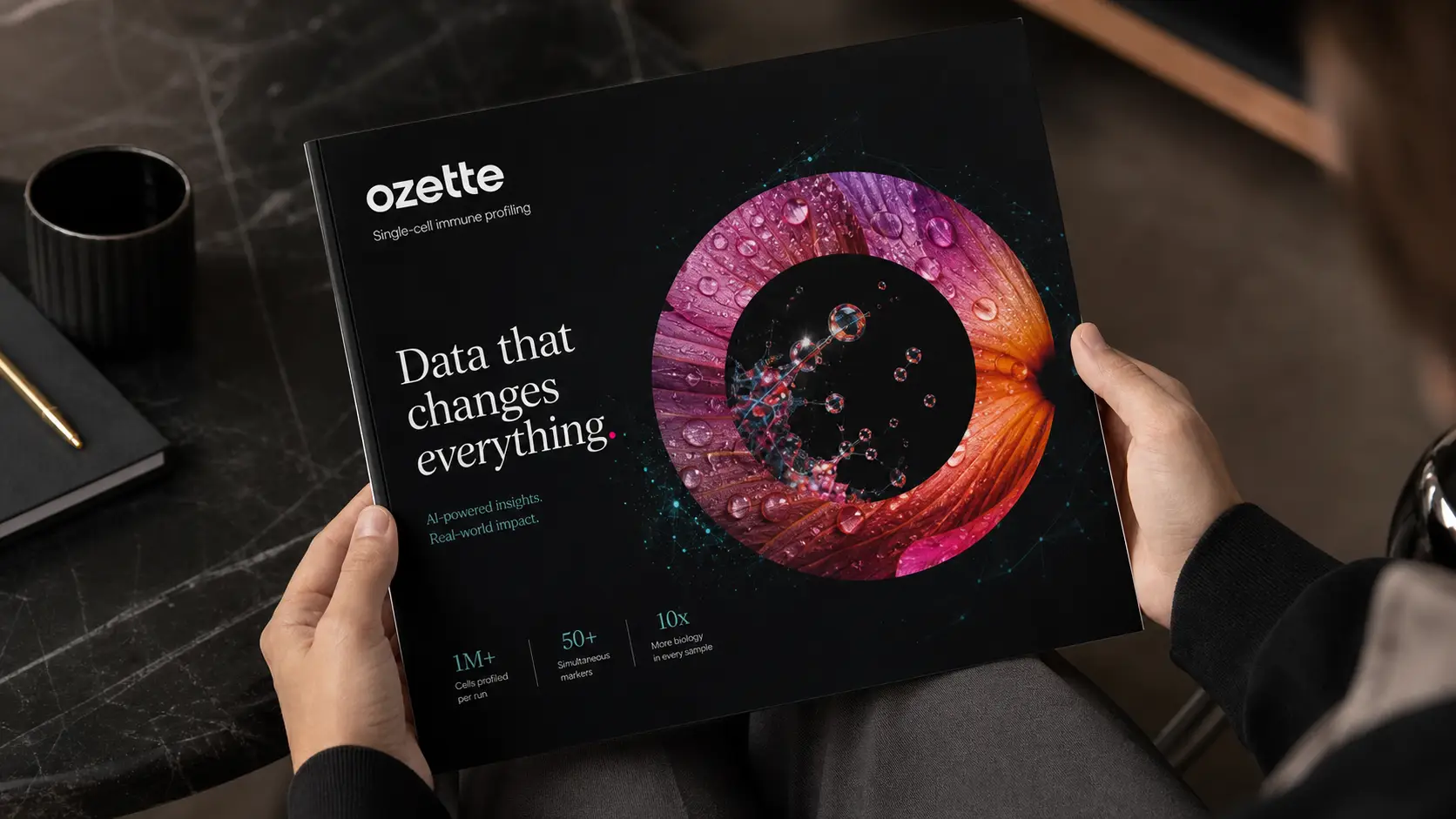
Ozette
Data that changes everything.
Services
Brand Identity, Visual System, Infographics, Information Design, User Experience and User Interface, Experiential Design, Print Design
Result
A distinctive visual system that broke the biotech default and made Ozette’s rare, data-driven science impossible to overlook.
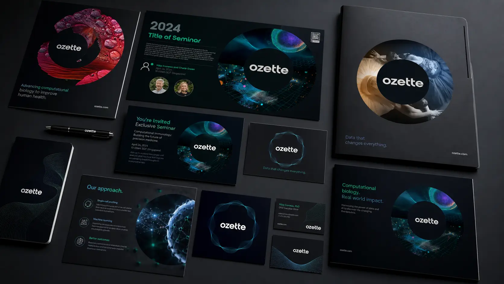
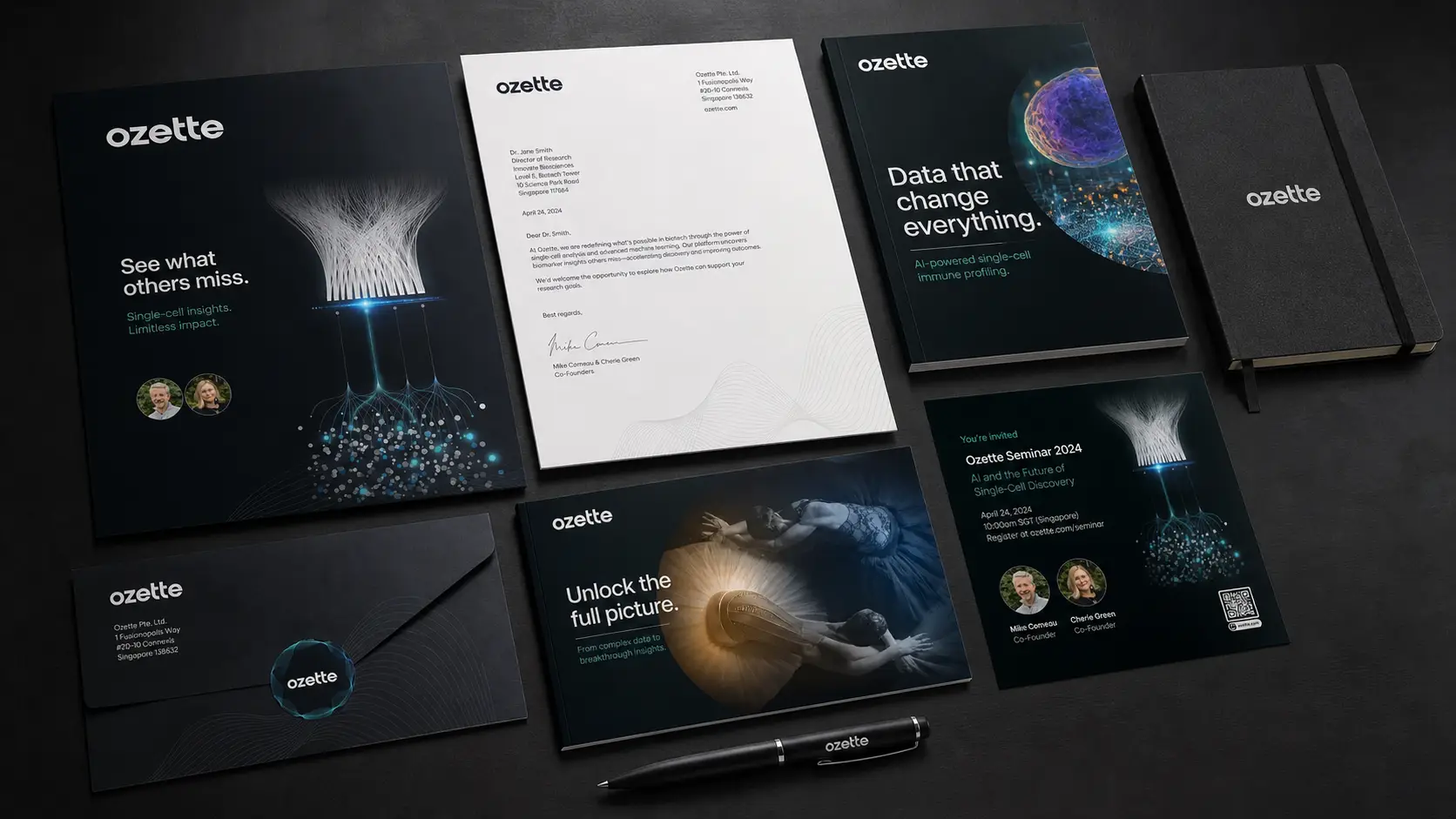
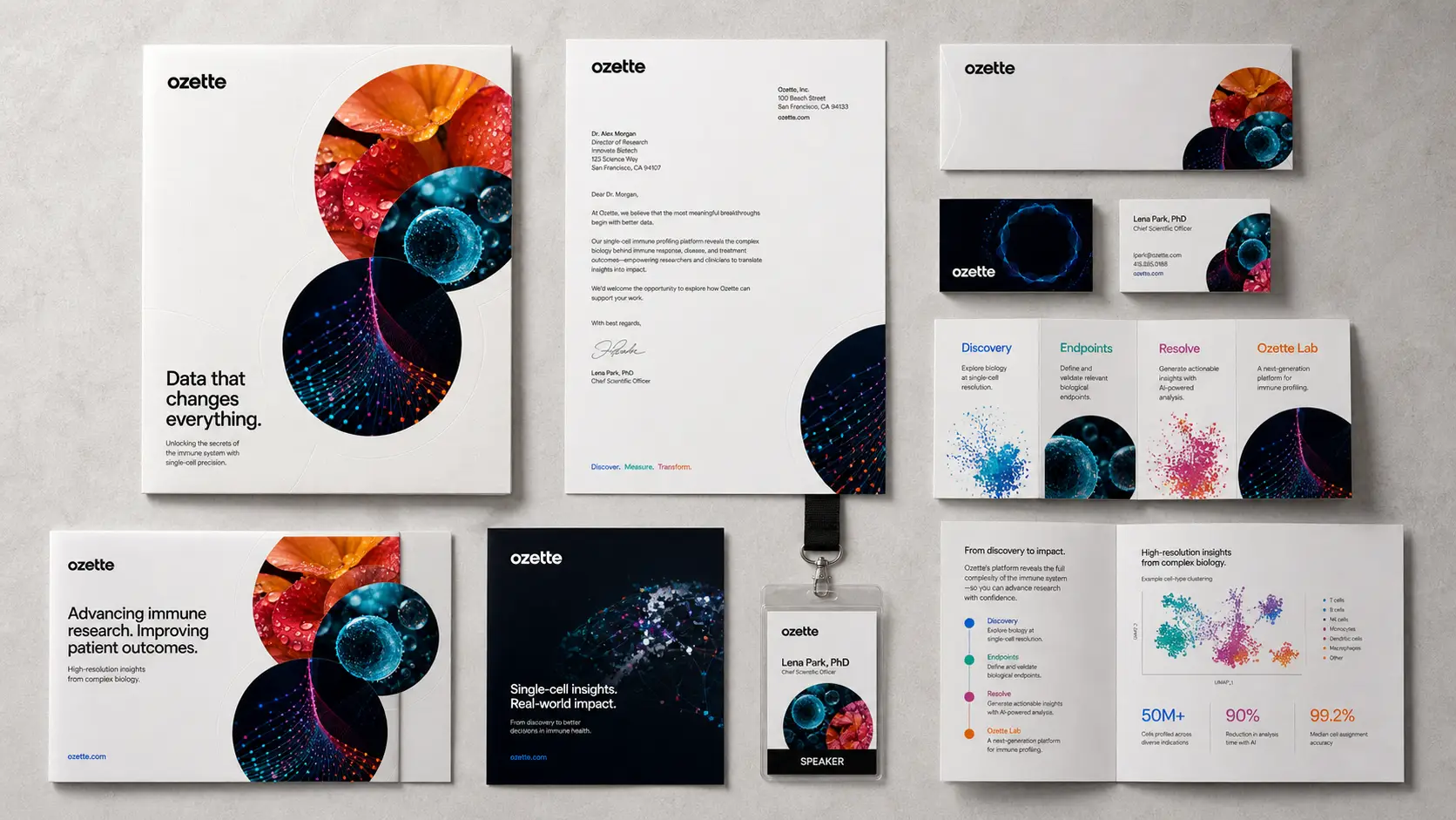
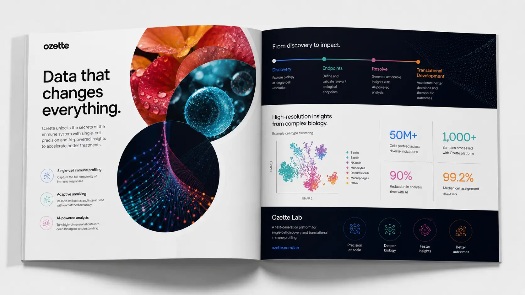
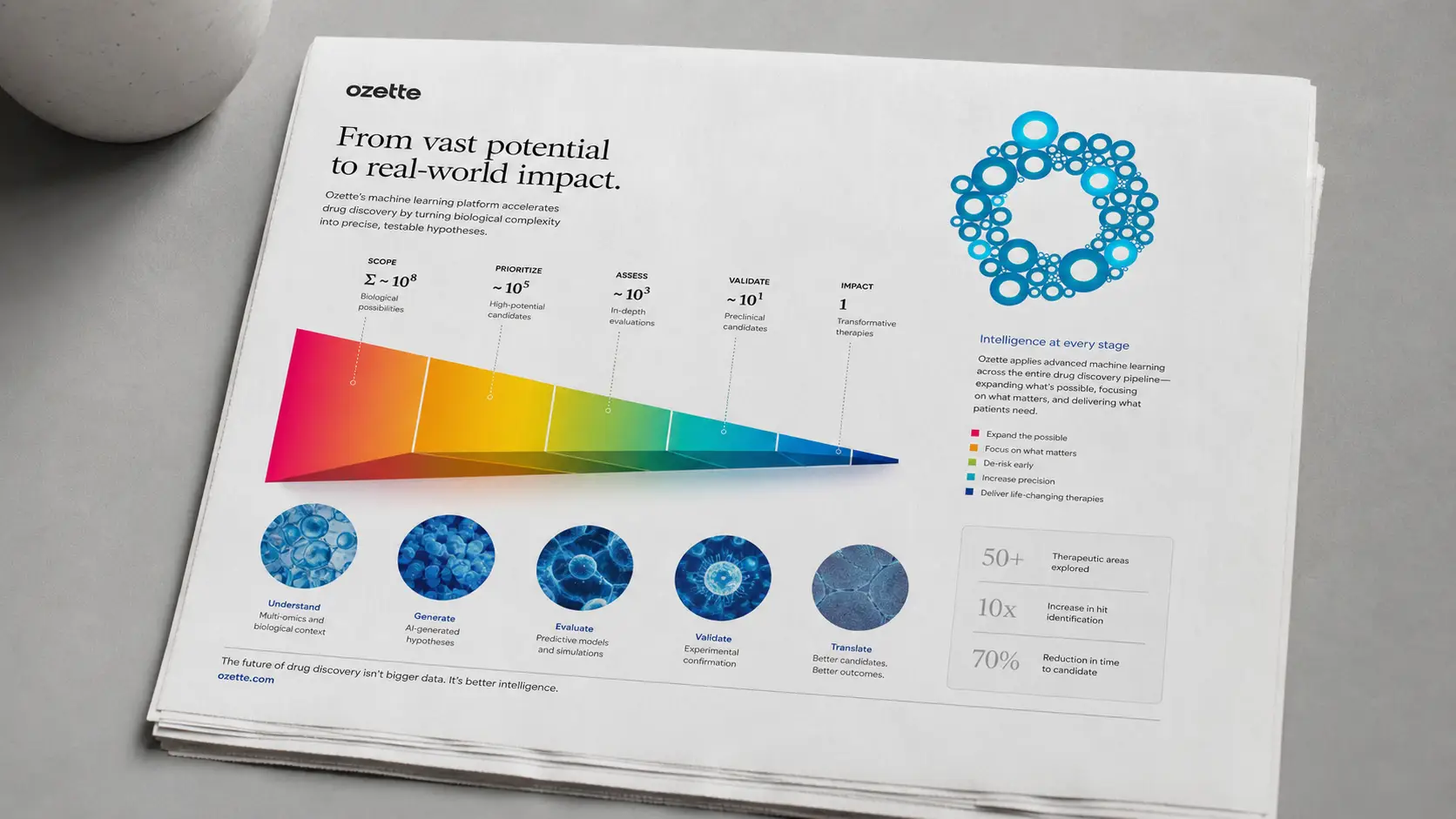
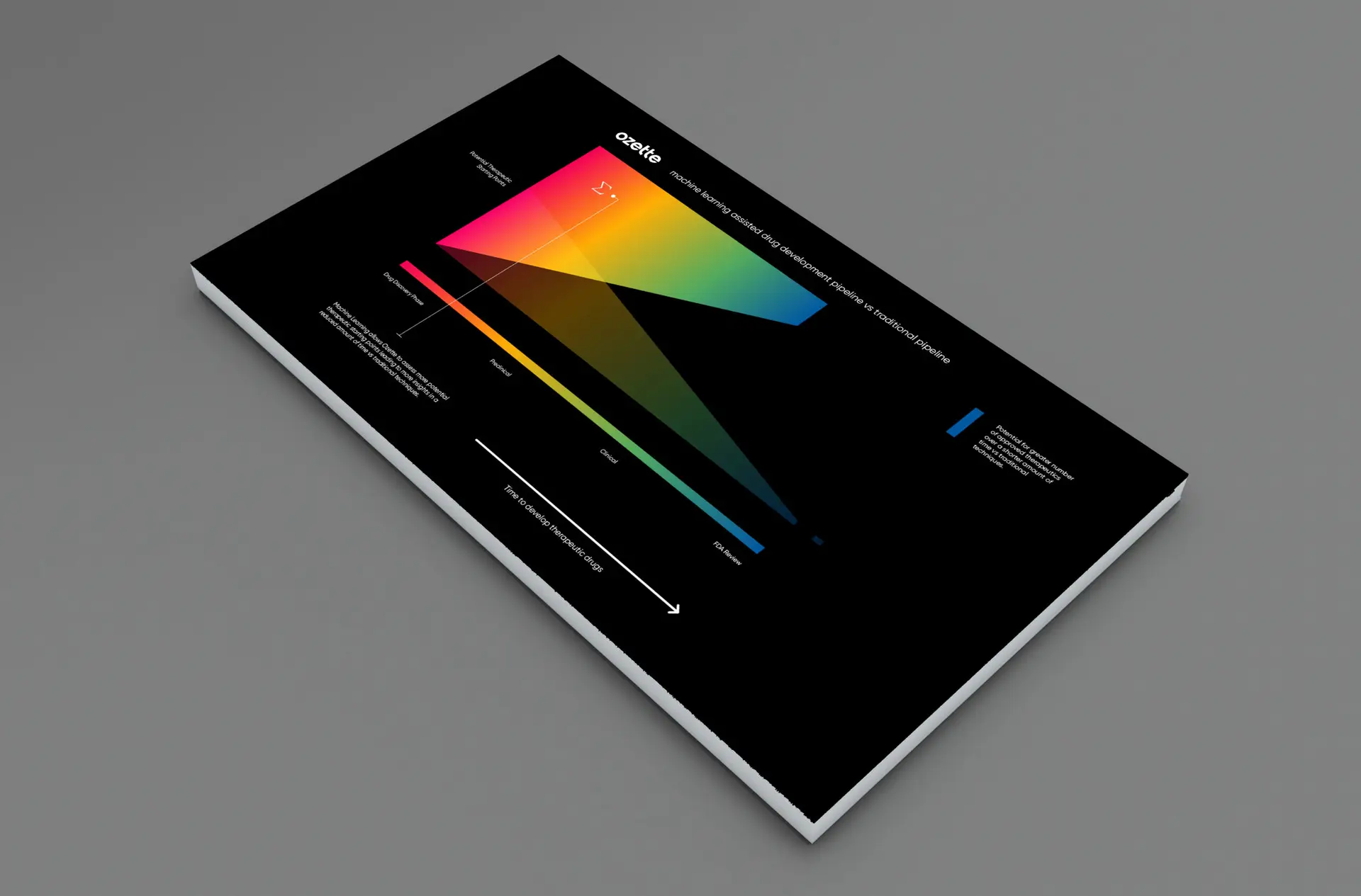
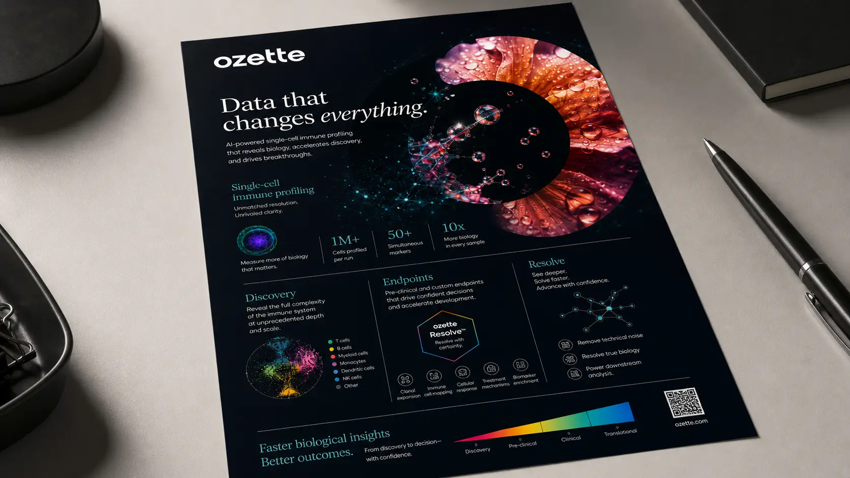
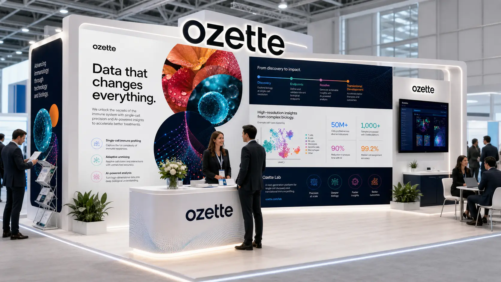
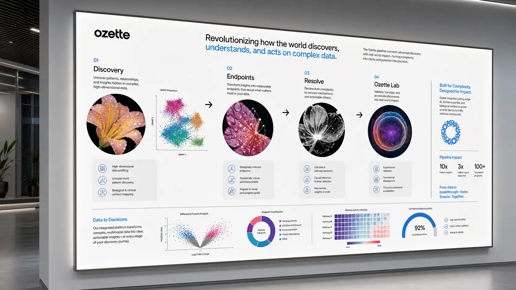
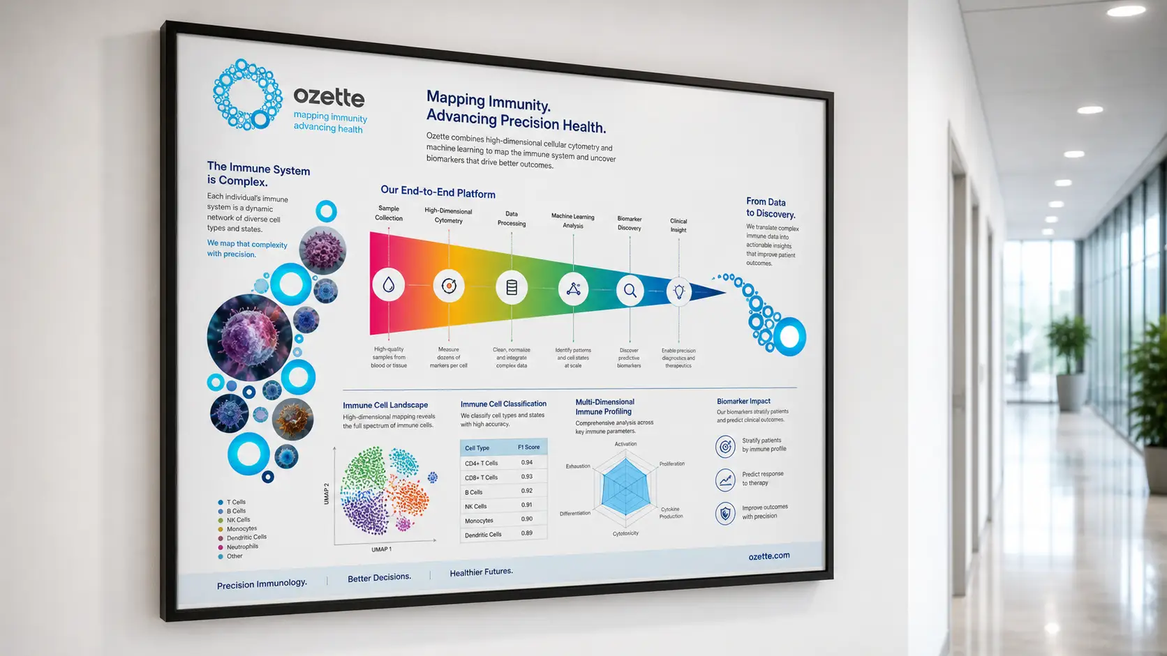
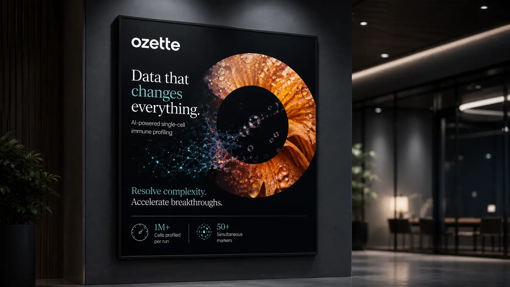
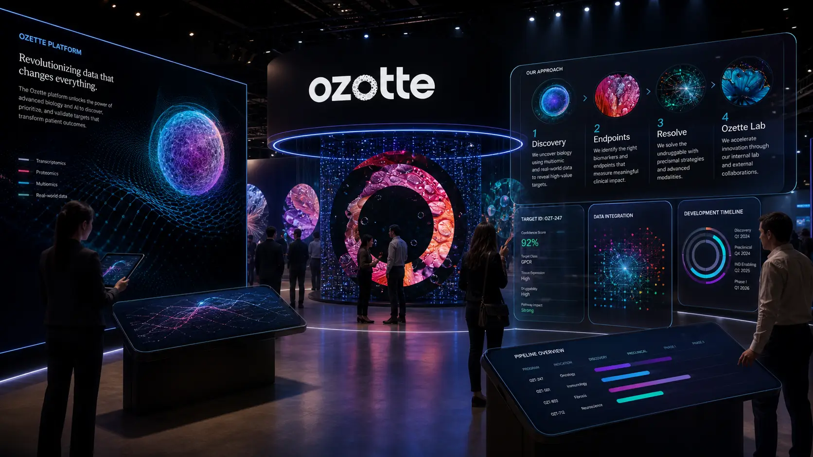
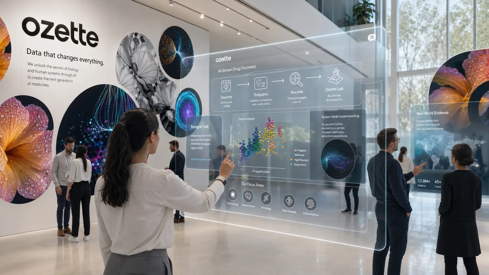
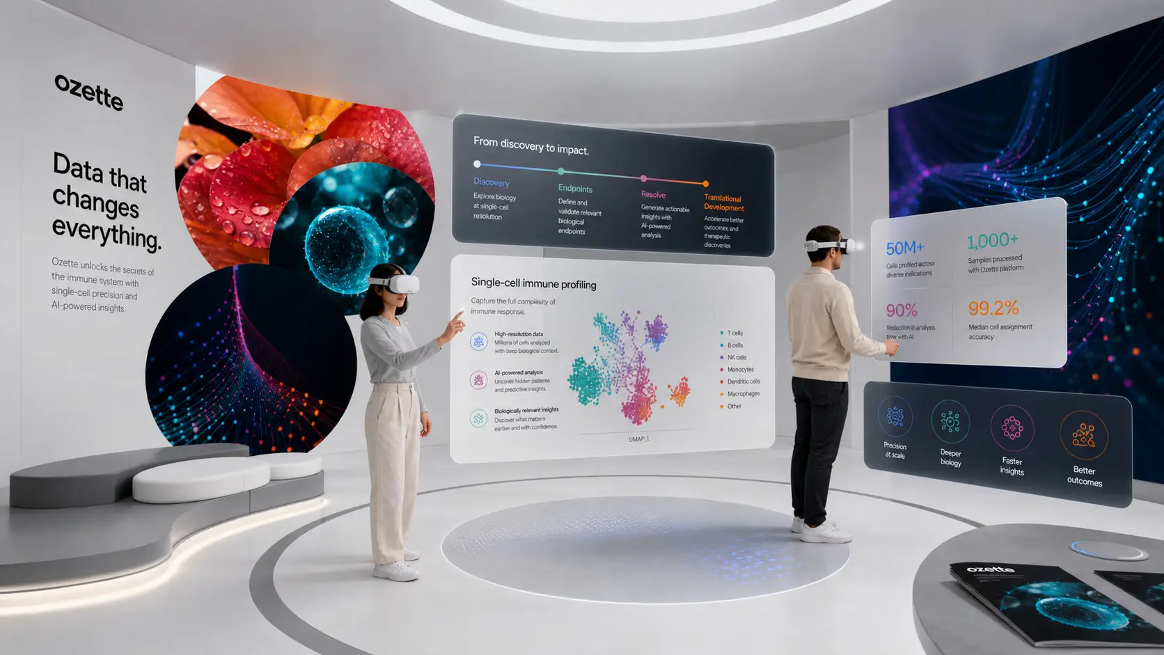
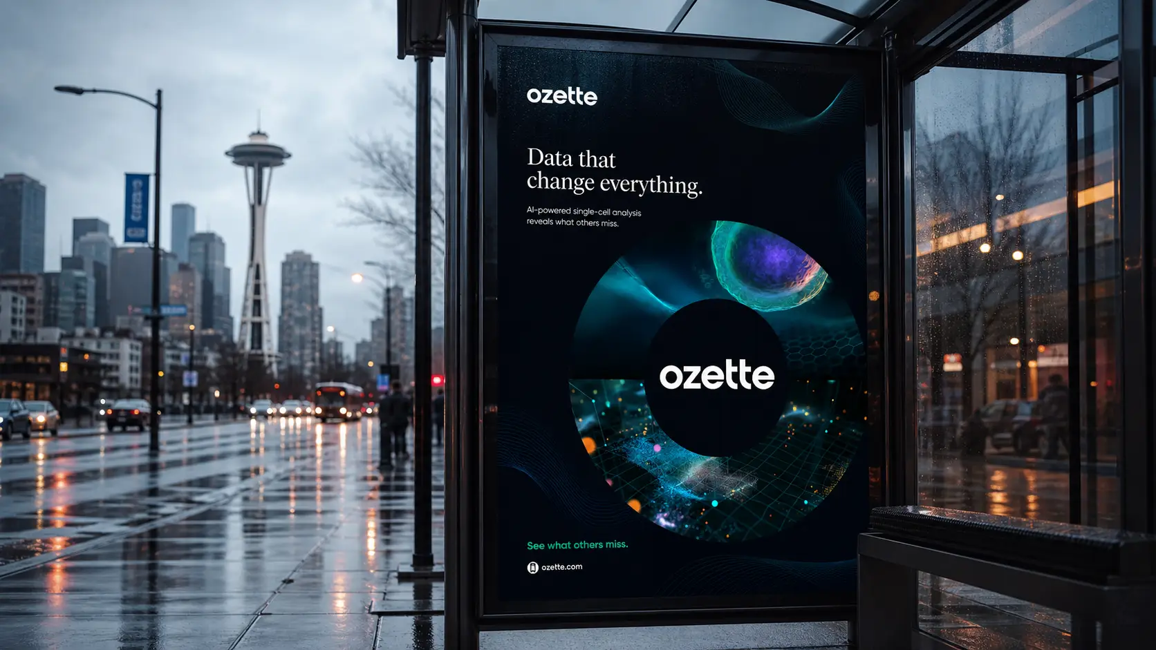
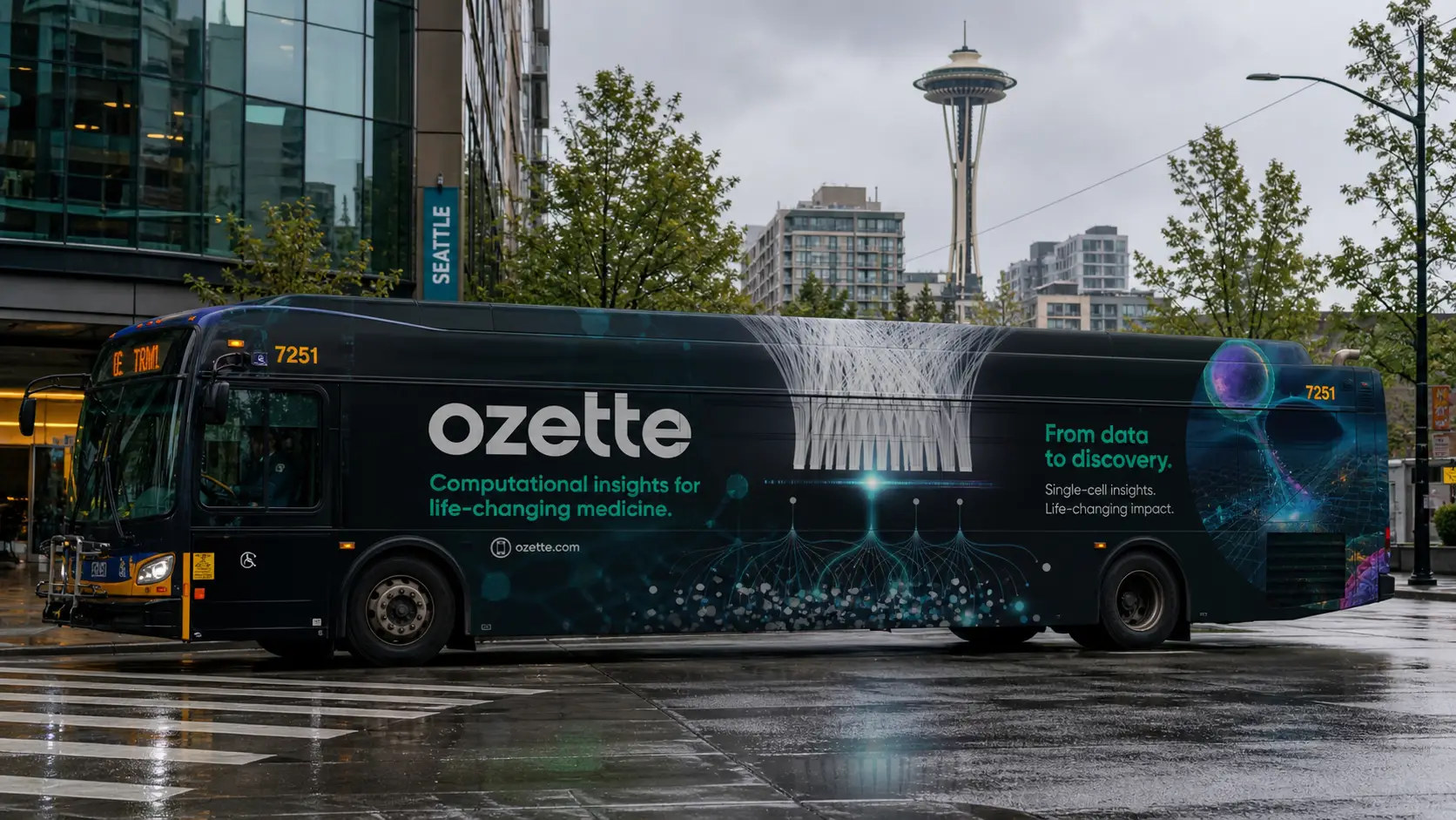
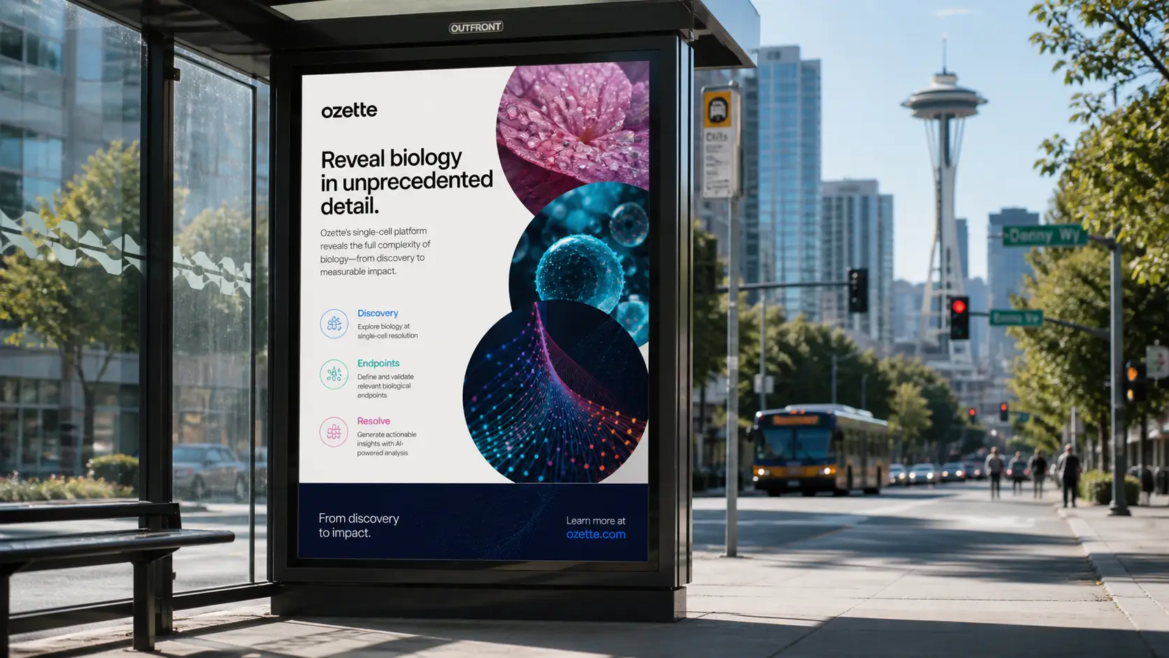
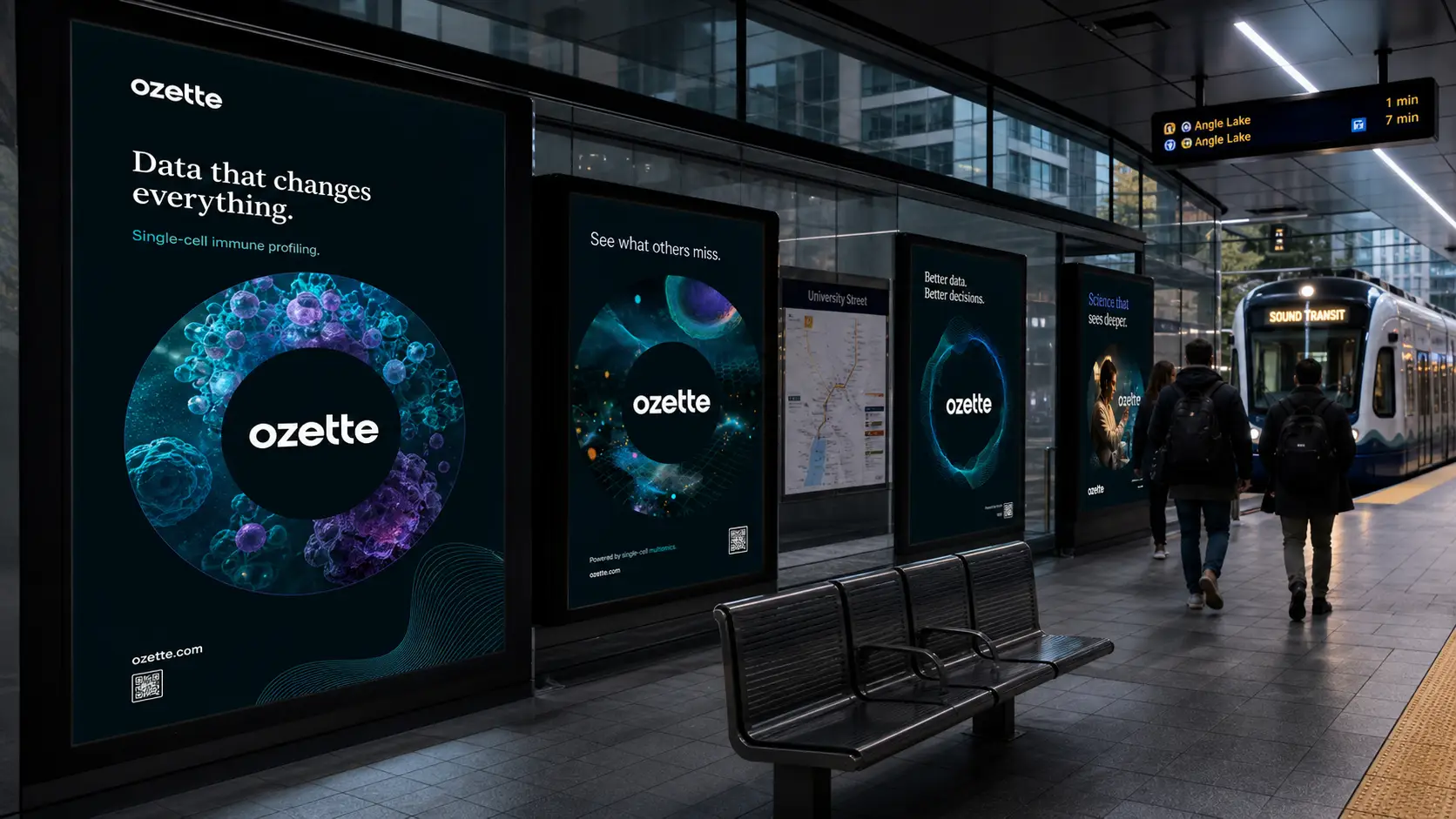
Biotech branding has a default look, and often it’s a missed opportunity. Cool blues. A double helix. A microscope shot lifted from a stock library. All nice, all invisible. Ozette is doing genuinely rare work, using AI and single-cell immune profiling to reveal the kind of biological detail that traditional methods flatten or miss entirely. The science is gorgeous. It moves. It contains multitudes. The brand needed to look like the data, not like the category. So we built one that does.
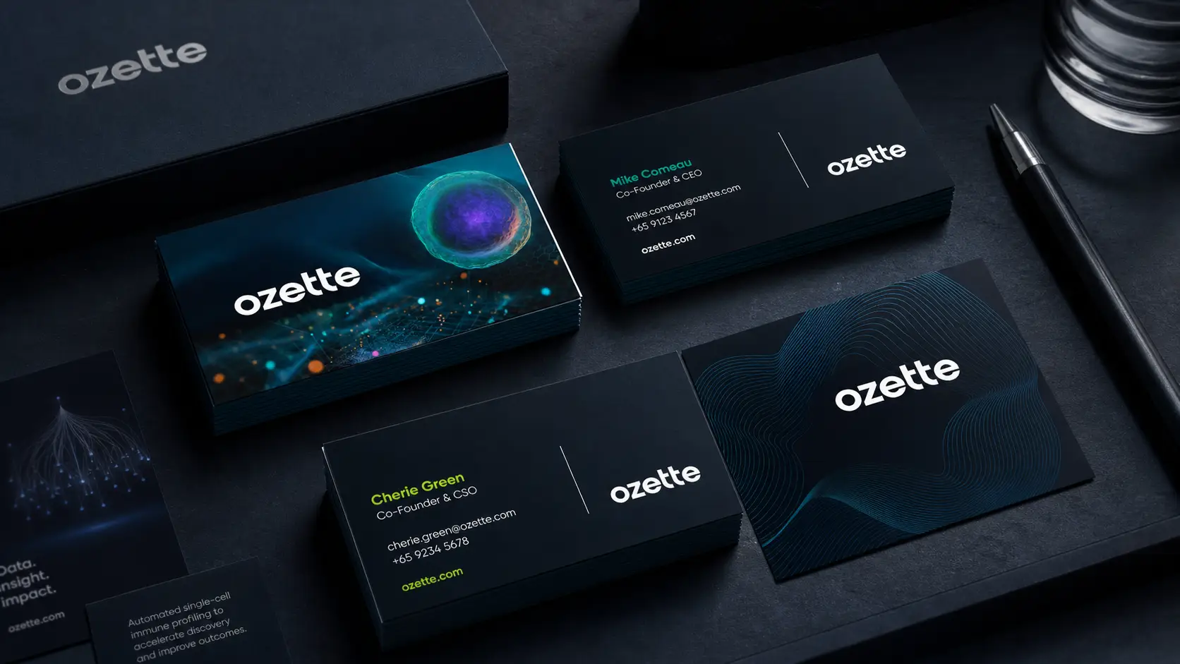
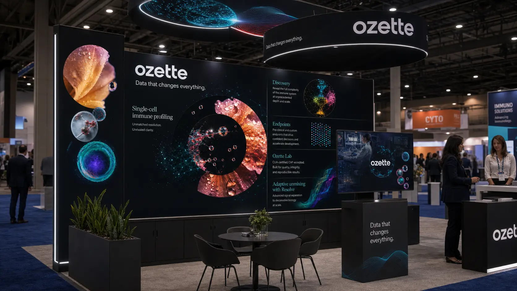
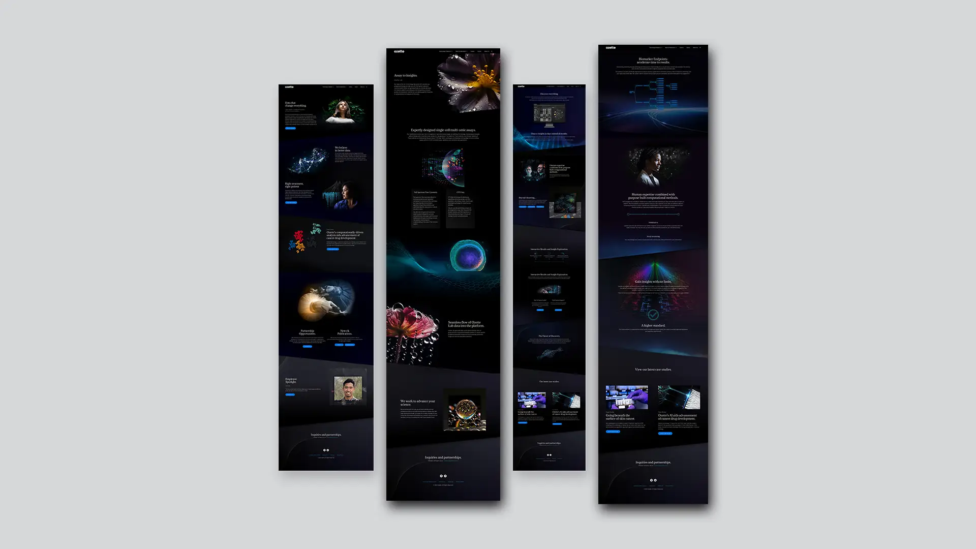
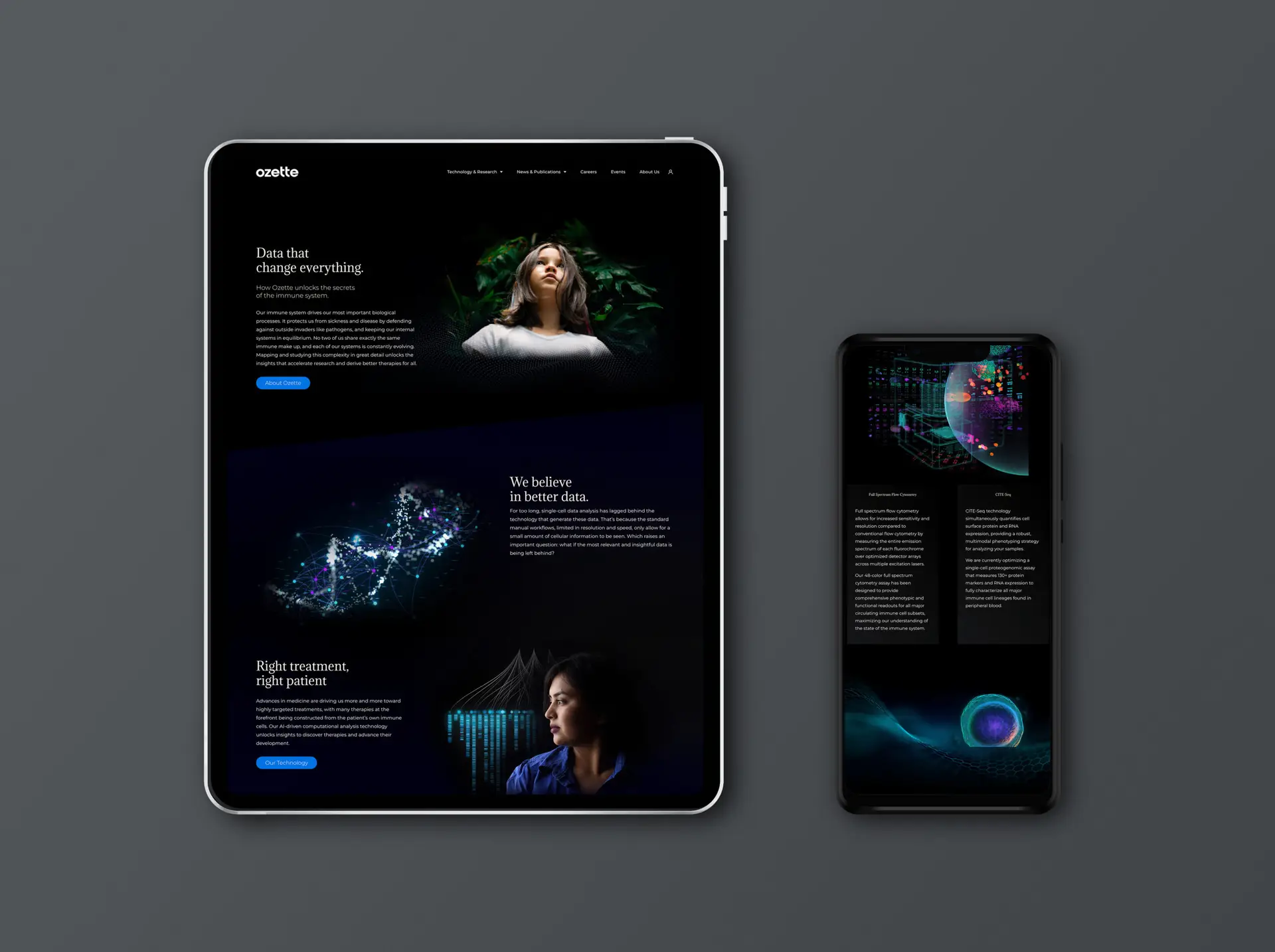
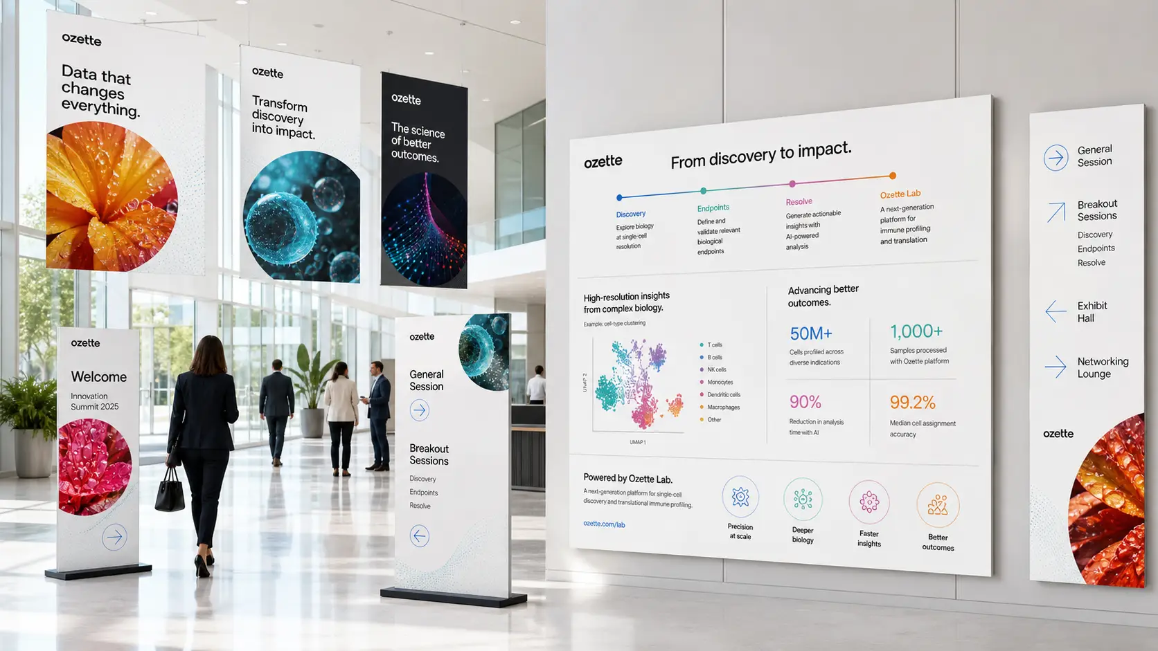
The Ozette O is built from a constellation of cells, a single elegant gesture that telegraphs what the platform actually does the moment you look at it. From there, the visual system uses real and rendered single-cell imagery as its primary language: jewel-toned spheres, particle clouds, spectral gradients, biological structures photographed and rendered at a level of detail the category almost never permits itself. That language carries from the logo through the website, pitch decks, scientific posters, brochures, business cards and stationery, conference booth design, OOH across Seattle, transit wraps, taxi tops, and the keynote stage at product launch.
Most biotech brands separate their science from their identity, treating the imagery as decoration on top of the work. Ozette's system collapses that distance. The visual language is the platform's output, refined into a brand. That has a strategic effect well beyond aesthetics. It signals confidence to investors, credibility to research partners, and ambition to recruits, all in the same look. It also gives the company a creative platform that scales as the science does. New modalities, new indications, and new tissue types all arrive with their own visual signatures already built in. The brand isn't a wrapper around the work. It's the work, made legible.
