
Grand Slam of Curling
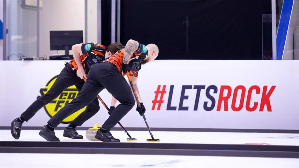
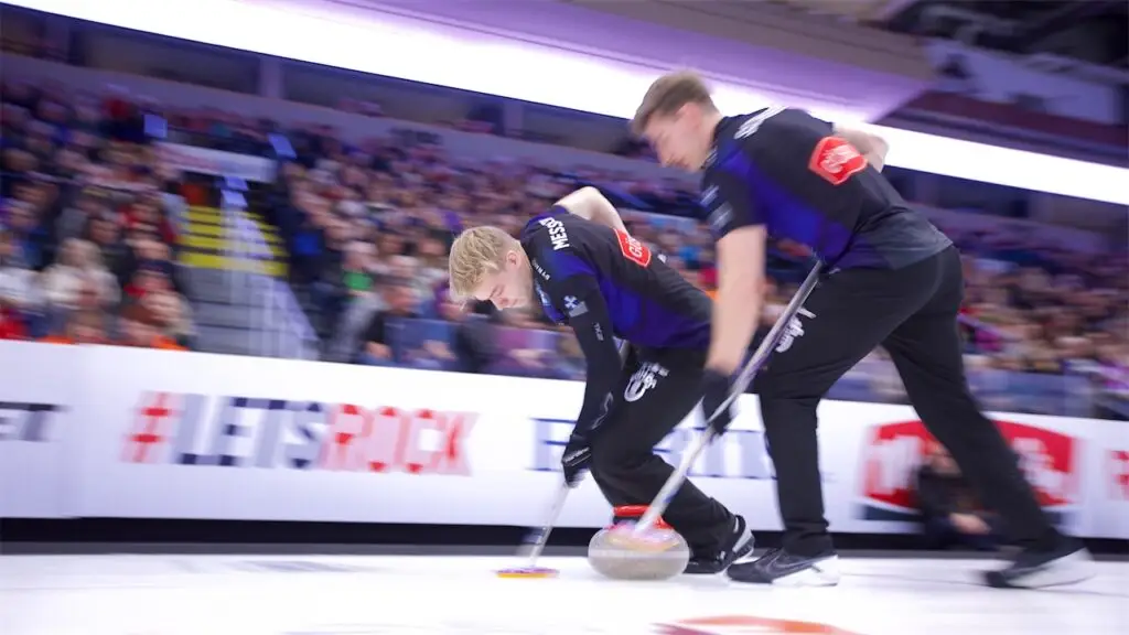
Let’s rock.
Services
Brand Identity, Campaign, Motion, Digital, Venue & Exhibition Design, Broadcast
Result
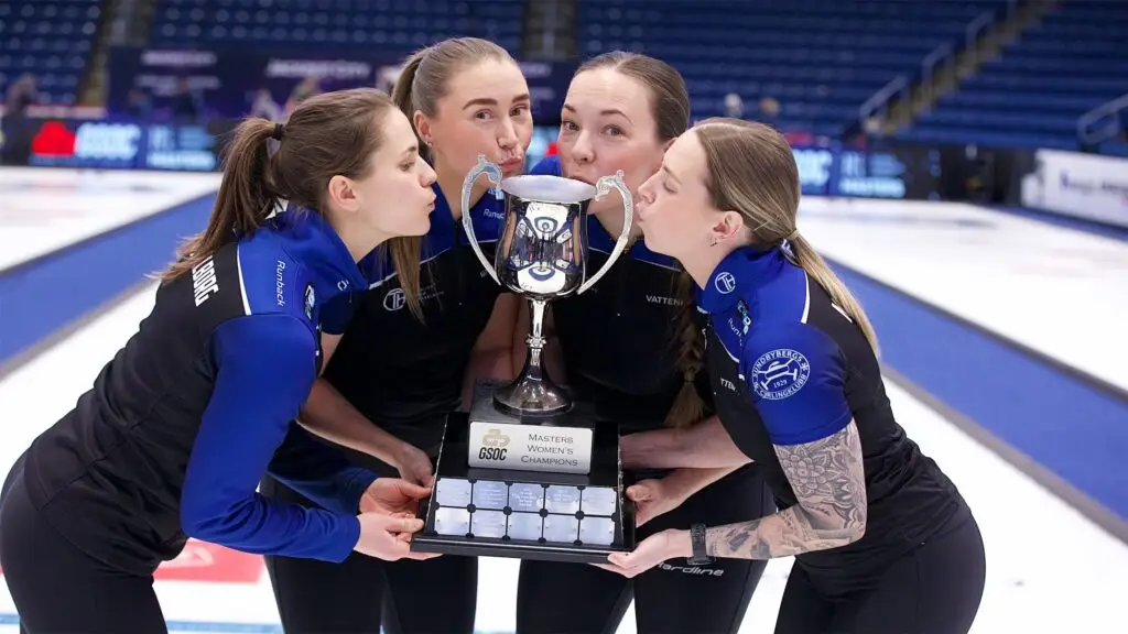
A rebrand that fueled an Olympic-season surge: 168% streaming growth, web traffic doubled to 2M+, social up 230%, and curling’s first U.S. broadcast partner.
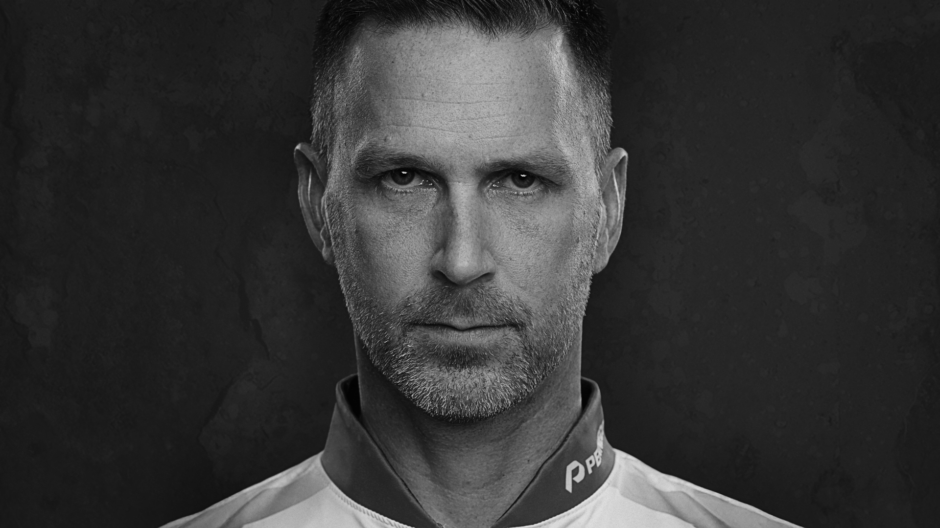
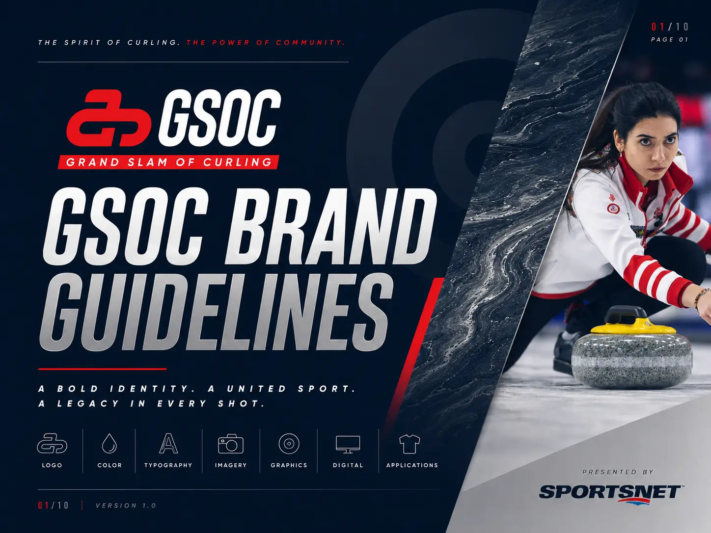
Curling had a perception problem. The over five hundred year old sport was stuck in the past. Loved by purist fans, but not growing because it was seen as boring and dated. But To anyone who’s actually watched a draw to the button with a championship on the line, it’s a chess match on ice played by some of the most competitive athletes on the planet. The Curling Group brought us in to close the perceptual gap for the Grand Slam of Curling, the highest level of professional play in the sport. We rebuilt the brand from the mark out and designed a system that looks like what curling actually is at this level. Fast. Sharp. Intense. And anything but boring. All around a simple positioning truth built out of a play on the one thing that makes it happen: the rock. Yep. Curling rocks.
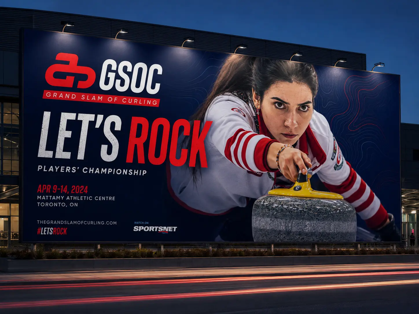
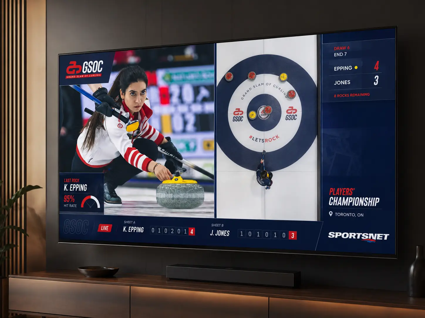
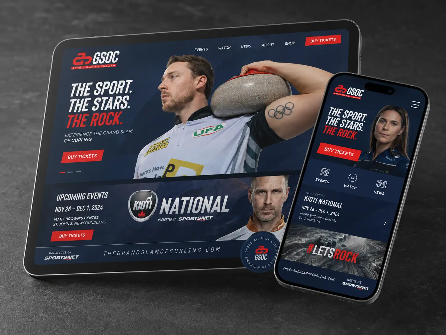
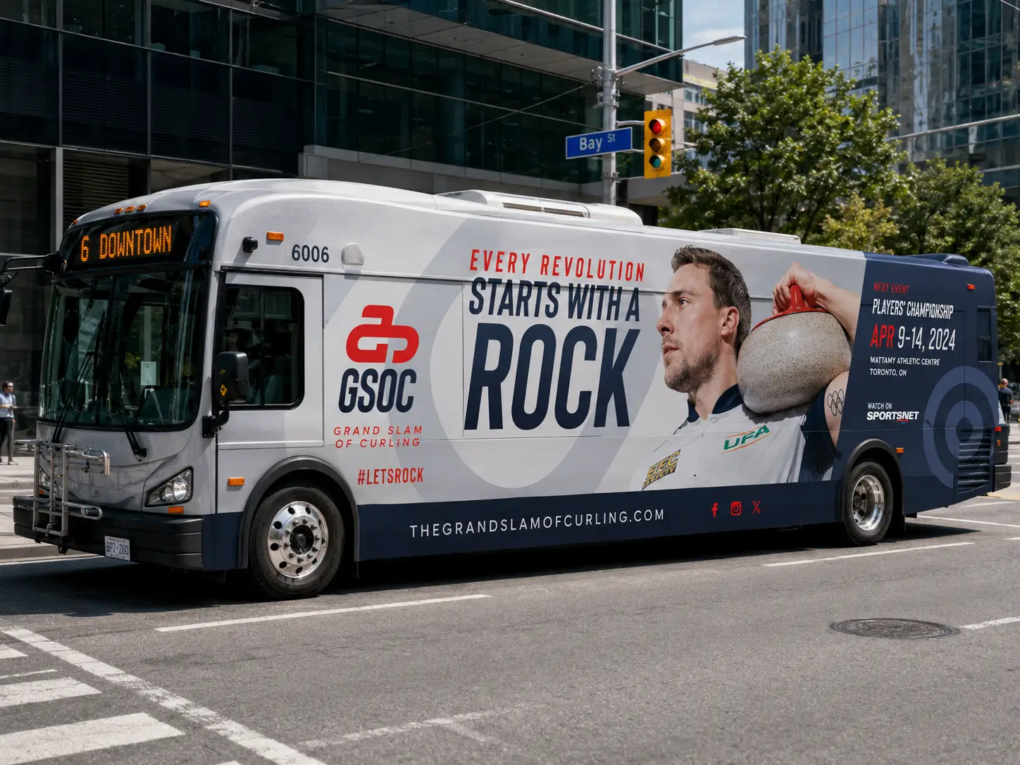
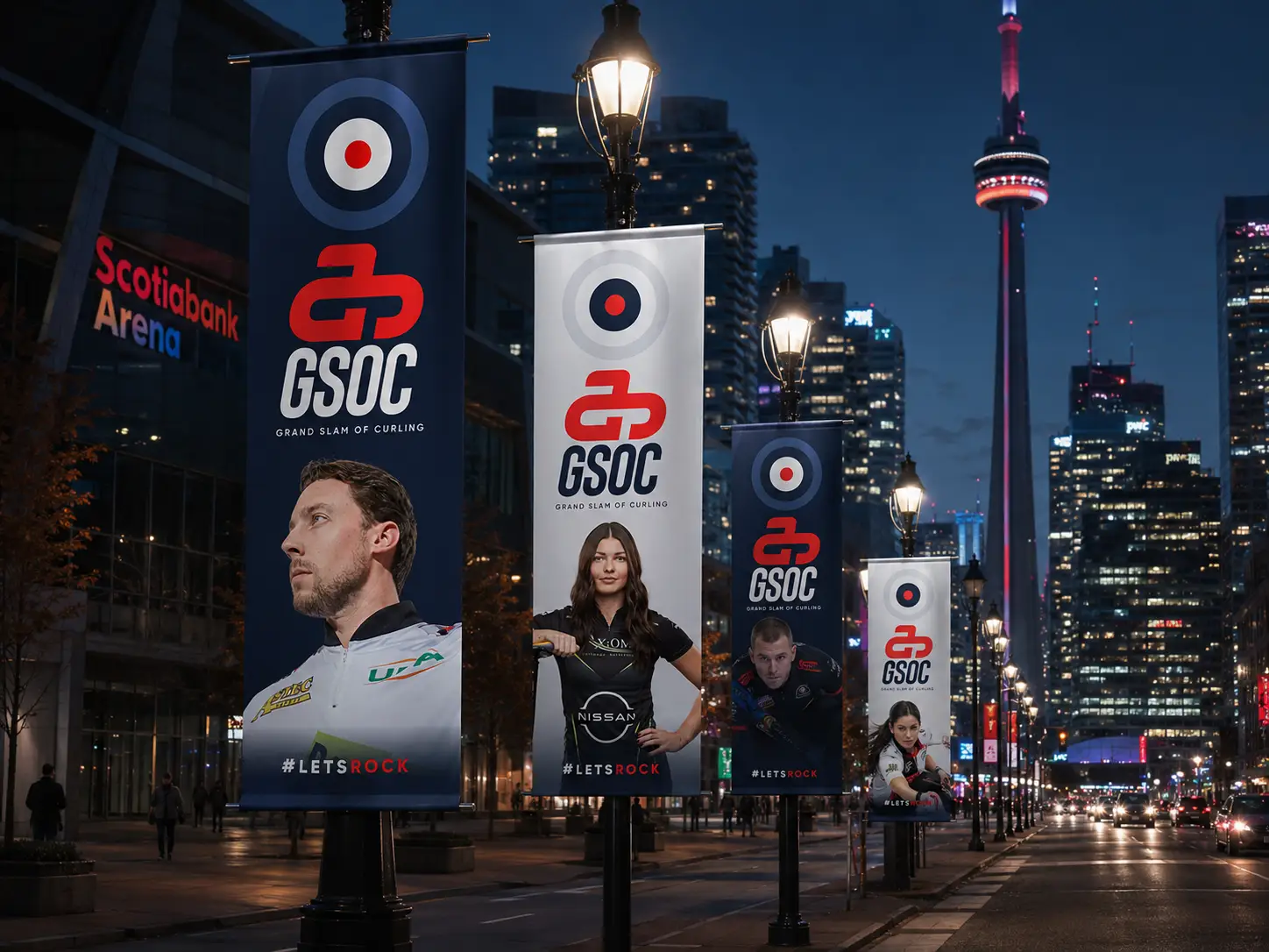
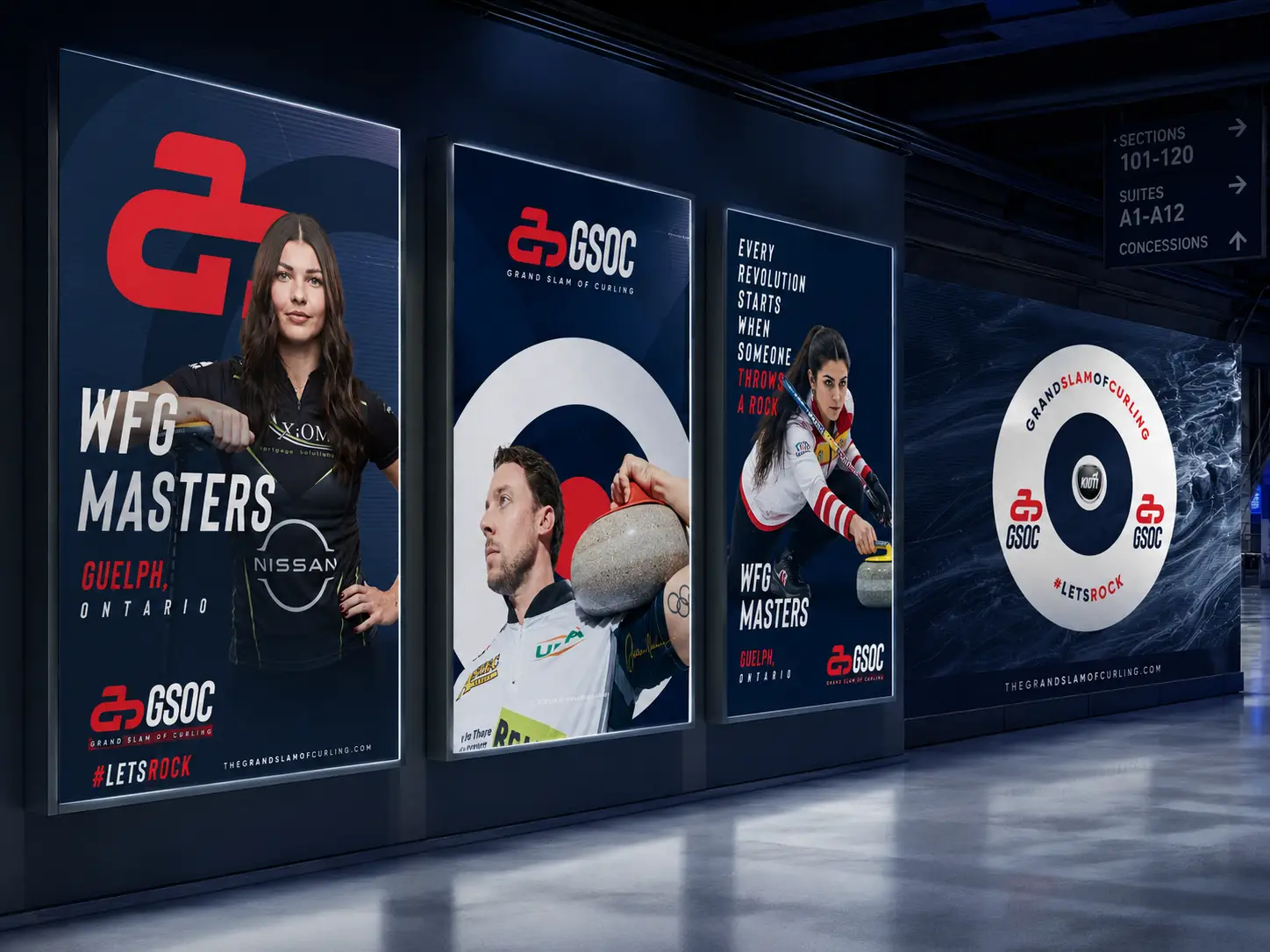
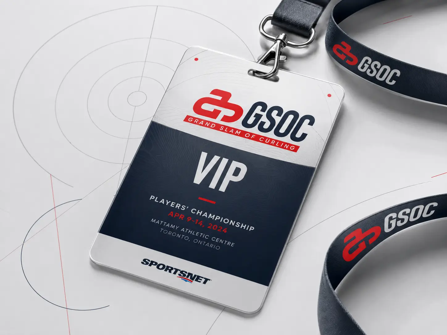
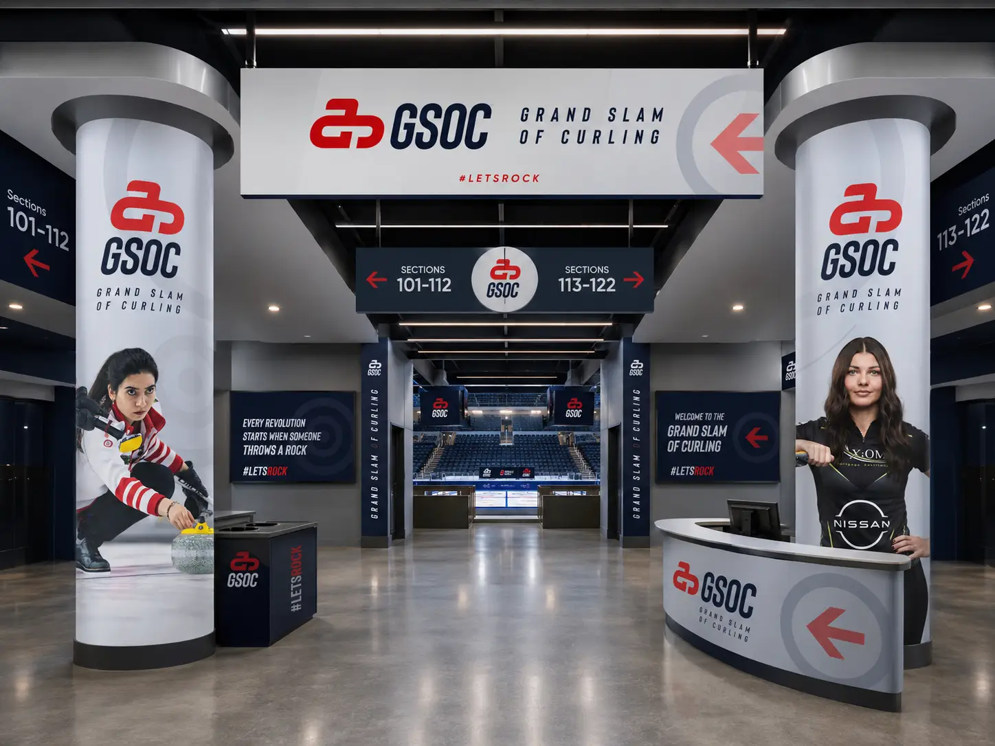
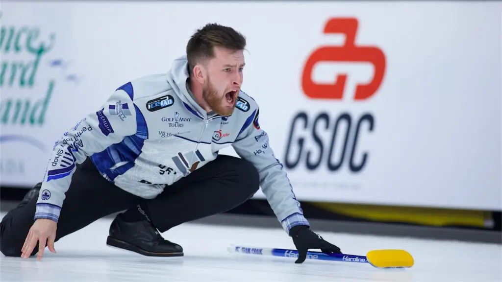
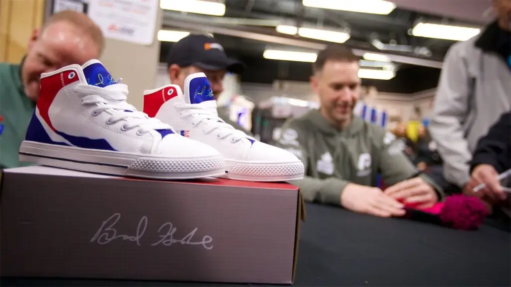
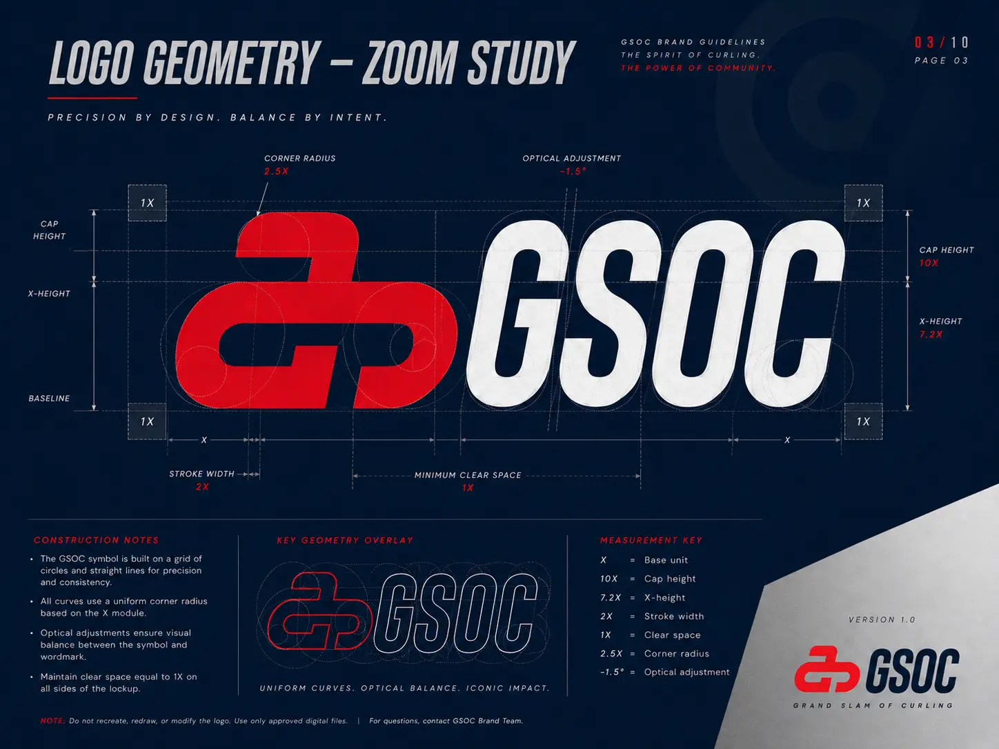
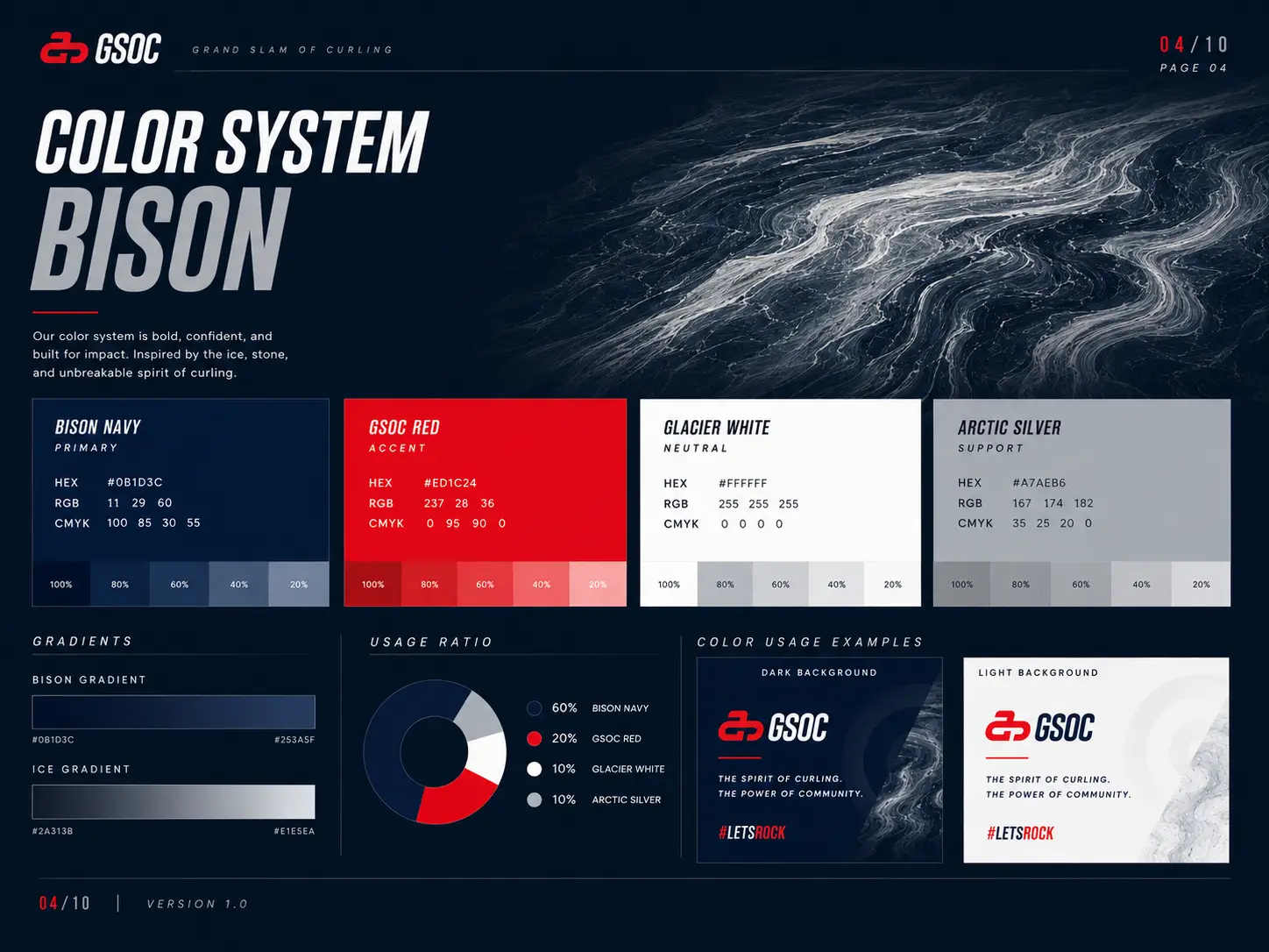
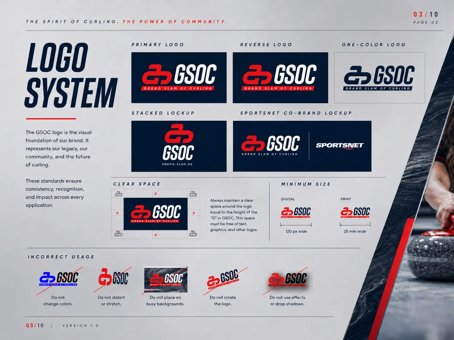
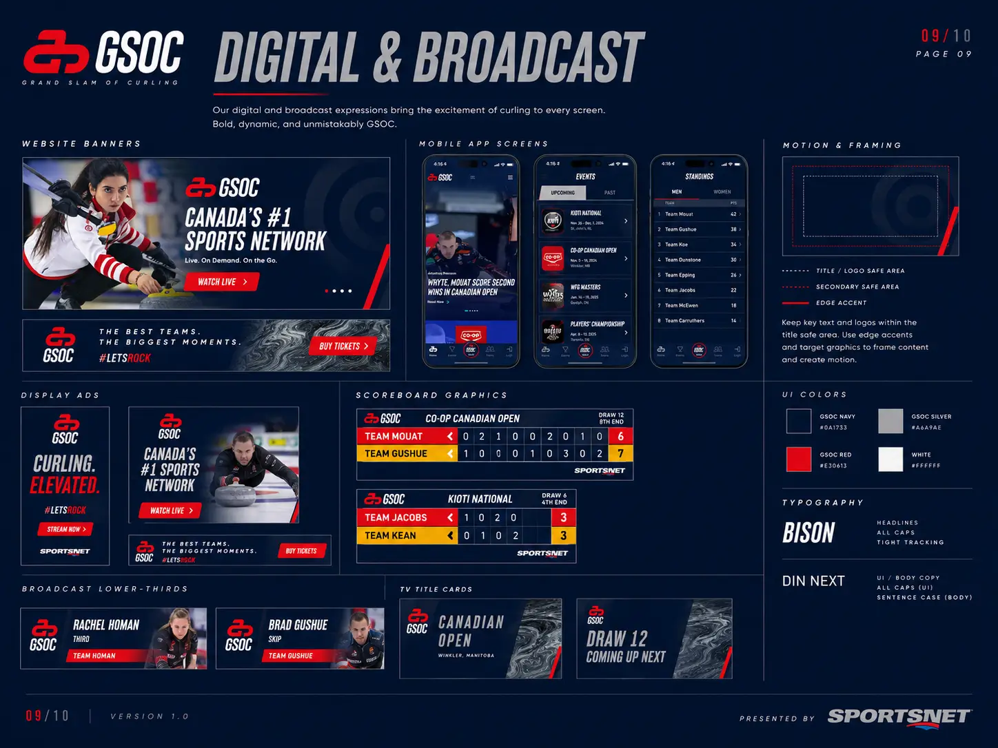
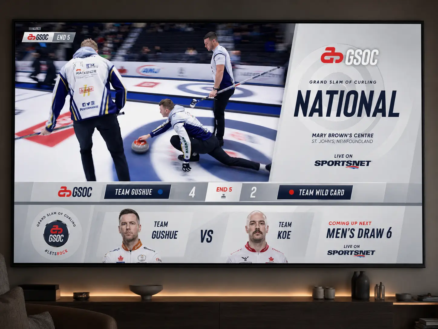
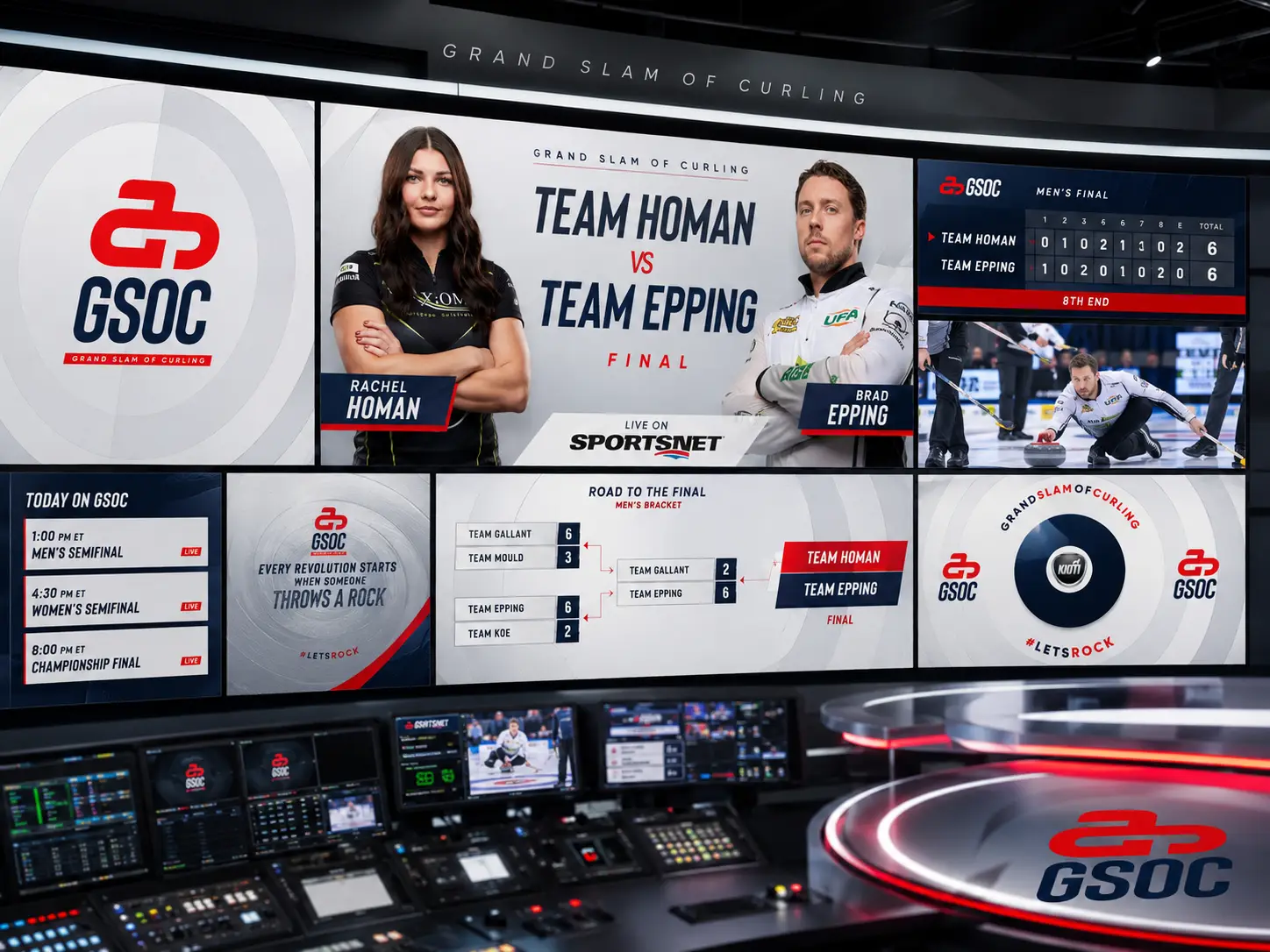
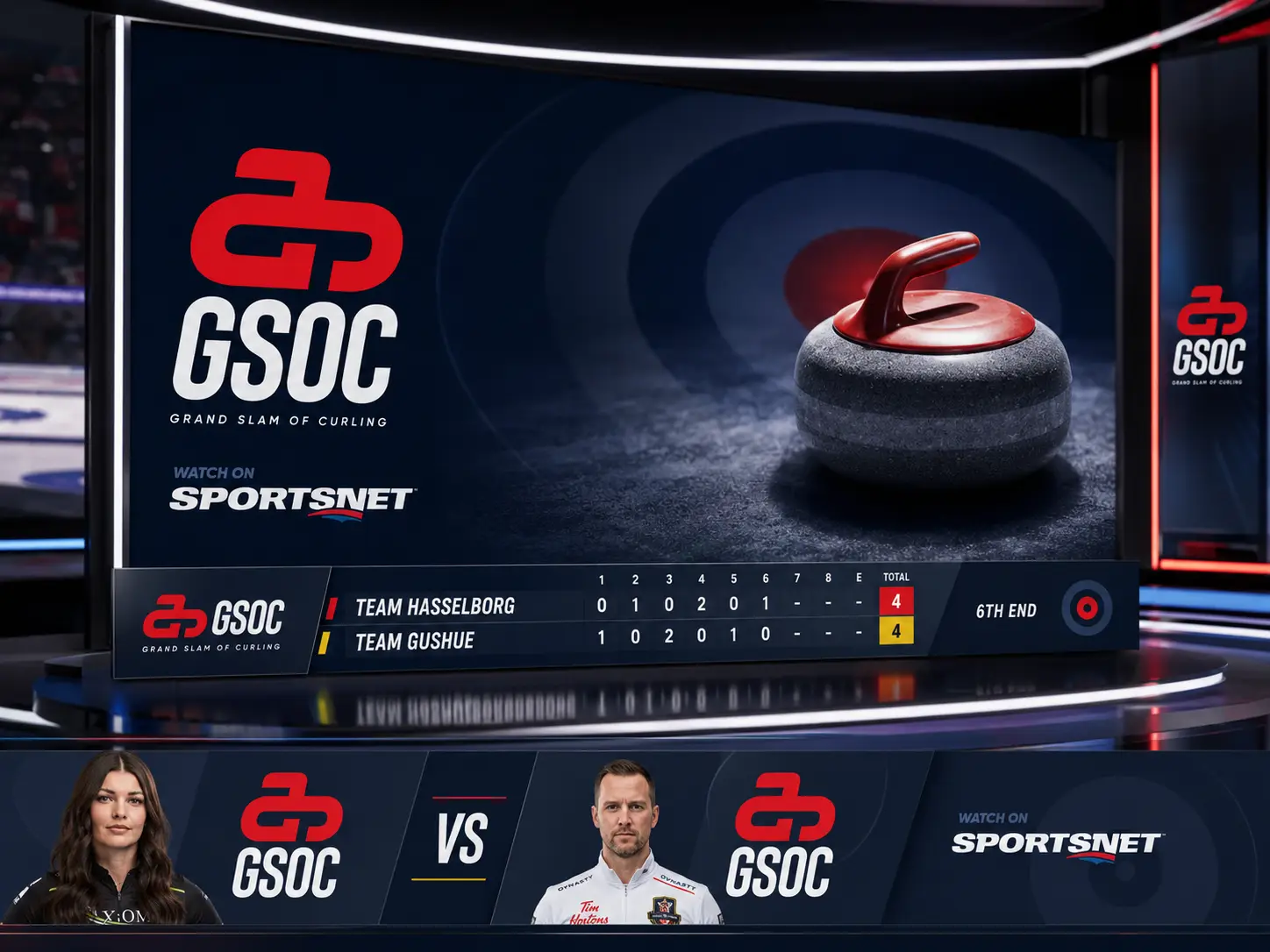
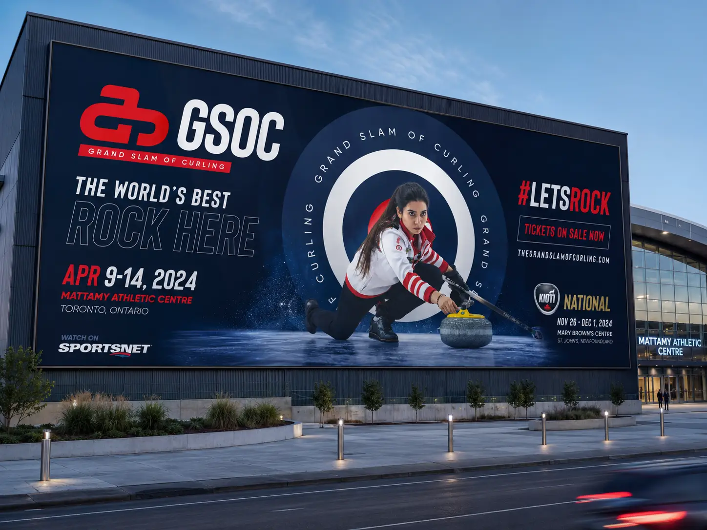
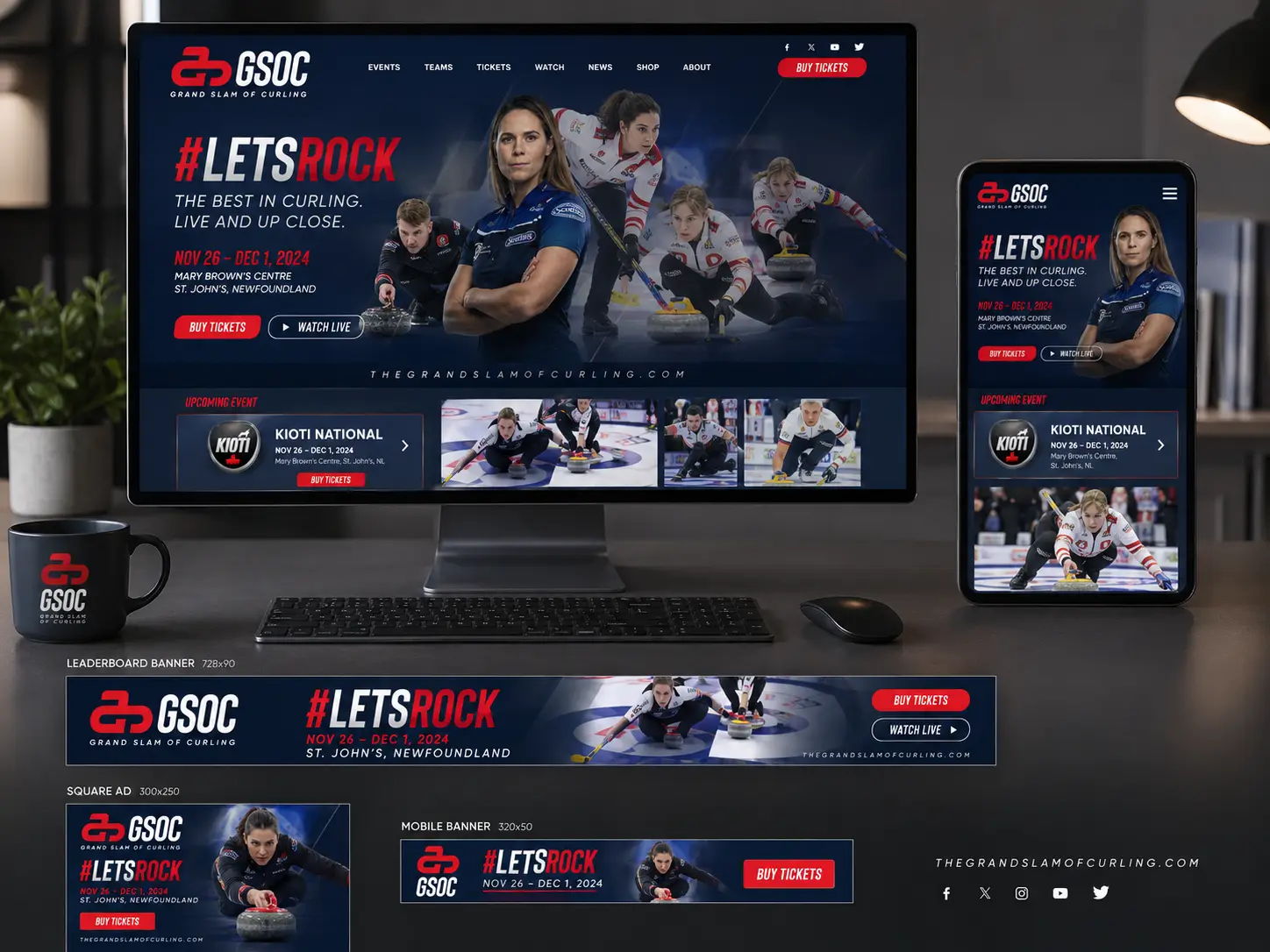
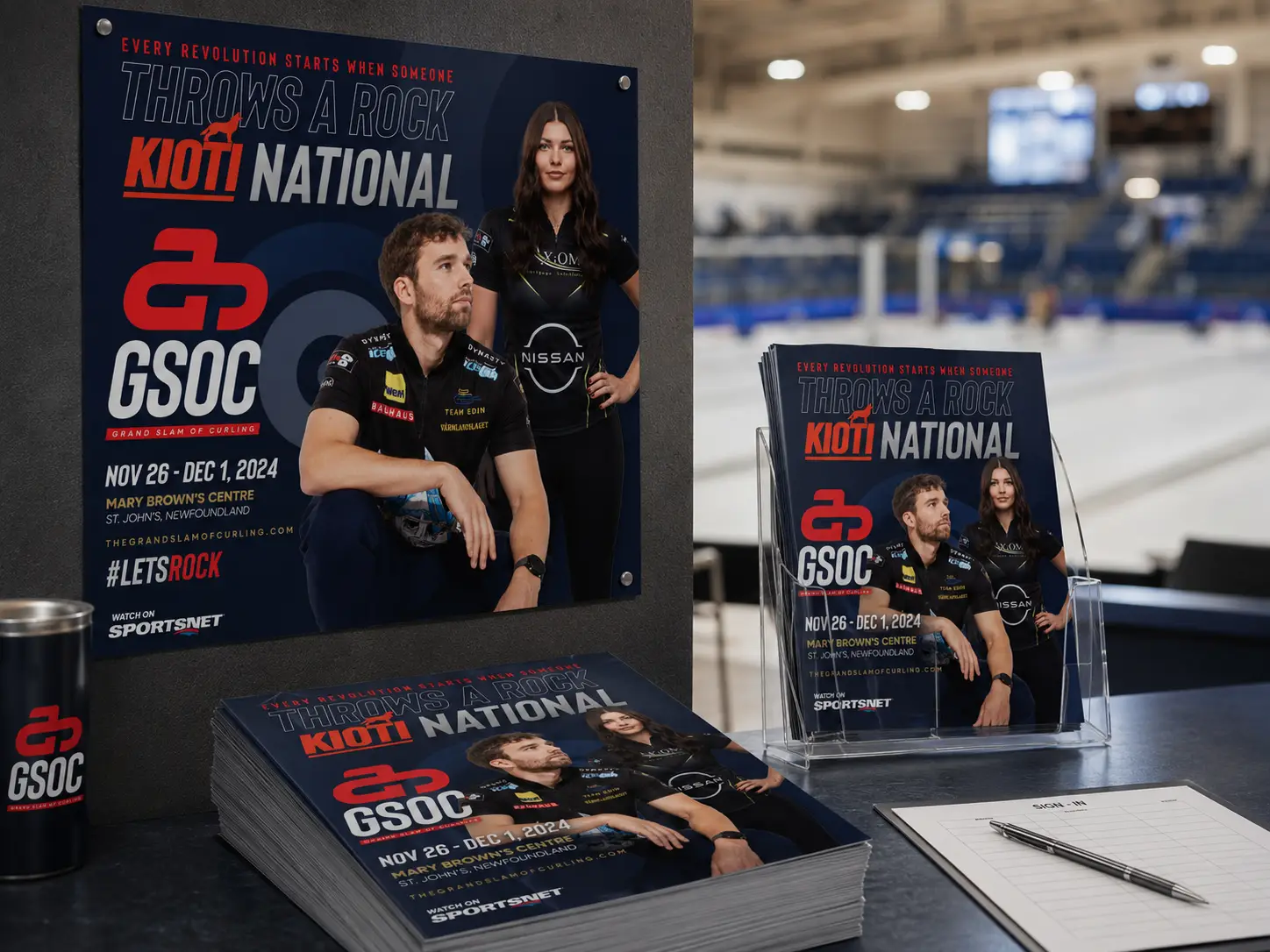
As a top-tier professional tour in the sport, the GSOC brand needed to convey fun, intensity, and vibrancy wherever a fan, broadcaster, sponsor, or athlete might encounter it. We worked across the full range. The new mark (a stylized rock and handle derived from the typographic G) sits at the center of a system anchored in deep navy, sharp red, and the kind of typographic confidence the category has historically been allergic to. We extended it into venue branding, athlete photography, broadcast packages, OOH, transit, ticketing, programs, the website, and the world's first shoe designed for a professional curler (Brad Gushue's signature Gu-Shoes, a separate but related project for TCG). Here's a small sample of what the system can do.
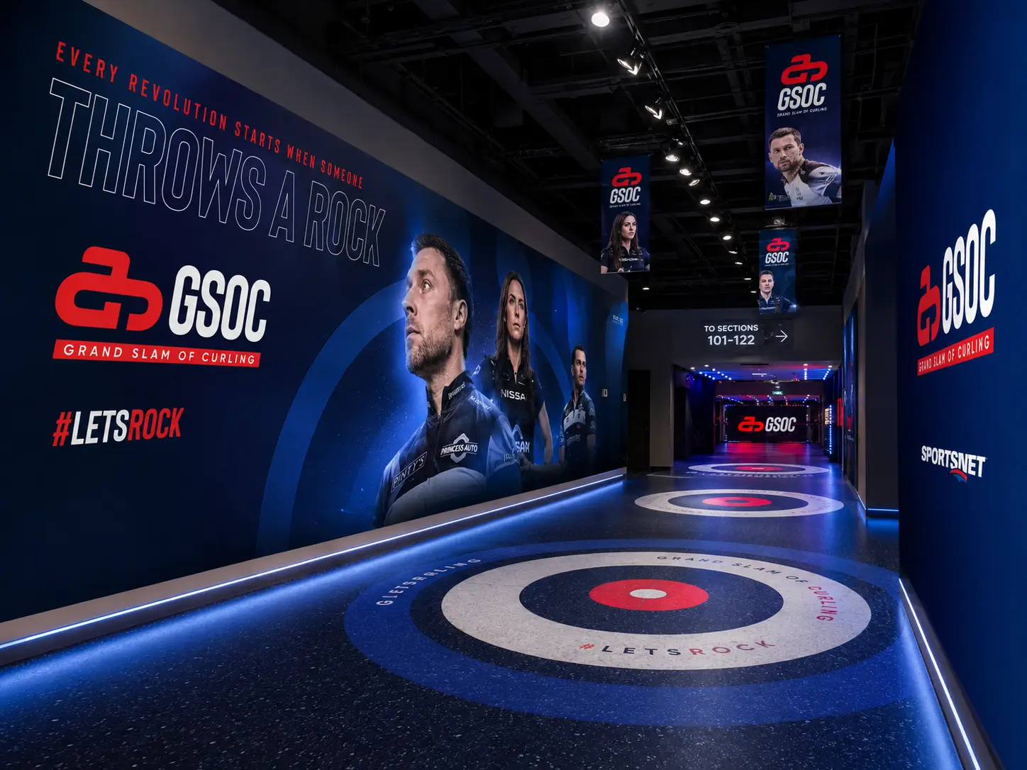
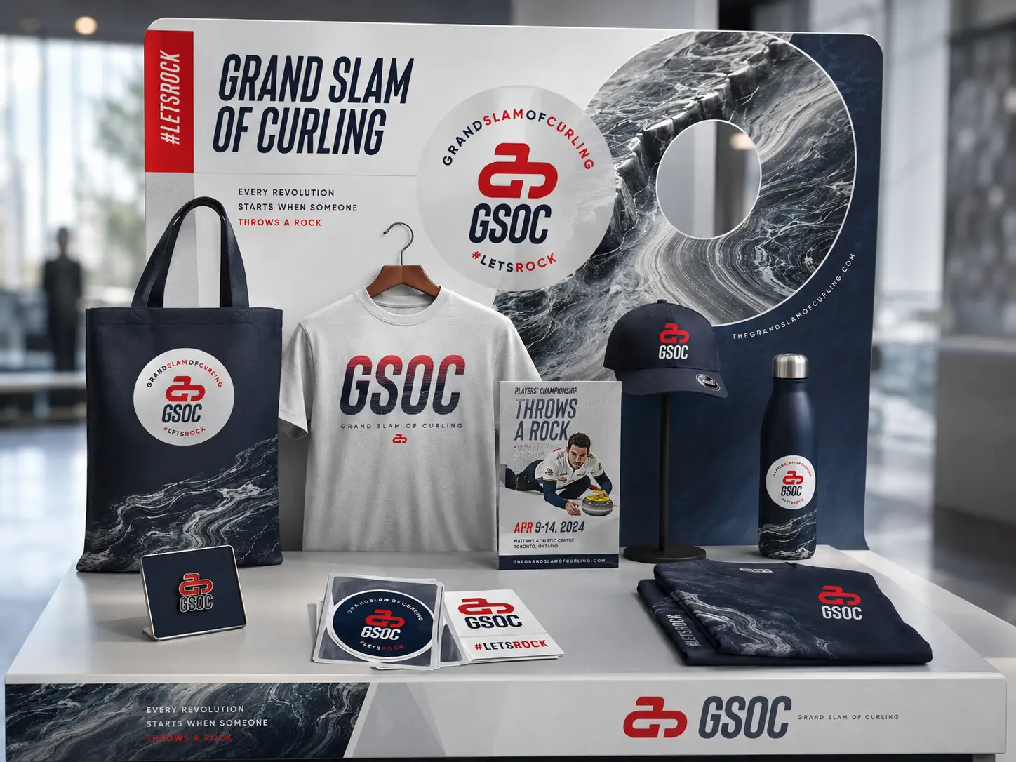
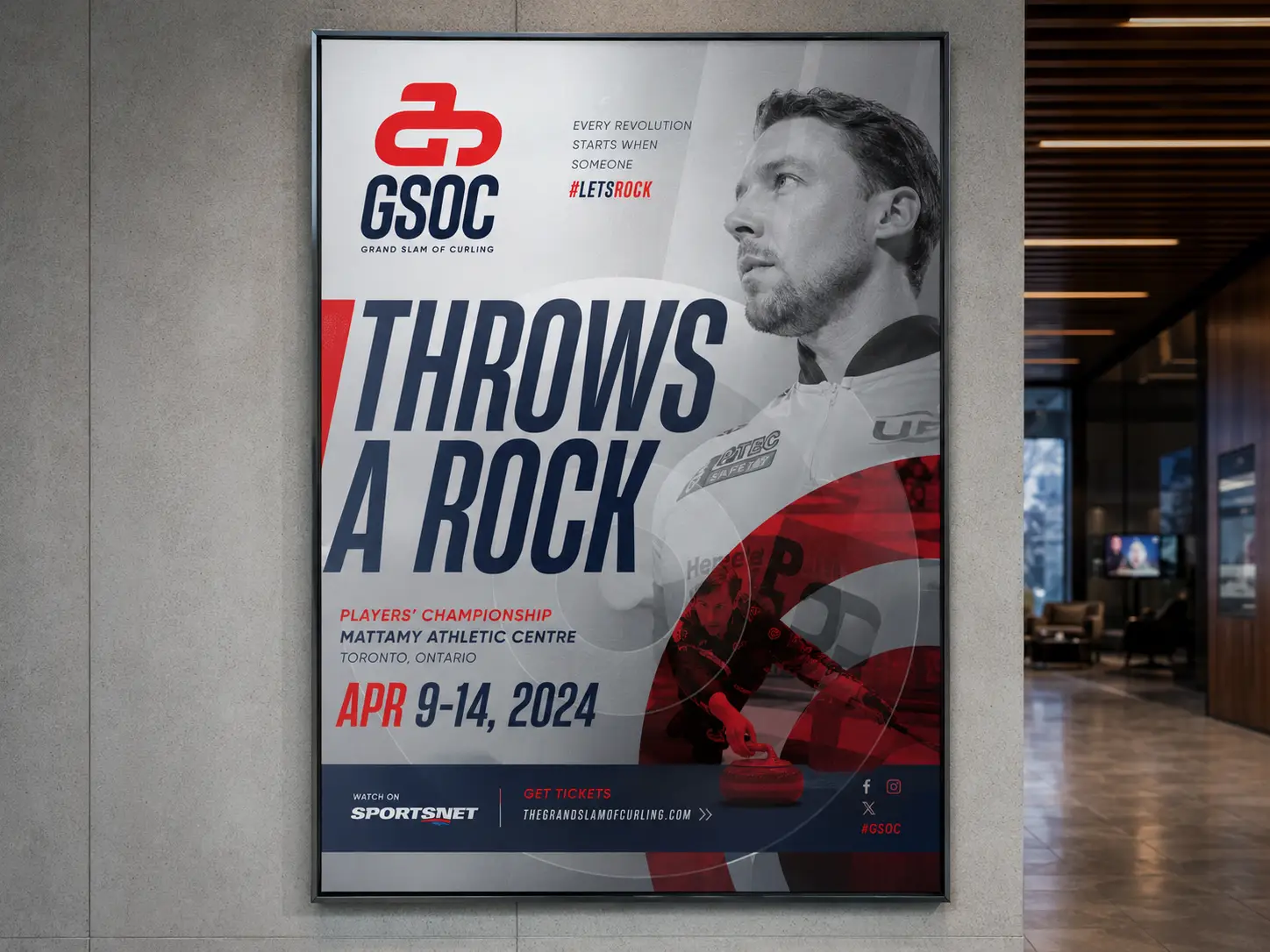
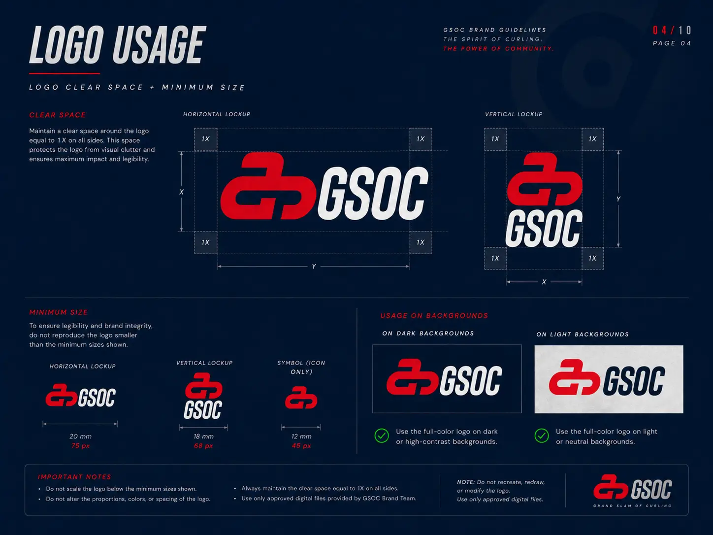
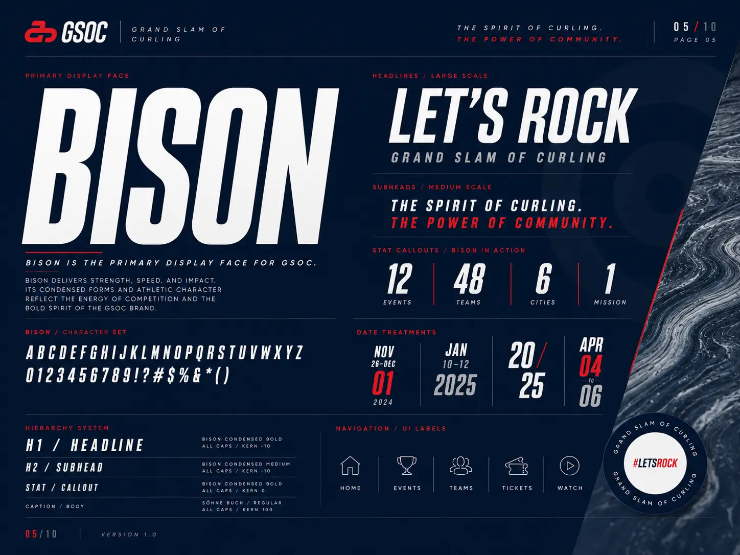
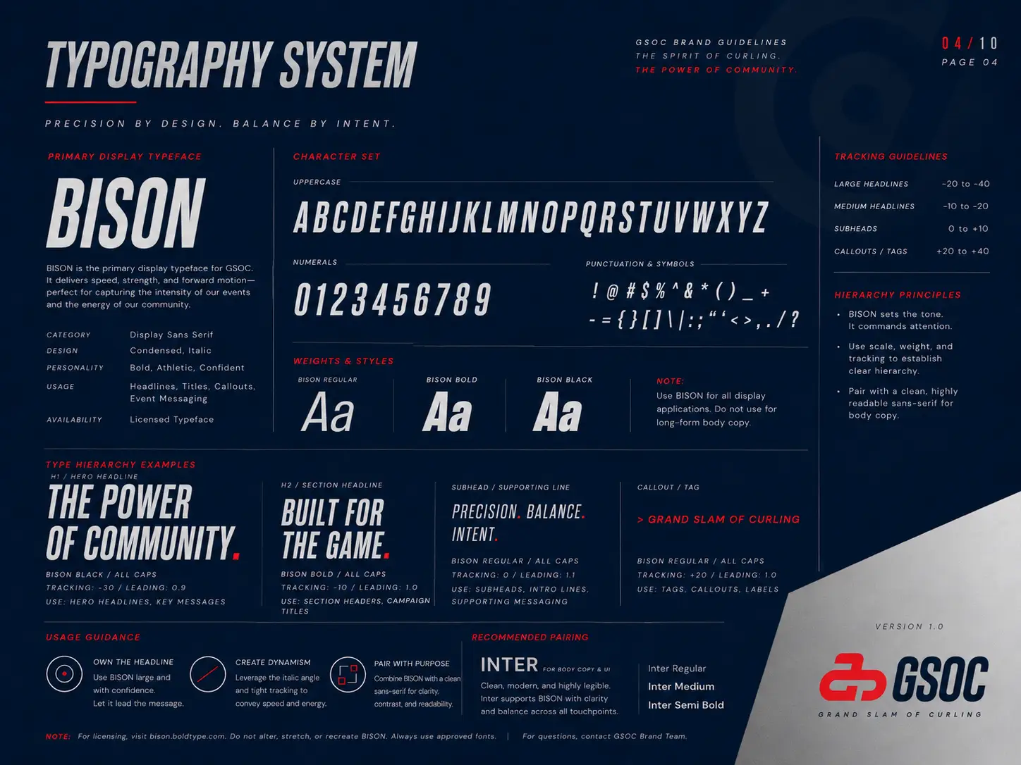
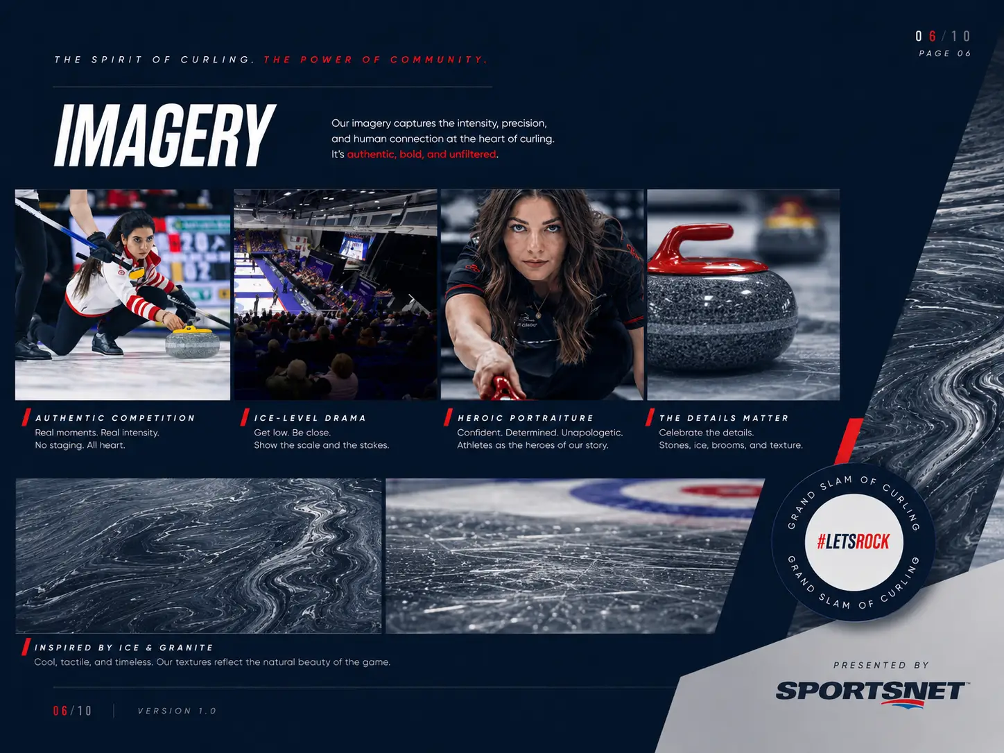
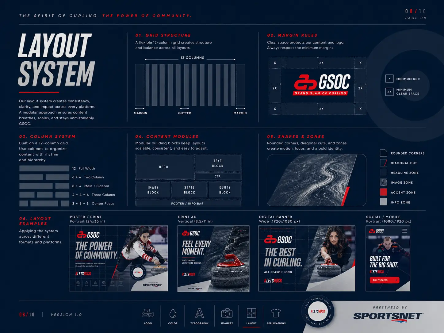
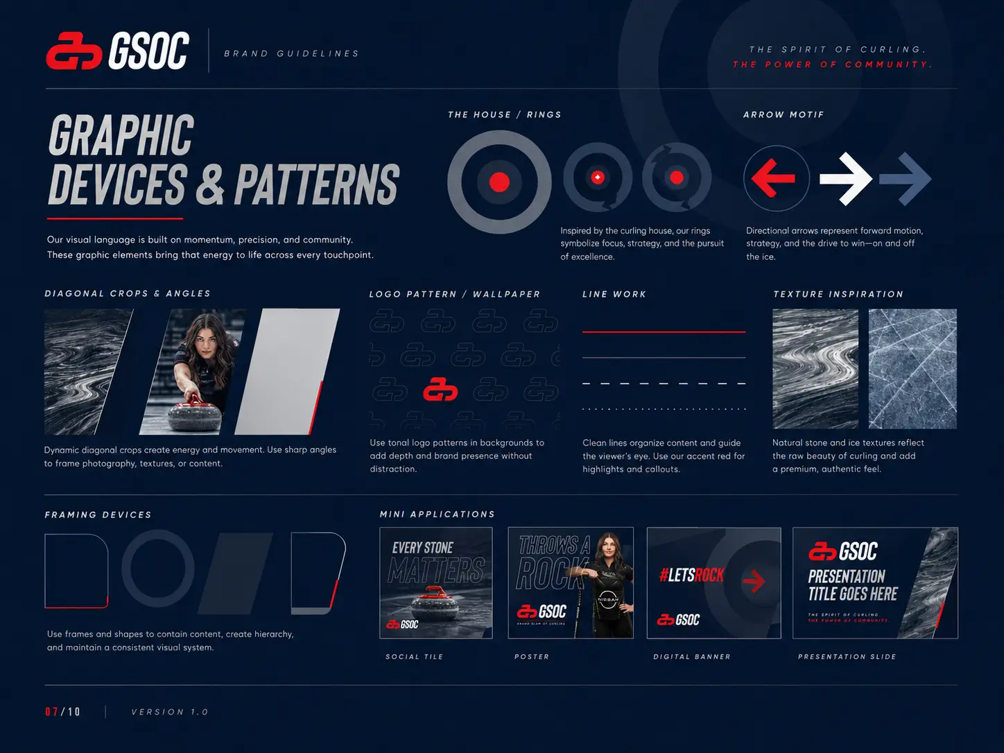
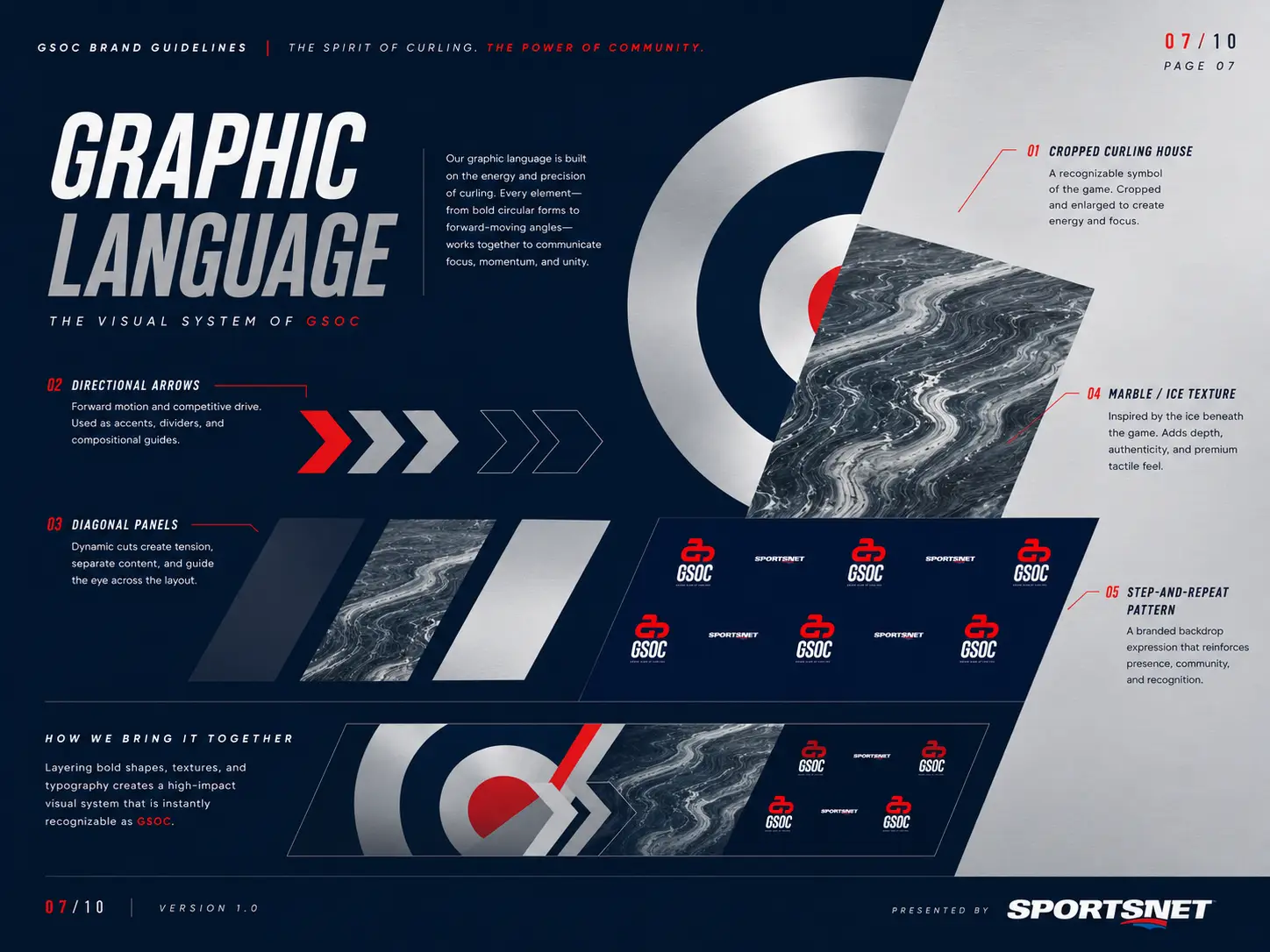
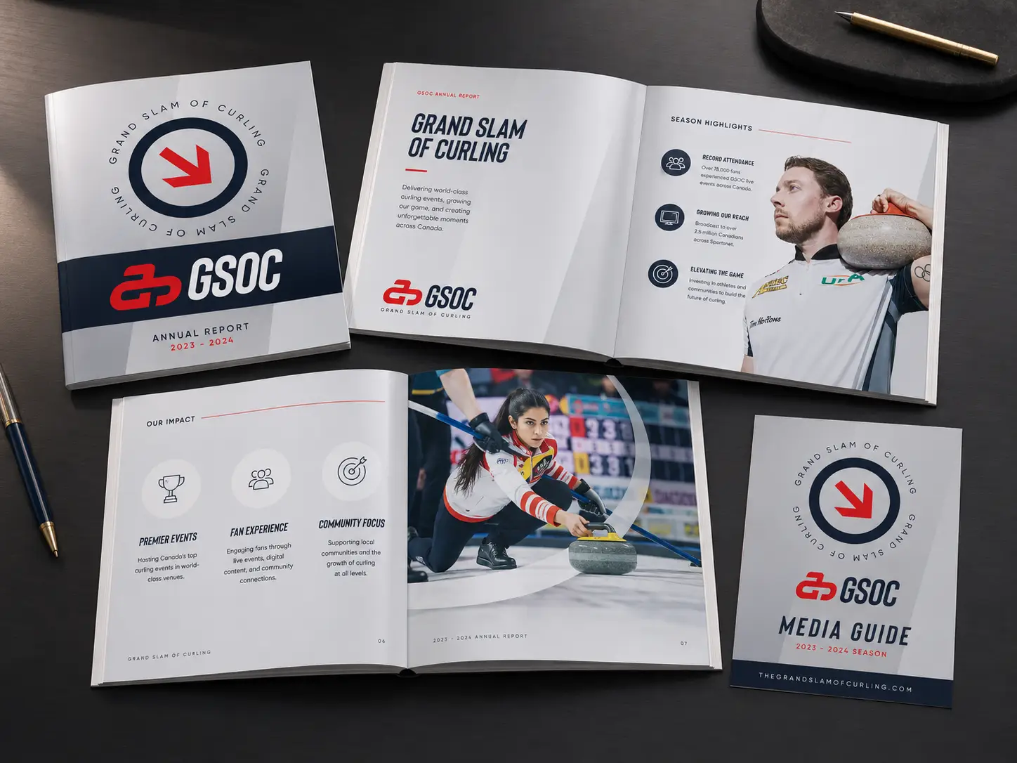
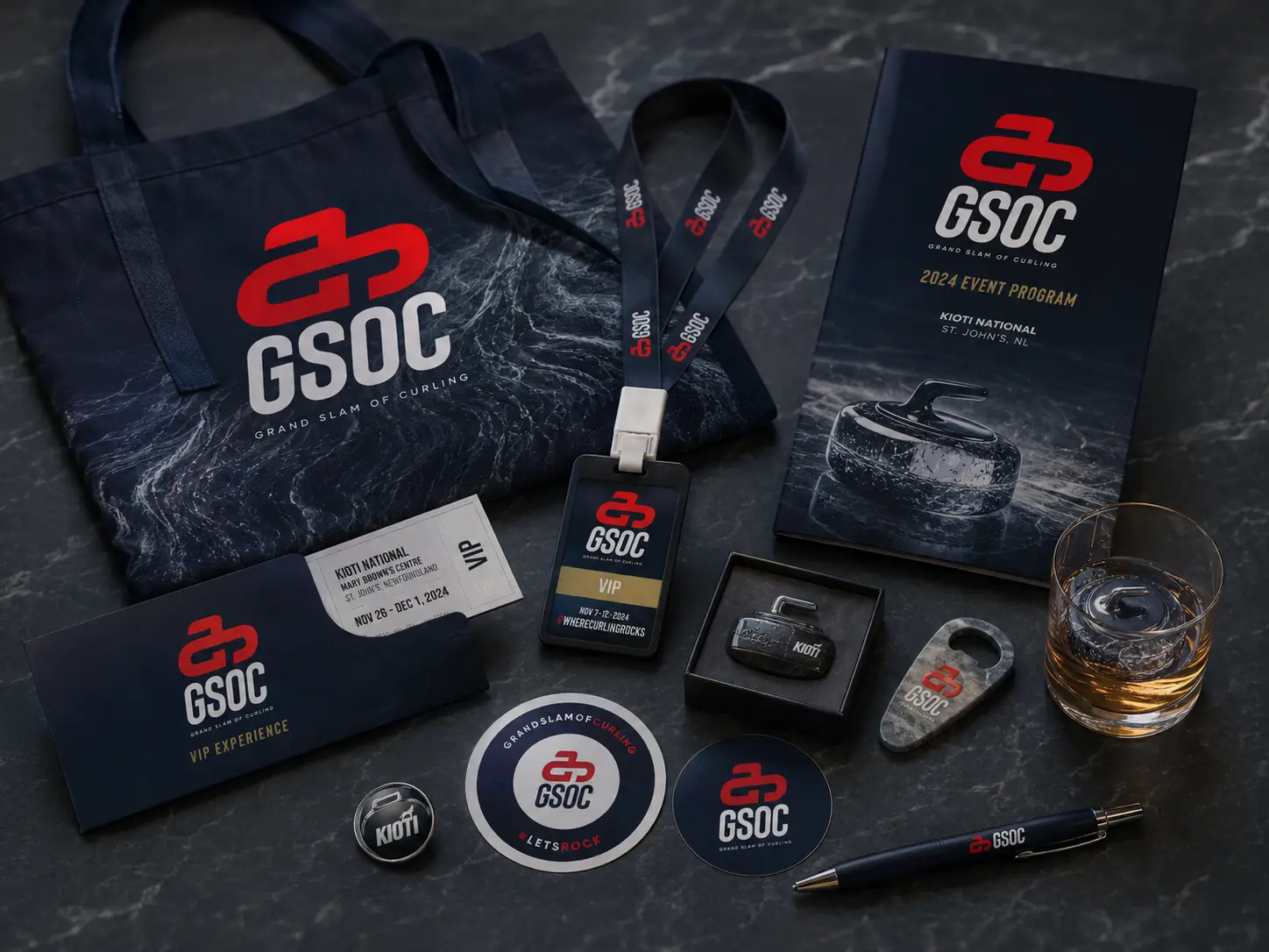
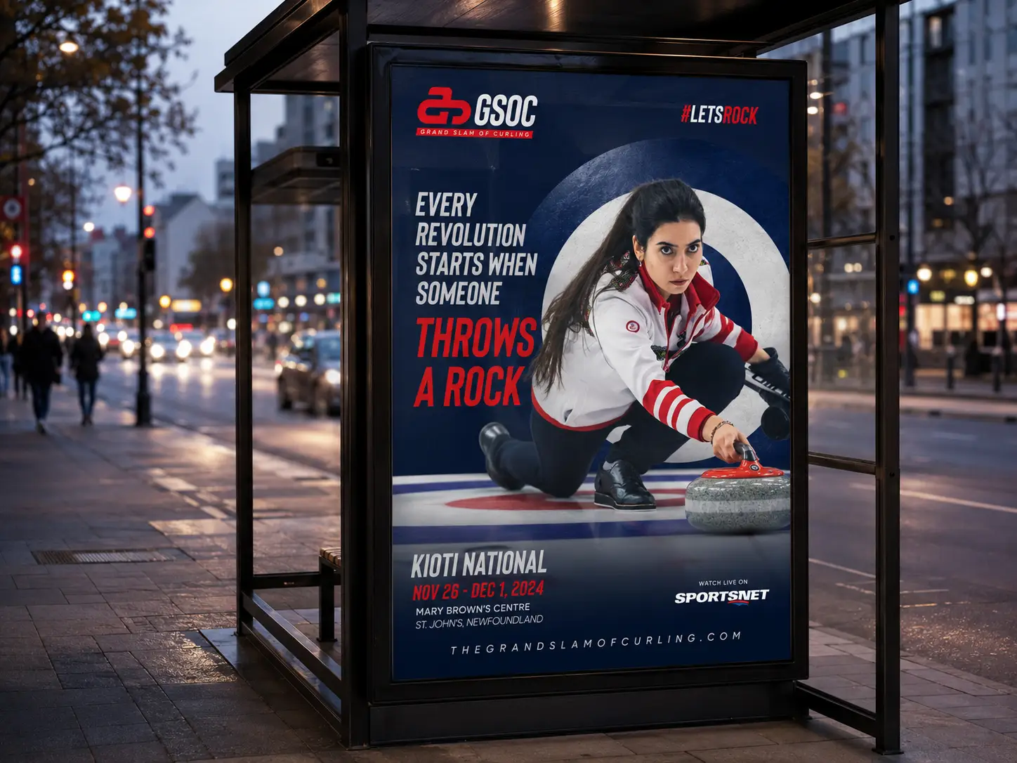
We built a creative platform around the rock itself, treating it less like a piece of equipment and more like a cultural icon. Cinematic athlete portraits. Bold black-and-red type. Headlines built to provoke the casual fan into actually pressing play. The accompanying brand guidelines run deep, covering logo geometry, typography, color, imagery, layout devices, graphic patterns, applications, and digital and broadcast specs, so GSOC's internal team and external partners can keep the look consistent as the tour scales.
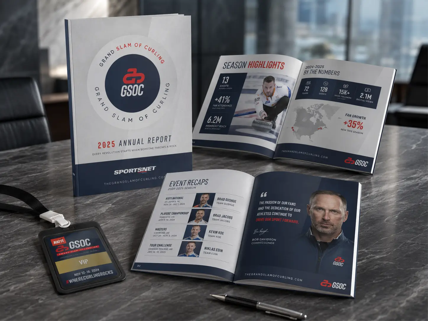
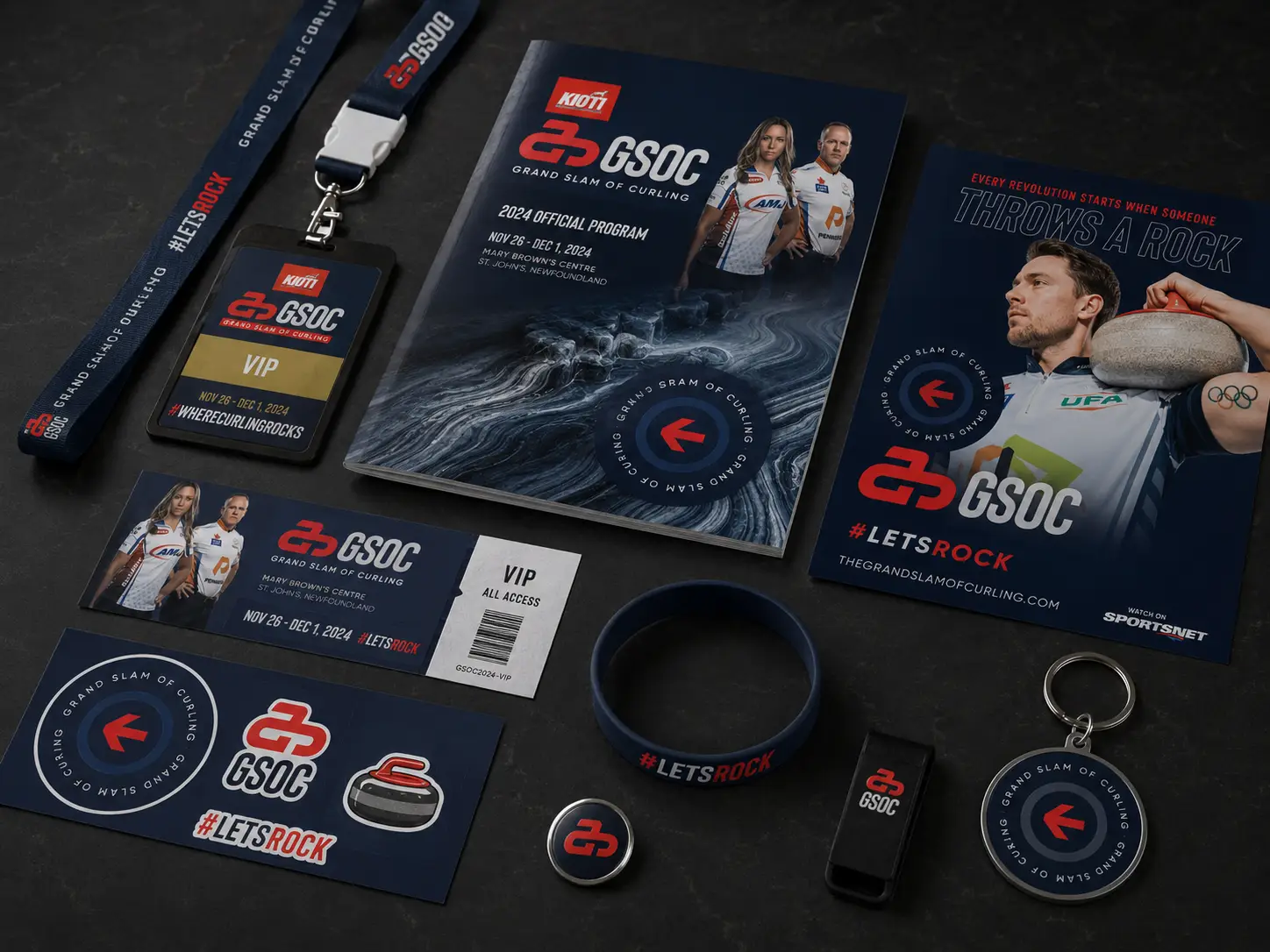
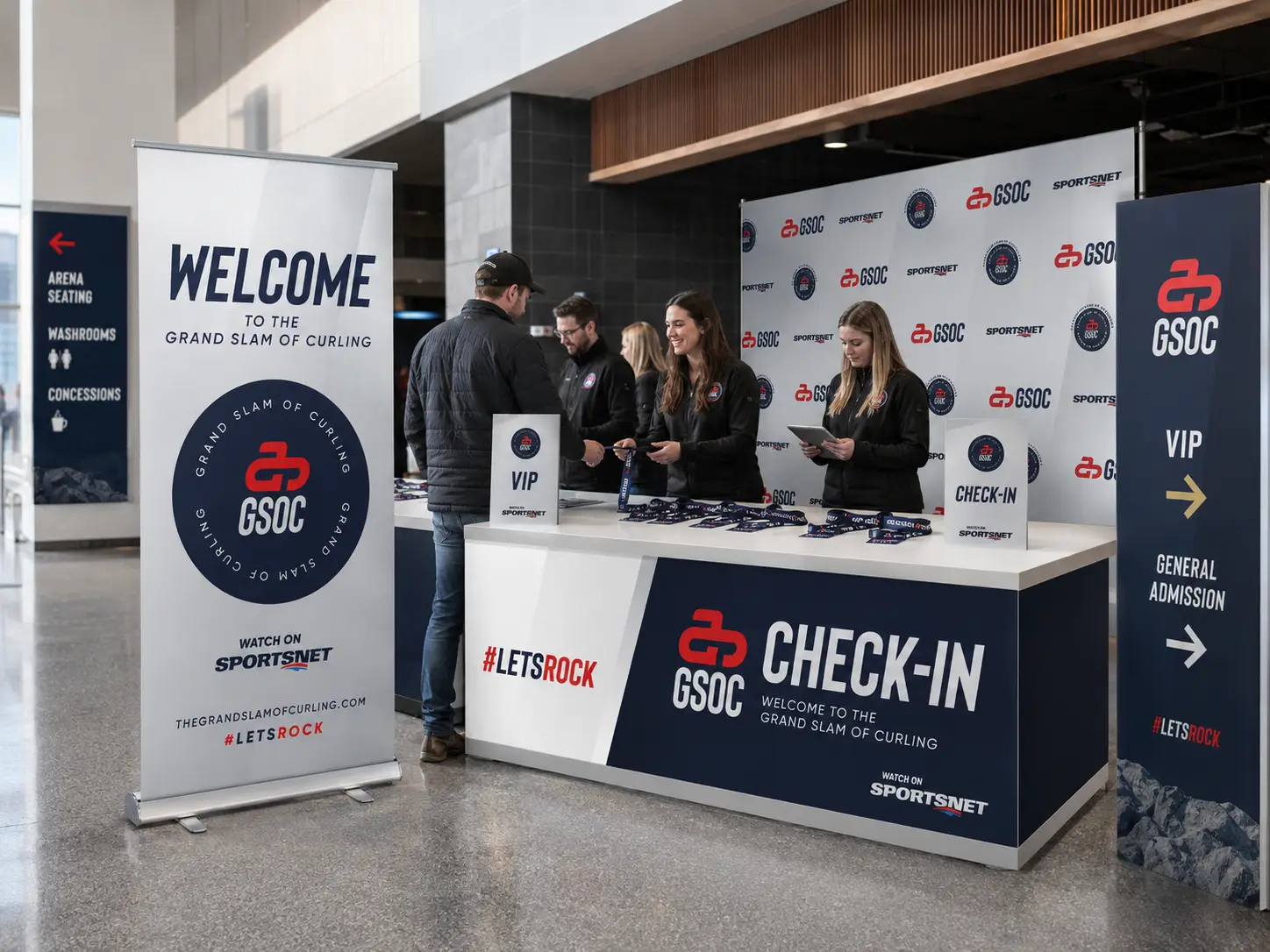
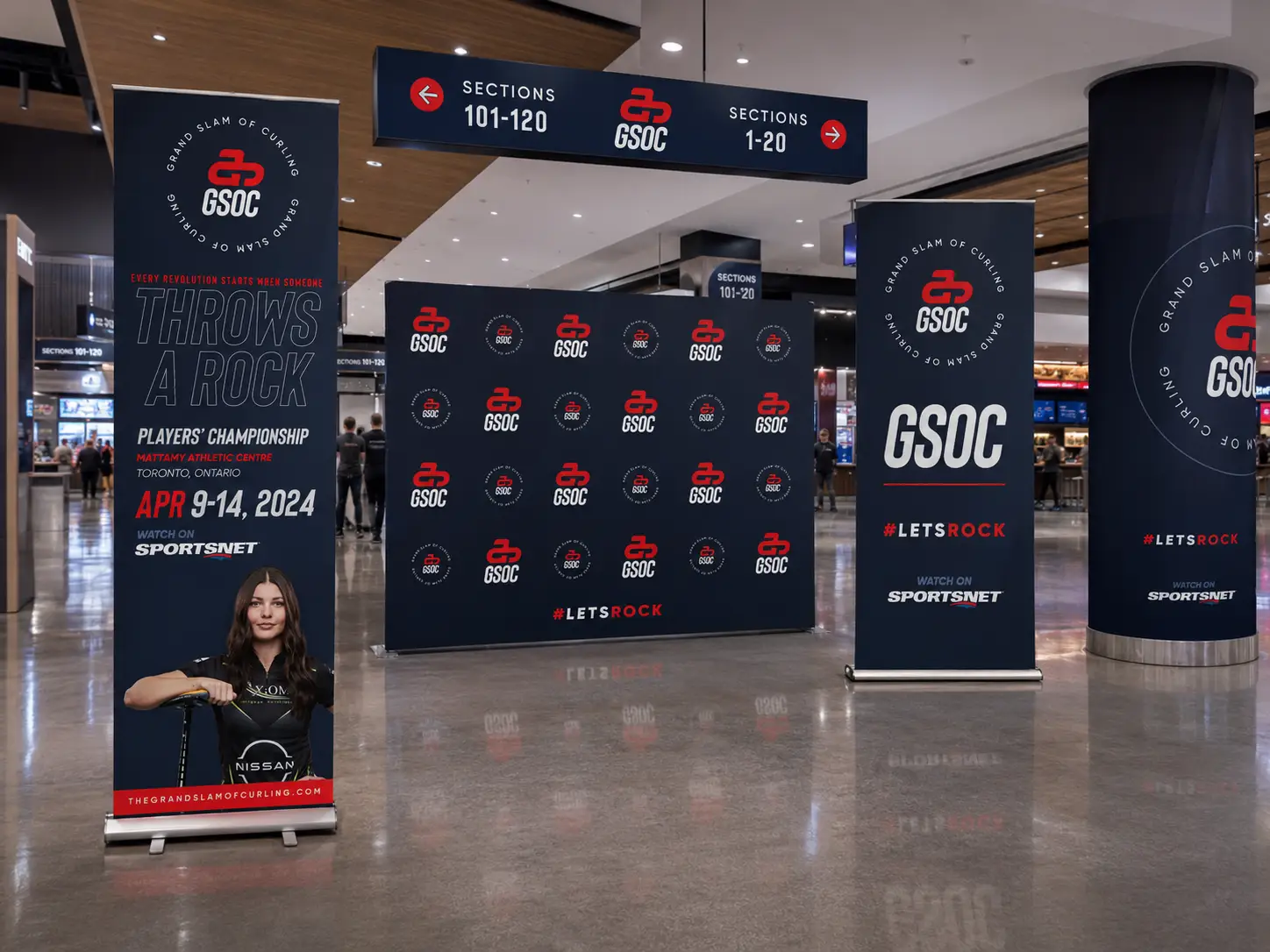
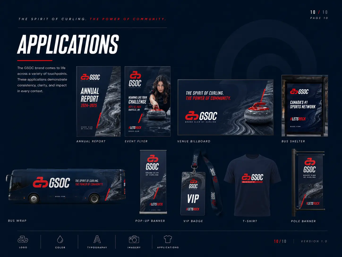
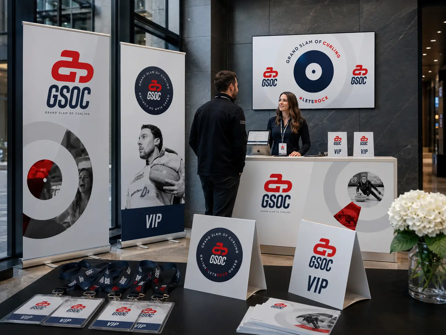
Stadium signage, in-venue collateral, street wayfinding, flyers, badges, and credentials, all designed to turn a curling event into something that feels like a sold-out playoff series. From the bus shelter ad a fan walks past on the way in, to the lanyard around their neck once they're inside, to the broadcast graphics on Sportsnet between ends, the brand carries one consistent voice and one unmistakable look. The fan experience now matches the level of play.
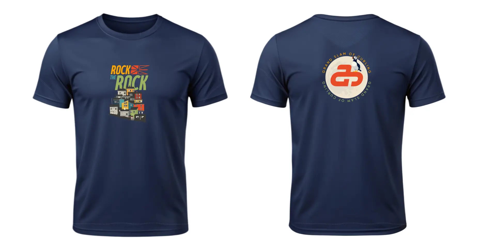
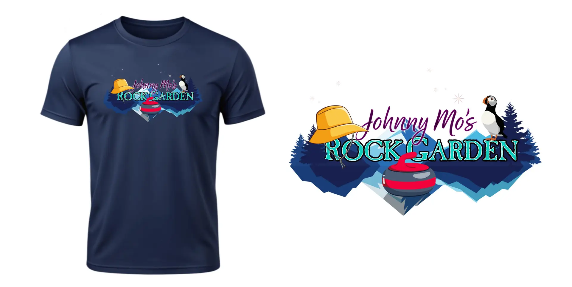
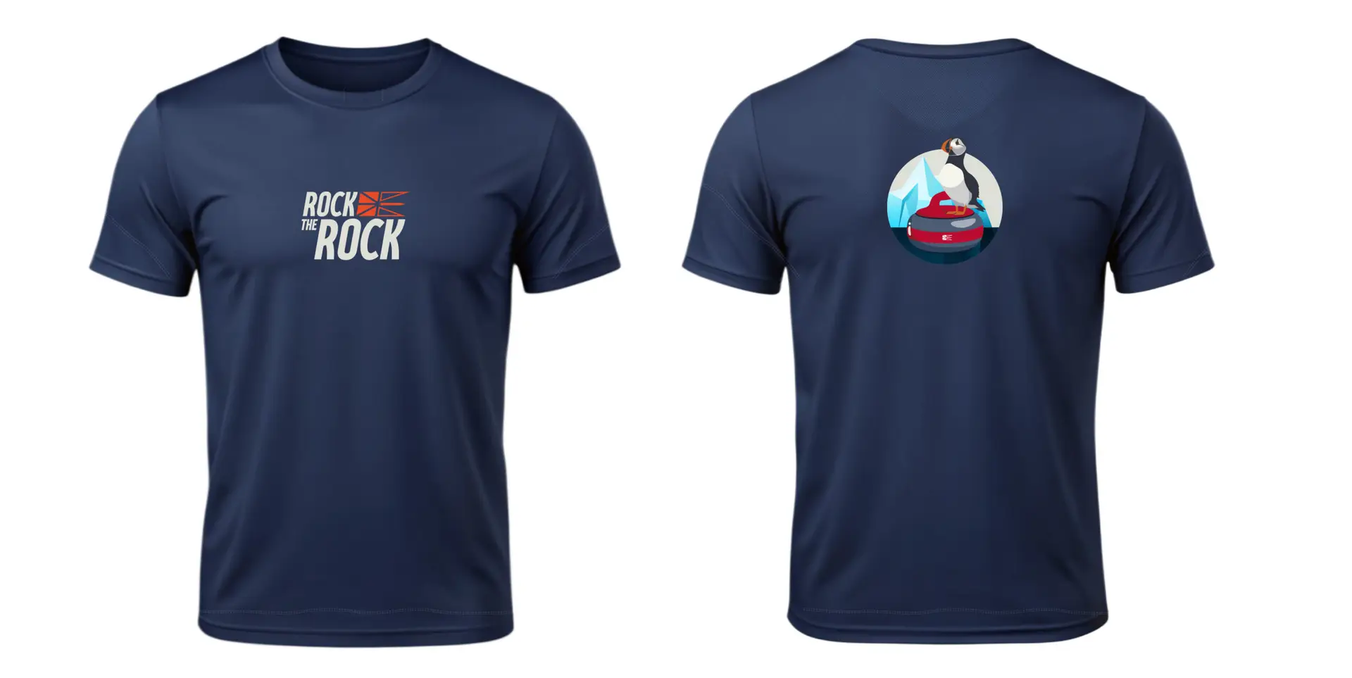
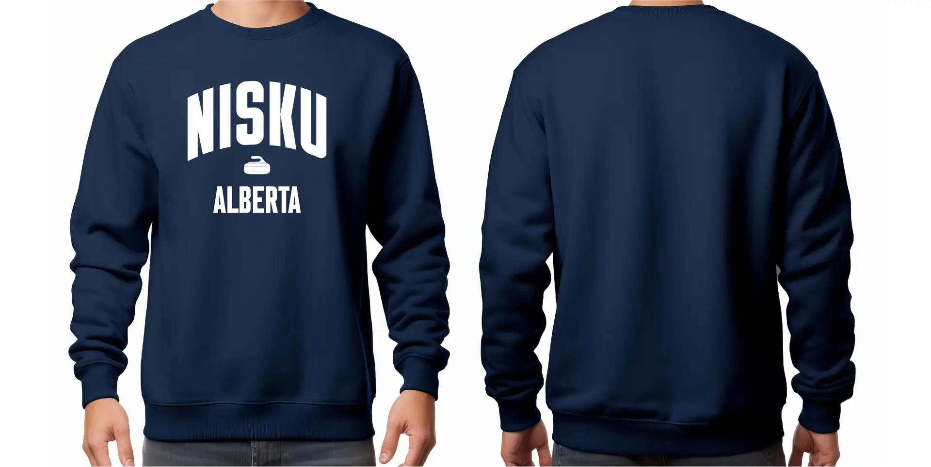
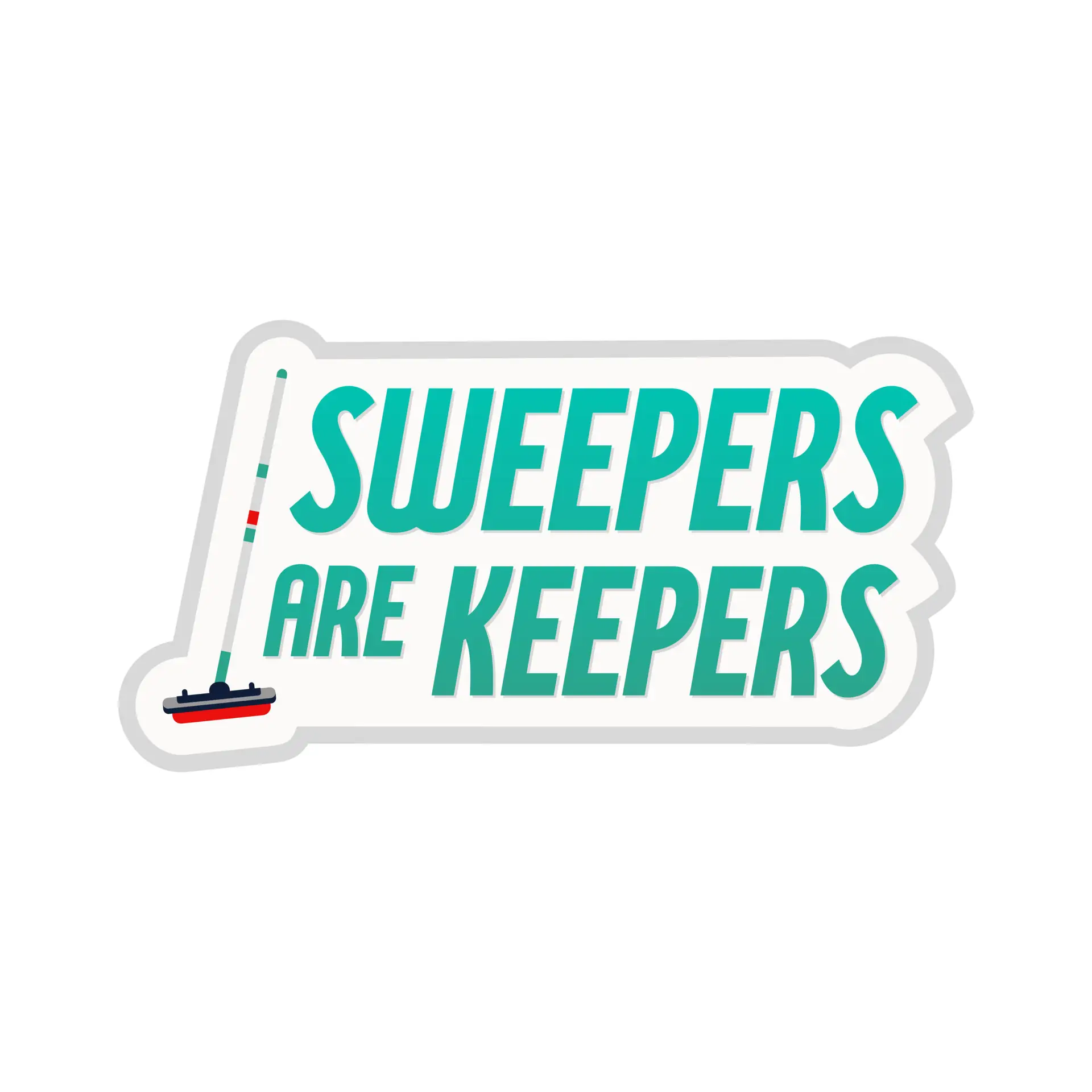
Merchandise designed for fans to actually wear, not just at the event but on a Tuesday. Tournament tees, embroidered crewnecks, regional callouts (Nisku, Alberta, the spiritual home of Tuesday-night club curling), and a sticker pack built around the kind of one-liners curlers already say to each other (Have broom, will curl. Sweepers are keepers. Roar baby roar.). The merch line is a stealth marketing channel. Every time someone wears one out in public, they're quietly recruiting the next fan who's about to ask what it means.
Brand positioning, brand identity, the full visual and verbal system, brand guidelines, in-venue and stadium graphics, broadcast packages and motion graphics, OOH and transit, web, ticketing and programs, merchandise, athlete-signature product, and more on the way. The Grand Slam of Curling has been the top of the sport for a long time. Now it finally looks like it.
Sample intro animation developed for broadcast.
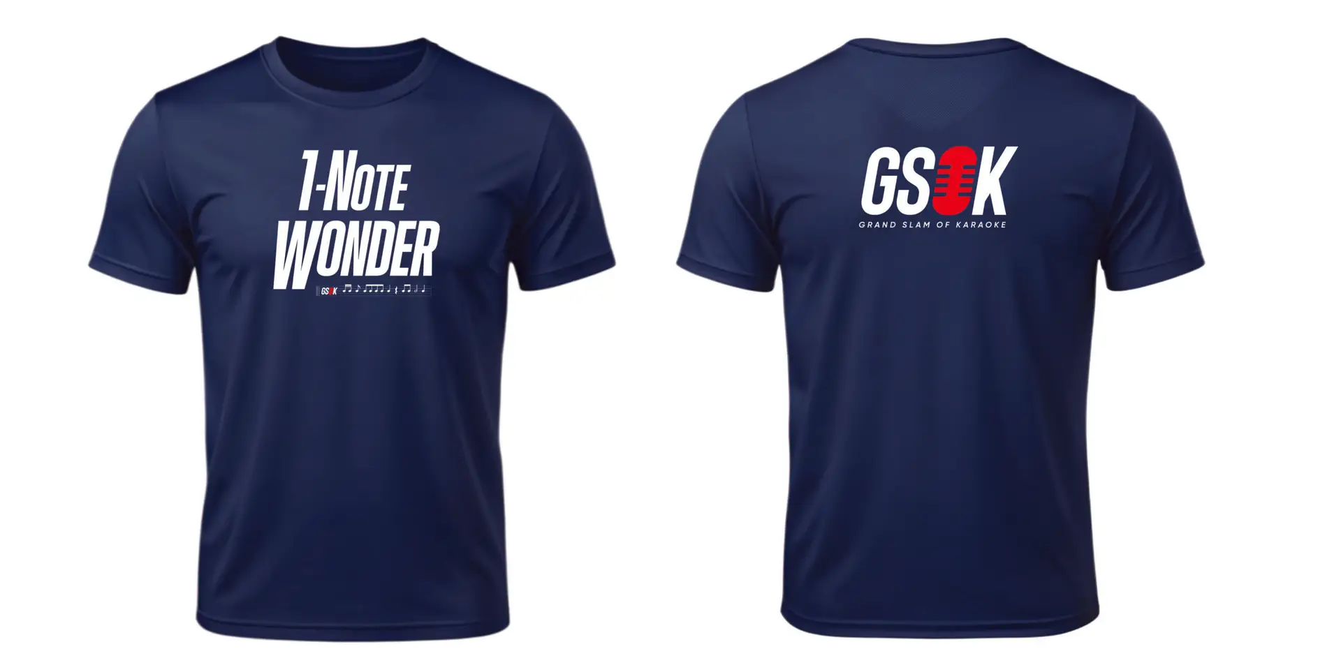
Grand Slam of Karaoke event.


